
Kendo UI for Angular
Angular DropDownTree
- The easiest way to show hierarchical data in a drop-down tree of selectable options.
- Part of the Kendo UI for Angular library along with 110+ professionally-designed components.
- Includes support, documentation, demos, virtual classrooms, Visual Studio Code Extensions and more!
-
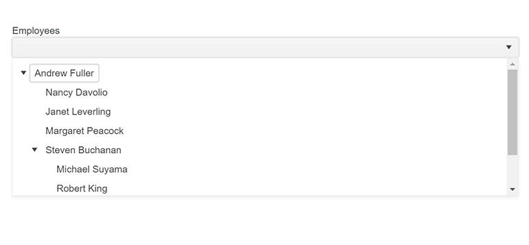
Display a Hierarchical Dropdown Menu
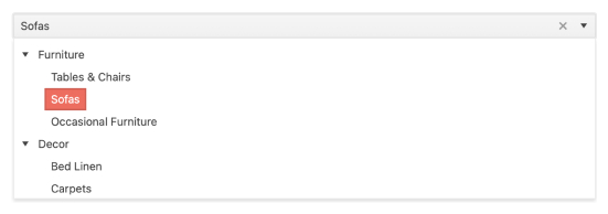
The Kendo UI for Angular DropDownTree is a form component that renders data in a tree-like structure within a DropDown component. The user can click the dropdown and then choose a single predefined value. It is a richer version of the <select> HTML element and supports data binding, filtering and templates.
-
Data Binding
The Kendo UI for Angular DropDownTree enables you to bind it to various forms of data, including datasets of complex items (objects) or an array of primitive items. As a part of this binding, fields can be defined to represent the text displayed to the user as well as a separate underlying value to be used by developers.
-
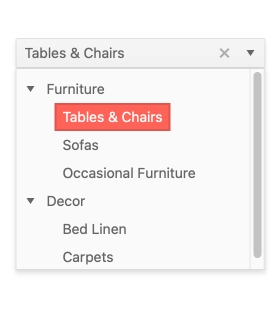
Persistent Expanded Sate
The Kendo UI for Angular DropDownTree helps give your users a great experience by allowing you to persist the expanded state of the drop-down tree. The most common use case for this feature is showing the user the same expanded state tree nodes were in when the user last used the component. You can also set the expanded state based on application events.
-
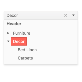
Templates
Out of the box, the Kendo UI for Angular DropDownTree renders items as plain text. You can utilize Angular templates to create a custom layout for each element, including the list items, the list value, the header and footer areas, as well as the message displayed when no data is connected to the Angular DropDownTree.
-
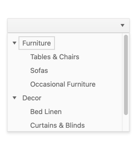
Adaptive Mode
The Angular DropDownTree supports an adaptive mode enabling a mobile-friendly rendering of the component popup. The component automatically adapts to the current screen size and alters its rendering accordingly.
-
Control Over Open State
The Kendo for Angular DropDownTree component allows you to not only control the initial open or closed state of the component, but also allows you to toggle the ability to open and close nodes.
See the Kendo UI for Angular Controlling the Open States demo.
-
Keyboard Navigation
The Kendo UI for Angular DropDownTree supports users manually typing both the date and time into its input. It also offers the ability to open and interact with the date and time picking popups of the Angular DropDownTree using keyboard navigation.
-
Accessibility
The Kendo UI for Angular DropDownTree is AAA rated for WCAG 2.0 and compliant with both WAI-ARIA and Section 508 standards.


Get Started with Kendo UI for Angular
