Kendo UI for Angular
Angular Bar Chart
- Effectively compare and interpret categorical data with the Kendo UI for Angular Bar Chart.
- Part of the Kendo UI for Angular library along with 110+ professionally-designed components.
- Includes support, documentation, demos, virtual classrooms, Visual Studio Code Extensions and more!
-
Data Binding
You can populate the Angular Bar Chart series with data from various source types, including numbers, arrays and objects (or models)—simply specify the fields you want to use.
-
Angular Bar Chart Types
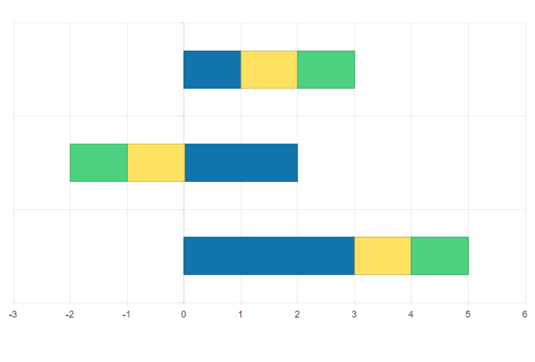
The Angular Bar Chat can easily act as a Column chart by simply changing the chart axes—the vertical axis to display the category variables and the horizontal or the x-axis to represent the numerical values. You can additionally leverage the Stacked Bar Chart and 100% Stacked Bar Chart to visualize part-to-whole relationships in your dataset by showing multiple subcategories. For example, use the Angular Stacked Bar Chart to display a breakdown of total sales by device or the 100% Stacked Bar Chart to compare the percentage of unique website visits to the total website sessions.
-
Bars Gap and Spacing
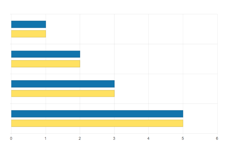
Adjust the distance between bars to effectively use the white space in your Angular Bar chart to your design advantage. You can customize the distance between the categories through the gap property and the distance between bars in a single category through the spacing property and set them as a percentage of the bar’s width.
-
Panning and Zooming
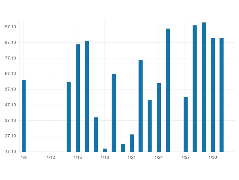
Leverage built-in pan and zoom functionality to enable users to zero in on specific ranges of the Kendo UI for Angular Bar Chart. The component makes use of a drag motion for panning and a mouse wheel or pinch-and-zoom motions for zooming. Additionally, you can disable panning and zooming for an axis to prevent users from moving vertically or horizontally across the chart plot area.
-
Rendering
The Angular Bar Chart renders data in the Canvas (bitmap) and SVG (vector graphics) formats. SVG is the default format to ensure an always crips presentation of your data. When performance is the priority, you can easily switch to a canvas format through a single configuration option to ensure your chart will handle large data and real-time updates with no interruption.
-
Export Options
You can export your Angular Bar Chart to PDF, SVG, PNG and the Kendo UI drawing format. In scenarios where you need to change the image size or fit the chart to a paper size when exporting to PDF, the intuitive export method of the component will allow you to preserve the quality and rendering of the Chart in the output file.
-
Themes
Customize the series colors of the Kendo UI for Angular Bar Chart component with one of our predefined color sets, including Default (our own styling), Material (based on the Material Design guidelines), Bootstrap (resembles the Bootstrap styling) and Fluent (based on Microsoft Fluent UI). You can further customize any of the built-in themes or create a new theme to match your branding using Progress ThemeBuilder.
-
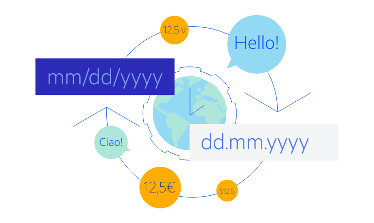
Globalization
The Kendo UI for Angular Bar Chart supports globalization and localization to ensure that the component can effectively support any application’s language and locale. You can also enable the right-to-left (RTL) rendering for languages that use right-to-left scripts.
See the Angular Bar Chart globalization demo
-
Build Powerful Data Visualizations with the Angular Bar Chart
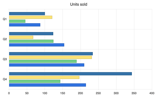
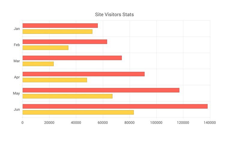
The Kendo UI for Angular Bar Chart displays a comparison between categories in a single or across several sets of data. Each data series is represented in horizontal or vertical (side-by-side or stacked) bars, whose length is based on their values, and a color corresponding to each category, enabling you to easily analyze proportions in your data. Enjoy built-in customization options for the chart and category labels, legend, axes, series color, font, size, position and even negative values.

Get Started with Kendo UI for Angular