
Kendo UI for Angular
Angular Stepper
- Build great UX by visualizing the progress of a process in chronological steps with this highly customizable component.
- Part of the Kendo UI for Angular library along with 110+ professionally-designed components.
- Includes support, documentation, demos, virtual classrooms, Visual Studio Code Extensions and more!
-
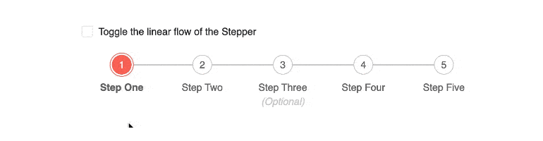
Linear Flow
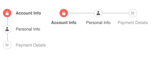
With the Linear Flow option, the Kendo UI for Angular Stepper can switch between a strict step-by-step flow or allow users to freely move between the available steps in random order.
-
Step Types
Steps within the Kendo UI for Angular Stepper can be several types: an indicator, which renders each step as a circle with an icon, a label, which shows no circle and just a text label, or a mix of both the indicator and label.
See Angular Stepper Step Types demo.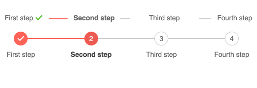
-
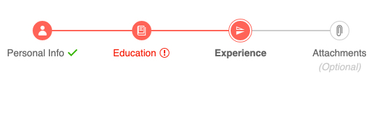
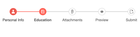
Step Validation
The Kendo UI for Angular Stepper enables you to set validation for each step. In this way, you can ensure that users complete the current step before moving to the next one. Additionally, valid and invalid steps come with unique styling to indicate success or error.
-
Orientation
The Kendo U for Angular Stepper can be rendered in both horizontal and vertical modes.
-
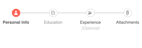
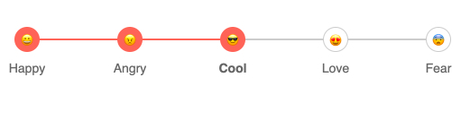
Step Appearance
The Kendo UI for Angular Stepper provides several out-of-the-box styles to control the appearance of each step. The styling options enable you to utilize existing Kendo UI icons or custom icons inside each step, as well as leverage unique styling for optional steps, disabled steps, templated steps and more.
-
Keyboard Navigation
Thanks to its built-in support for keyboard navigation, users can interact with the Kendo UI for Angular Stepper using just a keyboard.
-
Accessibility
The Kendo UI for Angular Stepper is compliant with Section 508 and WAI-ARIA accessibility standards and is rated AA with WCAG 2.0.

-
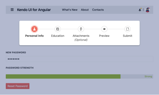
Navigate a Process Through Incremental Steps
The Kendo UI for Angular Stepper component visualizes the progress of a process by dividing it into chronological steps. The Angular Stepper provides several features out of the box, including the ability to define the appearance of each step, validation of content at each step, strict linear flow and templates to make the Angular Stepper fit any design requirements.
-
Templates
The indicators, labels, and steps of the Kendo UI for Angular Stepper can all be customized using a standard Angular template. This allows you to tweak every aspect of the Angular Stepper to meet design requirements.

Get Started with Kendo UI for Angular
