
Kendo UI for Angular
Angular BottomNavigation
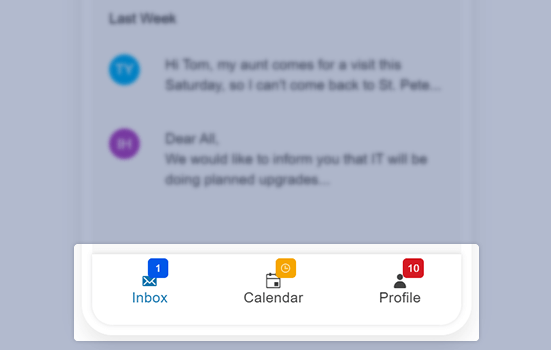
- The Angular BottomNavigation component gives users a convenient iPhone-style way to navigate apps.
- Part of the Kendo UI for Angular library along with 110+ professionally-designed components.
- Includes support, documentation, demos, virtual classrooms, Visual Studio Code Extensions and more!
-
Popular Navigation for Touch Screens
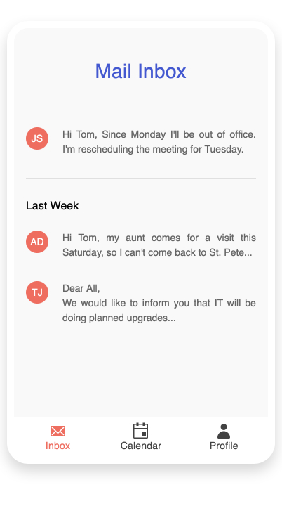
The Angular BottomNavigation component is perfect for adding a convenient way for users to navigate between primary screens on touch devices with smaller screens. Typically used in responsive applications and Progressive Web Applications, bottom navigation places three to five items, consisting of text and an optional image, across the bottom of the screen where they are easily accessible.
-
Items
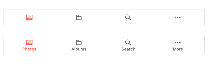
The Bottom Navigation component’s primary parts are its items. Items are the tappable elements that make up the navigation bar. These items can be text, images, or text and images. When using text and images, which is the most common scenario, you can choose where the text and image align, or glow, vertically or horizontally.
-
Fixed or Sticky Modes
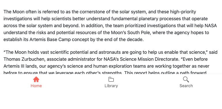
Choose how you would like the Bottom Navigation component to appear on the page in relation to your other content. When using a sticky position, the navigation bar will always appear at the bottom of the container while the sticky position will place the bar at the bottom of the viewport.
-
Templates
Go beyond the built-in appearance configurations and customize your BottomNavigation component however you like.
-
Appearance
Customize the appearance of your Bottom Navigation bar with convenient properties for theme, fill options, borders, and more.

-
Keyboard Navigation
The Angular BottomNavigation Component supports keyboard commands to move focus and select items.
-
Accessibility
The Kendo UI for Angular BottomNaviagation component is compliant with Section 508 and WAI-ARIA standards and has a WCAG 2.0 AAA rating.

All Kendo UI for Angular Components
Charts
- Area Chart
- Bar Chart
- Box Plot
- Bubble Chart
- Bullet Chart
- Chart Wizard New
- Charts
- Donut Chart
- Funnel Chart
- Heatmap
- Line Chart
- Pie Chart
- Polar Chart
- Pyramid Chart
- Radar Chart
- Range Area Chart
- Sankey Diagram
- Scatter Chart
- Sparkline
- Waterfall Chart
Editor
TreeList
Scheduler
Buttons
- Button
- ButtonGroup
- Chip
- ChipList
- DropdownButton
- Floating Action Button
- Speech To Text Button New
- SplitButton
Common Features
Conversational UI
Indicators
Progress Bars
Date Inputs
Dialogs
Labels
Icons
Design
Navigation
Diagrams and Maps
Dropdowns
Gauges
Grids
Upload
Inputs
- Checkbox
- ColorGradient
- ColorPalette
- ColorPicker
- FlatColorPicker
- Form New
- FormField
- MaskedTextBox
- NumericTextBox
- RadioButton
- RangeSlider
- Rating
- Signature
- Slider
- Switch
- TextArea
- TextBox
- TreeView
Bar & QR Codes
Data Tools

Get Started with Kendo UI for Angular
