
Kendo UI for Angular
Angular MaskedTextBox
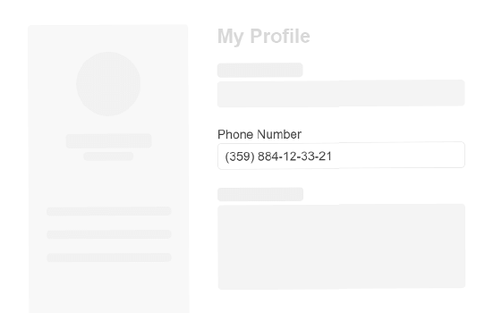
- Enforce standard input rules such as valid phone number and email formats or create your own to ensure data integrity.
- Part of the Kendo UI for Angular library along with 110+ professionally-designed components.
- Includes support, documentation, demos, virtual classrooms, Visual Studio Code Extensions and more!
-
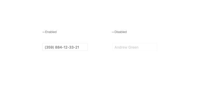
Disabled MaskedTextBox
The Kendo UI for Angular MaskedTextBox can be enabled or disabled with a single configuration option. When disabled, the Angular MaskedTextBox provides a unique visual style and prevents the user from interacting with the component.
-
Read-Only MaskedTextBox
You can set the Kendo UI for Angular MaskedTextBox to be in read-only mode, preventing the user from editing data bound to the Angular MaskedTextBox input.

-
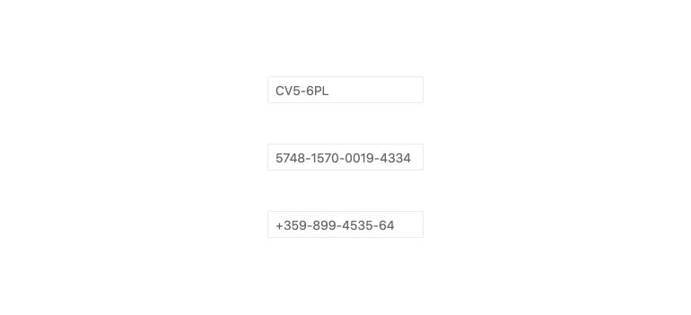
Masks
The Kendo UI for Angular MaskedTextBox comes with several predefined masks out of the box. These masks can be defined character-by-character and allow you to control what slot requires digits, letters, or special symbols and characters.
-
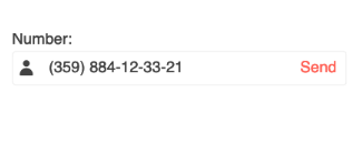
Prefix and Suffix Adornments
Elevate user interactivity leveraging the option for adding prefix and suffix adornments. These are custom items, usually an icon or button, inside the field before or after the input area. Typical prefix adornments are currency symbols or unit indicators, while suffix adornments are often used for password visibility toggles, formatting or clearing the input.
-
Forms Support
The Kendo UI for Angular MaskedTextBox can be integrated with both Template-driven forms and Reactive forms.
-
Accessibility
The Kendo UI for Angular MaskedTextBox adheres to Section 508 and WAI-ARIA standards and is AAA rated with WCAG 2.0.

-
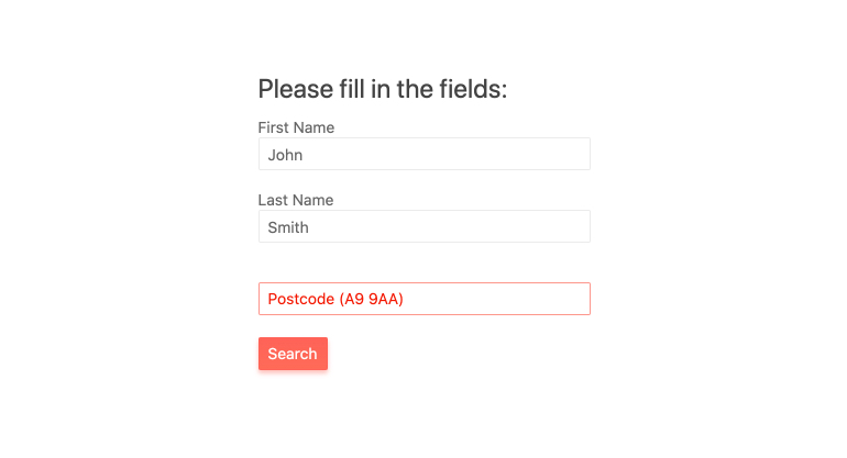
Enforce Input Rules in Form Fields
When application inputs need to be tied to certain data types such as zip codes and phone numbers, a simple way to ensure users are typing the correct information is through a mask. With the Kendo UI for Angular MaskedTextBox, you can add an angular input mask to enforce that information provided follows a strict pattern. The Angular Masked Textbox comes with built-in mask types, as well as the ability to provide any custom mask.


Get Started with Kendo UI for Angular
