
Kendo UI for Angular
Angular Grid
- Best-in-class Angular data grid built for performance with must-have features such as paging, sorting, filtering, grouping and many more.
- Part of the Kendo UI for Angular library along with 110+ professionally-designed components.
- Includes support, documentation, demos, virtual classrooms, Visual Studio Code Extensions and more!
.svg?sfvrsn=3a69671a_6)
-
Why Choose the Kendo UI Data Grid?
Purpose-built for Angular, the Kendo UI Grid delivers unmatched integration, native performance, and full customization across UI workflows. Supported by Telerik’s professional-grade components and Angular tooling, it powers mission-critical apps from prototypes to enterprise deployments.
-
Responsiveness and Theming
The Grid adapts to any device with responsive layout support. Choose from built-in Kendo, Material, Bootstrap, or Fluent themes, or create your own.
-
Build Enterprise-Grade Angular Tables with Maximum Performance
The Kendo UI for Angular Data Grid delivers unmatched performance, accessibility, and adaptability for modern web applications. It supports best-in-class accessibility with full WCAG 2.1 compliance and ARIA roles and offers a responsive layout that works seamlessly across desktop and mobile devices. With built-in virtualization for handling large datasets, and four out-of-the-box themes, including Angular Material, Bootstrap, Fluent and Default, the Grid offers unparalleled flexibility and speed. Built natively for Angular, it integrates cleanly with Angular forms, routing, and services to provide a truly native development experience. on mobile, tablet, and desktop
- Built-in virtualization for both rows and columns to support massive datasets
- Includes four out-of-the-box themes, including Angular Material, Bootstrap, Fluent, and Default
- Built natively for Angular to ensure unmatched compatibility and performance
-
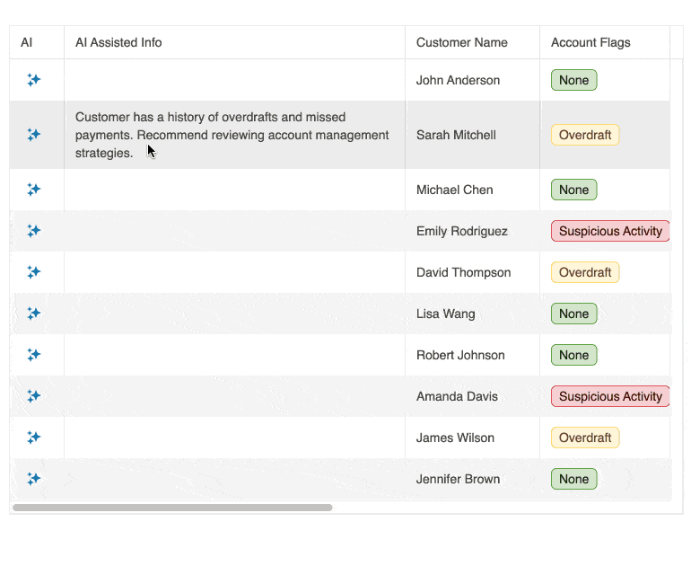
AI Assistant Column
Add a dedicated AI Assistant column to the Grid to let users ask questions about row data, generate summaries and perform quick transformations. Define allowed commands and control prompts per row or selection to align with your data policies. Capture events for analytics and plug into your preferred AI service.
-
AI Toolbar Assistant
Let users sort, filter and group with natural language directly from the Grid toolbar. The assistant opens in a Window with an AIPrompt inside and connects to your AI service through a configurable
requestUrl, with events for controlled or manual integration when you need custom headers or logic. You can also implement prompt-based row highlighting to visualize patterns without applying filters.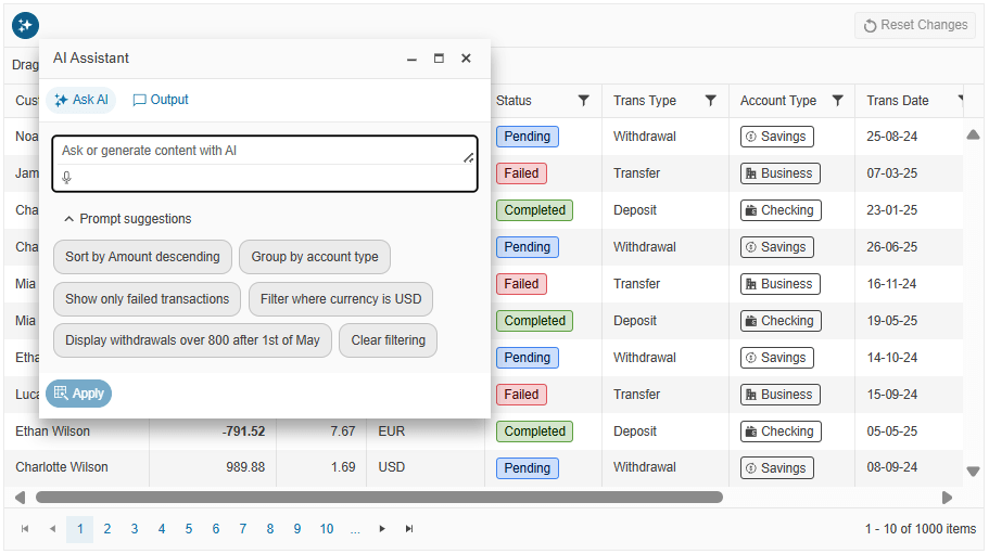
-
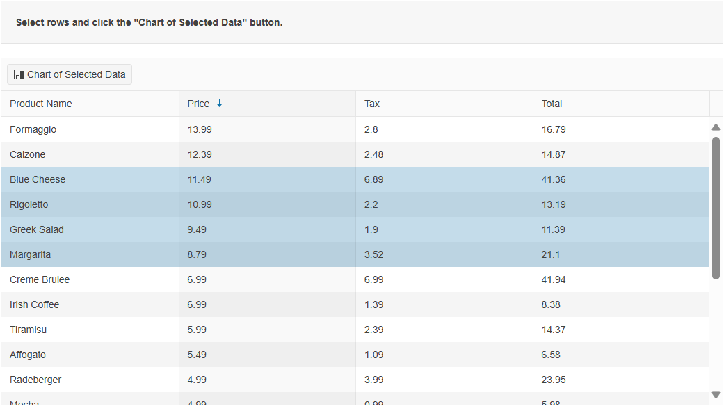
Chart Integration
Visualize selected or aggregated Grid data in real time by integrating with Kendo UI for Angular Charts. Ideal for interactive dashboards and reporting.
-
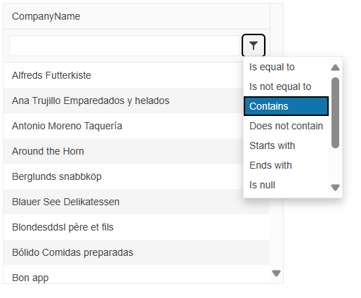
Multi-Checkbox Filter
The Angular Grid Multi-Checkbox Filter provides an Excel-like filter menu that shows unique values for a column as a list of checkboxes, letting users include or exclude multiple values in a single interaction. You enable it by setting the column
filterVarianttomultiCheckboxand using the Grid filter menu mode, then refine the experience withFilterVariantSettingsto supply custom value lists or limit the available options. The filter supports a built-in search box for long lists and respects column formatting, so users see dates, numbers and other values in the same format in both the Grid cells and the filter UI.See the Angular Grid Multi-Checkbox Filter demo.
-
Semantic Search within Grid
The Semantic Search capability in the Smart Grid AI Smart Box lets users find the right rows based on intent instead of exact keywords. When they type a natural language query, the Semantic Search mode interprets related terms, synonyms and contextual meaning so a phrase like "workout essentials" can surface records such as resistance band sets, training guides or supplement bundles even if those exact words never appear in the data. You connect the Smart Grid to your own semantic matching or vector search implementation through the
semanticSearchevent and configuration options like delay, placeholder text and query history, so results stay fast, relevant and tuned to your domain.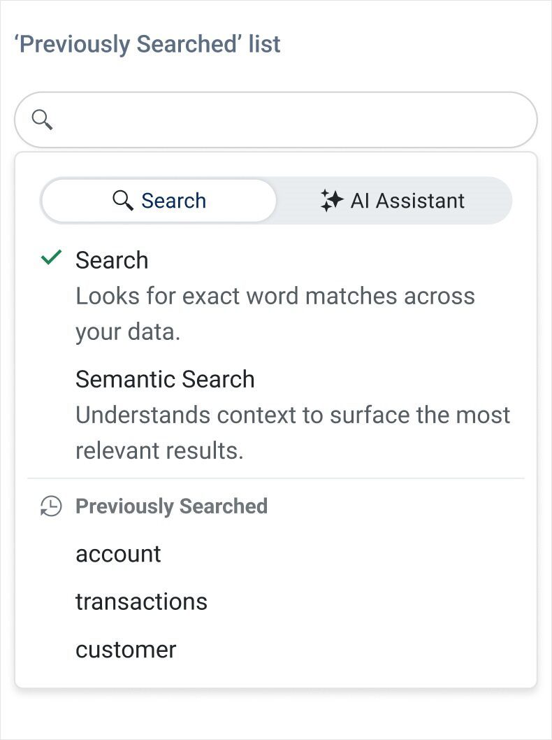
-
Column Resizing
The Angular Grid Column Resizing feature allows users to resize columns by dragging the edges of the header cells, so they can quickly adjust layouts to match their workflow. You can control the behavior in detail by enabling the
resizableoption, applying minimum and maximum resizable widths per column, and using auto-fit APIs to size columns based on their content or to stretch them to the full Grid width. Constrained mode keeps adjacent columns within their boundaries and eliminates unexpected layout shifts, while dedicated methods likeautoFitColumns,autoFitColumnsToGridand theautoSizeoptions help you deliver polished, pixel-perfect tables.See the Angular Grid Column Resizing demo.
-
Data Binding
Connect the Angular Grid to arrays, Observables, RESTful services, or SignalR hubs using built-in async support. It supports manual and automatic CRUD operations and integrates seamlessly with RxJS workflows.
-
Virtualization and Performance
Leverage row, column, and virtual scrolling to handle millions of records with no performance lag. Includes both static and dynamic data virtualization.
See the Angular Virtualization Demo
-
Editing Modes
Enable cell, row, or form-based editing with validation and templating options. Includes built-in editors like dropdowns, date pickers, and numeric inputs.
See the Angular Grid Editing Modes demo
-
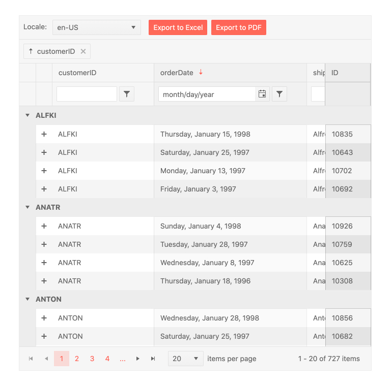
Sorting and Filtering
Support multi-column sorting and multiple filtering modes, including filter row, menu, and checkbox filtering. Easily create Excel-style filtering experiences.
-
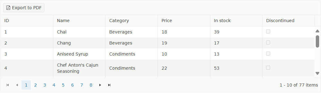
Export to PDF and Excel
Export data with formatting to Excel or generate customizable PDF files. Exports preserve grouping, filtering, and applied styles.
-
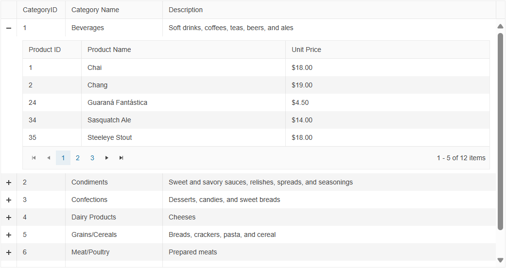
Hierarchy and Detail Templates
The Angular Grid provides options for visualizing the relations between its parent and child records by displaying the table data in a hierarchical order. Display nested child grids, additional rows, or full detail templates within the parent grid layout.
-
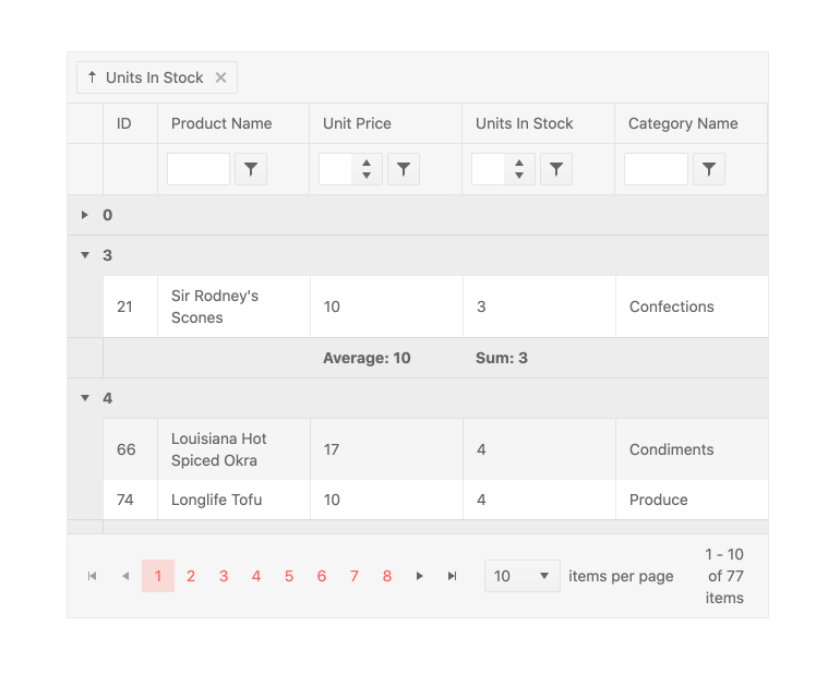
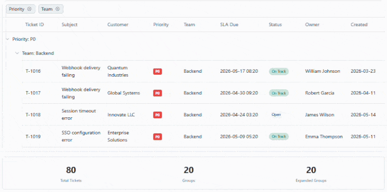
Grouping and Aggregates
Users can drag and drop columns to group them by field. This is not limited to a single column and there is no limit to the number of groups and subgroups that can be defined. When grouped, each group can be expanded or collapsed by users clicking on the appropriate expand/collapse icons. Each group can also provide aggregate information in both a header and a footer area and each group can be sorted in an ascending or descending order.
-
Updated: Accessibility and Keyboard Navigation
The Angular Grid Keyboard Navigation feature is enabled by default and lets users move through the table, pager and toolbar using intuitive keyboard shortcuts instead of a mouse. With a single
navigableconfiguration, you get a rich set of behaviors that cover cell and header navigation, opening filter and column menus, paging through data and interacting with toolbars and focusable components inside cells. The Grid follows accessibility best practices with a roving tabindex and dedicated focus directives, helping you build keyboard-first, WCAG-friendly data experiences without custom infrastructure.WCAG 2.1 AA-compliant with full screen reader support, ARIA roles.
-
Additional Features
- See the Angular Context Menu demo – Enable contextual right-click interactions
- See the Angular State Persistence demo – Maintain user preferences between sessions
- See the Angular Clipboard demo – Support copy-paste with Excel-style behavior
- See the Angular Column Interactions demo – Reorder, resize, freeze, and show/hide columns
- See the Angular Toolbar demo – Add search boxes, export buttons, and custom tools
- See the Angular Selection demo – Support row, cell, and checkbox selection modes
- See the Angular RTL demo – Enable right-to-left layout and localization
-
Sticky Group Headers and Footers
Grouped data is easier to navigate with sticky group headers and footers in the Kendo UI for Angular Grid. As users scroll, group headers remain visible at the top, providing constant context about the data currently in view. Group footers can also stay in place, ensuring key summary information is always accessible.
-
Row Pinning
You can pin rows to the top or bottom of the Kendo UI for Angular Grid, keeping important records in view regardless of sorting, filtering, or scrolling.

Get Started with Kendo UI for Angular
