
Kendo UI for Angular
Angular ActionSheet
- Also called a "BottomSheet", the Angular ActionSheet adds a menu that slides up from the bottom of mobile screens.
- Part of the Kendo UI for Angular library along with 110+ professionally-designed components.
- Includes support, documentation, demos, virtual classrooms, Visual Studio Code Extensions and more!
-
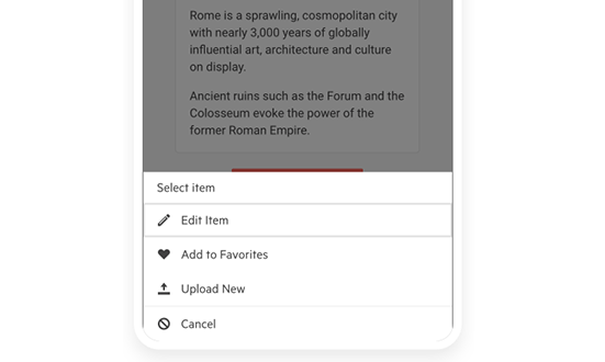
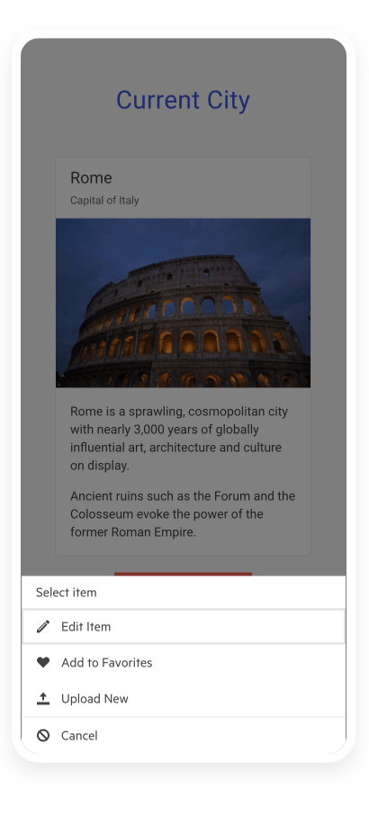
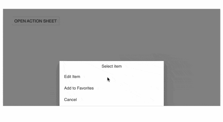
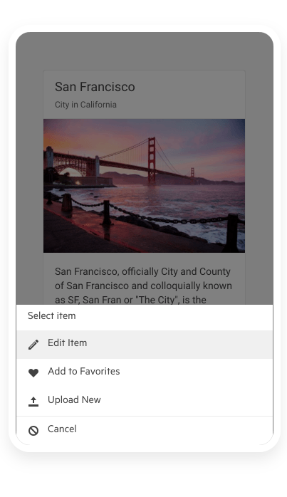
Slide Up a Navigation Menu From the Bottom of the Screen
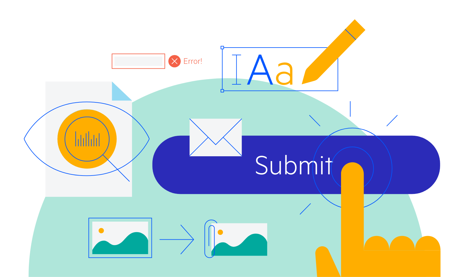
The Angular ActionSheet, sometimes called BottomSheet, is a UX device used for smaller screens when you need to alert or prompt users to action. It appears on the bottom of a screen as a modal dialog and presents users with a choice of actions that they must take. Since this element is popular in iOS and Android, it gives you an easy way to add a popular workflow to mobile or responsive applications.
-
Interaction modes
The Kendo UI for Angular ActionSheet component allows you to customize the initial display state (expanded or collapsed) and alter it as needed by using the available API options.
-
Animations
By leveraging the input properties of the Kendo UI for Angular ActionSheet, you can effortlessly configure the opening and closing animations, as well as the visibility of the ActionSheet component. The animations are included by default, and you have the option to disable them or control their duration.
-
Templates
The Angular ActionSheet supports templates to help you make the menu fit your menu's appearance requirements. Set the title template or the item template to uniformly configure the component with styles, colors, icons, images, and more.
-
Events
The Kendo UI for Angular ActionSheet emits certain events that enable you to control its behavior upon user interaction:
- ItemClick – fires when an ActionSheet item is clicked
- OverlayClick – fires when the modal overlay is clicked
- expand/collapse - fires when the ActionSheet is expanded or collapsed and the animation is complete
- expandedChange - notifies any changes in the expanded state
-
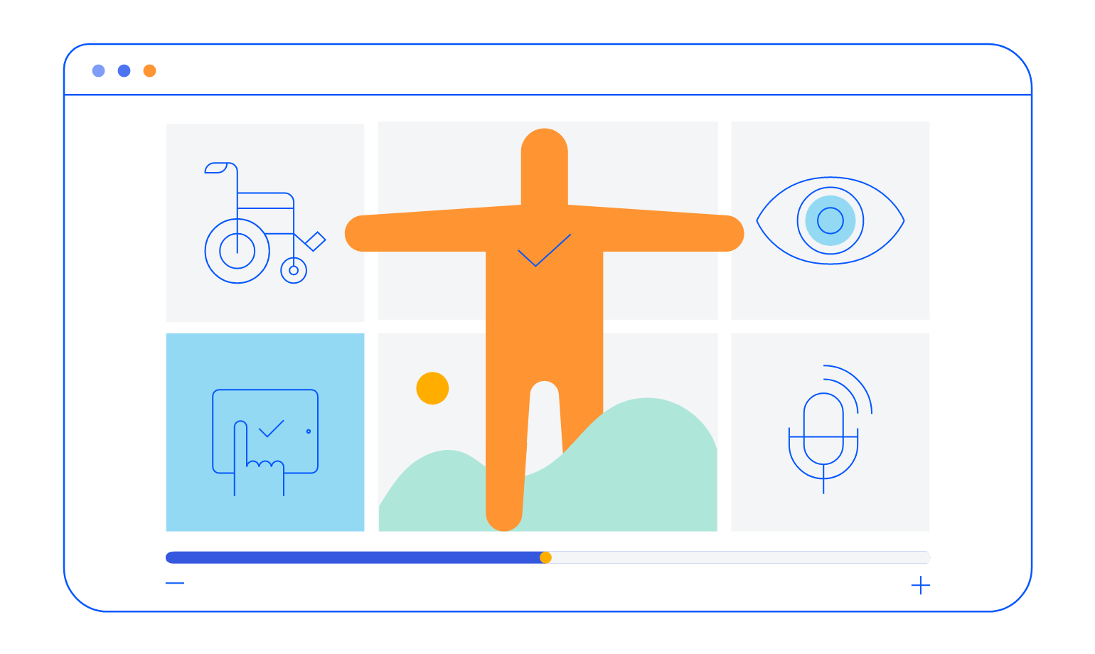
Accessibility
To ensure full accessibility, the ActionSheet is WCAG 2.1 AAA and Section 508 compliant. The component also follows the WAI-ARIA best practices for implementing the keyboard navigation for its component role and is tested against the popular screen readers.
-
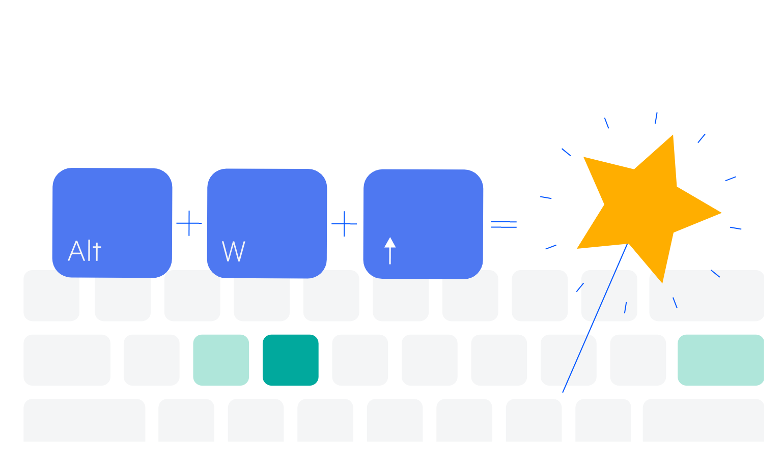
Keyboard Navigation
With both UX and accessibility in mind, the ActionSheet supports keyboard shortcuts for interacting with the component. Users who prefer keyboard navigation can open, navigate, and select items.

Get Started with Kendo UI for Angular
