Kendo UI for Angular
Angular Charts
- Add stunning data visualization to your apps with a wide range of Angular chart types, tooltips, zooming and panning, interactivity and much more.
- Part of the Kendo UI for Angular library along with 110+ professionally-designed components.
- Includes support, documentation, demos, virtual classrooms, Visual Studio Code Extensions and more!
-
Overview
The Kendo UI for Angular Charts represent a powerful and versatile data visualization library. With one single Angular component, you get a wide variety of chart types, each offering a variety of flexible features like tooltips, zooming and panning, built-in support for interactivity and much more. You can render the charts as an SVG or a Canvas element and export them to supported formats like an image or a PDF file. The Angular Charts library is built from the ground up and in-house.
-
Chart Elements
The modular structure of the Kendo UI for Angular Charts allows you to easily isolate single parts of the Angular Chart component and customize them to fit your requirements. The component is broken down to various building blocks, including the axes, the chart area, labels, legends, plot bands and tile, just to name a few.
-
Binding to Different Data Types
You can easily and flexibly bind the Kendo UI for Angular Chart components to various forms of data. This includes binding to simple arrays with X and Y values and into more advanced data types and objects with fields. Data binding comes with several helpful configuration options for binding to dates.
-
Crosshairs
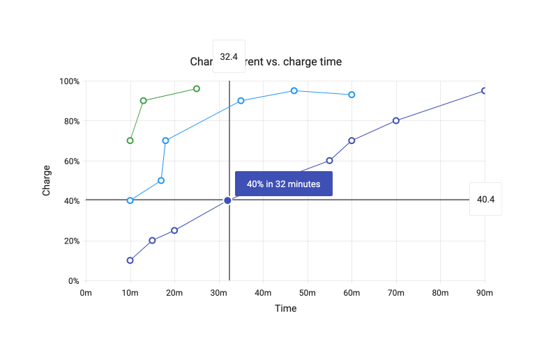
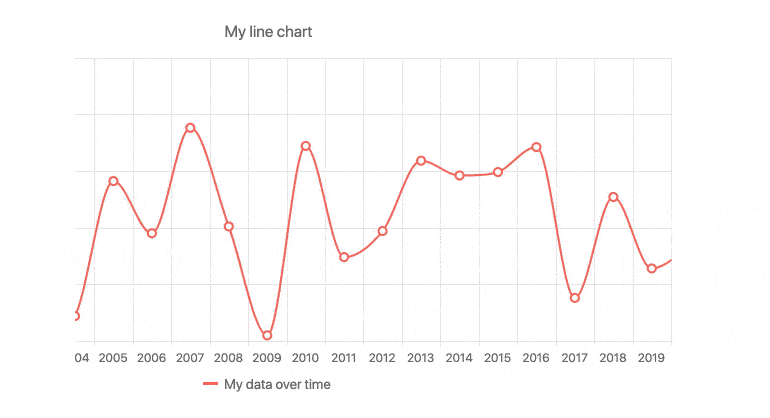
When chart labels are hidden, it can be difficult to see a data point’s specific X and Y value. With the built-in Crosshairs feature of the Kendo UI for Angular Charts component, you enable a crossing line moving perpendicularly to either axis that allows users to see the exact value at their current cursor position.
-
Error Bars
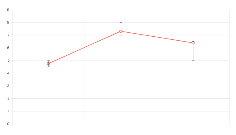
Display margins of error to indicate data points variability with Error Bars. In Kendo UI for Angular Charts, you can define the high and low fields associated with every value, allowing for an indicator to show where within a range of possible values the rendered data point falls.
-
Labels
Labels can be found everywhere in the Kendo UI for Angular Charts, including text displayed next to points with a series, text found along the axes of the Angular Chart, and in many more areas. You can customize labels by using the available properties and apply the changes to a single label or across multiple labels of the same type.
-
Panes
Panes allow you to divide a chart area into two or more charts that can share a common category axis. It’s great for comparing related trends.
-
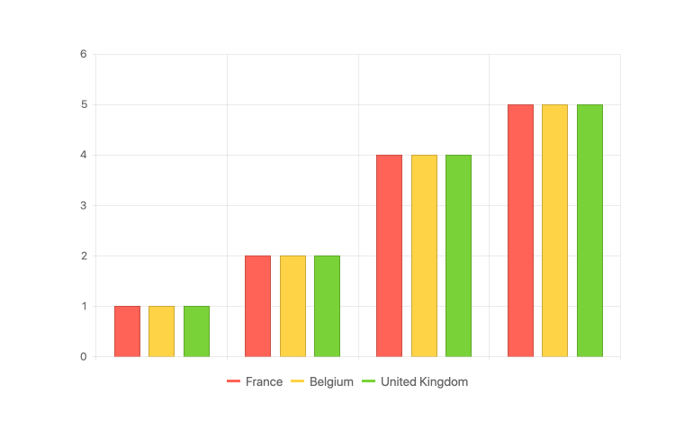
Legend
The Legend area of the Kendo UI for Angular Charts can be autogenerated based on the series bound to the Chart, giving a simple representation of what series and data is tied to what color and type. Additionally, the Chart Legend has interactivity built in, offering features like clicking on a series name to show or hide the series in the chart.
-
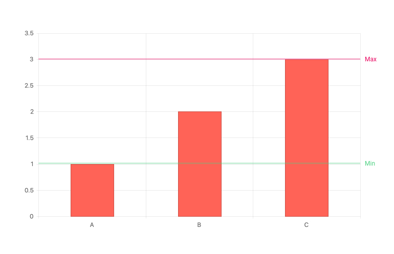
Plot Bands
Plot Bands allow you to highlight a specific range on a series axis, both X and Y. In this way you can showcase a range of good or bad numbers or draw attention to a certain area of the Angular Chart. You can define an unlimited number of plot bands in a single Angular Chart.
-
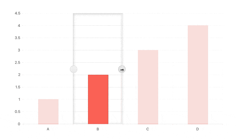
Selection
The Kendo UI for Angular Charts allow users to select a single, or a range of, data point(s) inside the chart. You can select data items with a single click through either dragging the mouse over a large area of the chart or working with a selection overlay that includes drag handles to help modify the range of selection.
-
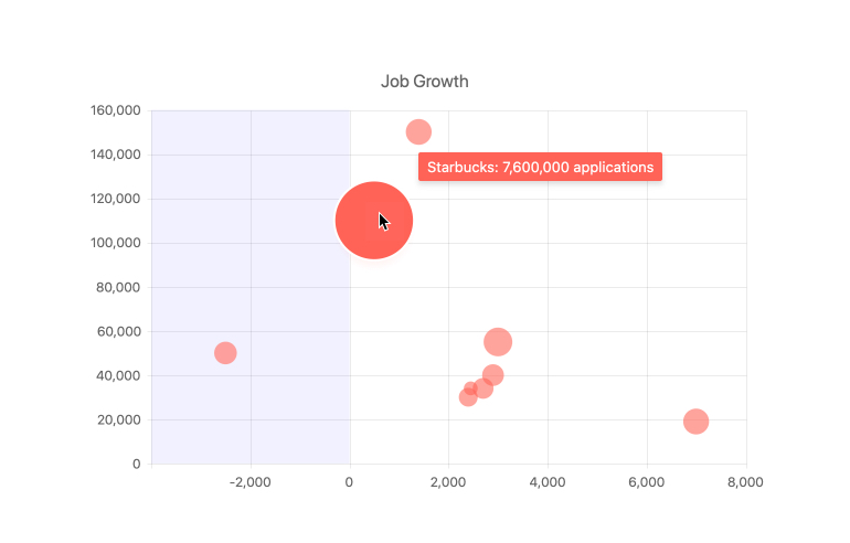
Tooltips
Use Tooltips to interactively provide users with additional information about specific values or fields not necessarily displayed within the Angular Chart. The Kendo UI for Angular Charts have built-in support for tooltips that can be displayed by hovering over a particular chart element. You can also display tooltips with a set of crosshairs that move along with the mouse to indicate the current X and Y value of the mouse pointer location.
-
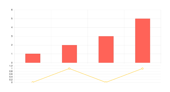
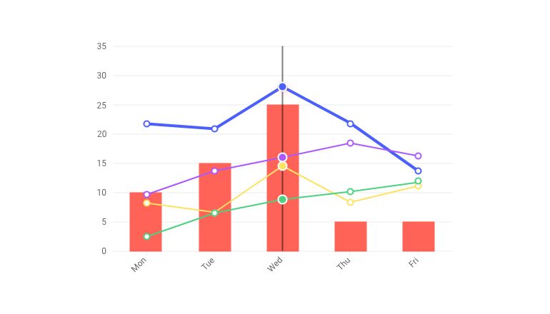
Multiple Axes and Chart Series on the Same Plot
A basic chart uses a single series and its X and Y axis generally start at 0,0. You can effortlessly accommodate scenarios that require multiple series in the same chart, including multiple axes showing different values and scales. With Kendo UI for Angular Charts, adding multiple series or multiple axes is just as easy as defining a single series.
-
Series Highlight
Develop great UX by highlighting chart series when they are hovered or tapped.
-
Tooltips
Use Tooltips to interactively provide users with additional information about specific values or fields not necessarily displayed within the Angular Chart. Tooltips can be displayed by hovering over a particular chart element. You can also display tooltips with a set of crosshairs that move along with the mouse to indicate the current X and Y value of the mouse pointer location.

-
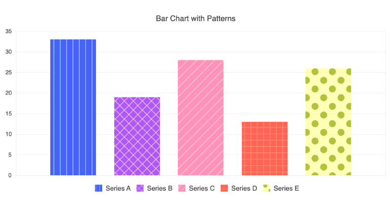
Pattern Fills
The Kendo UI for Angular Charts support customizable pattern fill of the chart series enabling you to spice things up by filling chart elements with different patterns such as diagonal stripes, dots or a grid pattern.
-
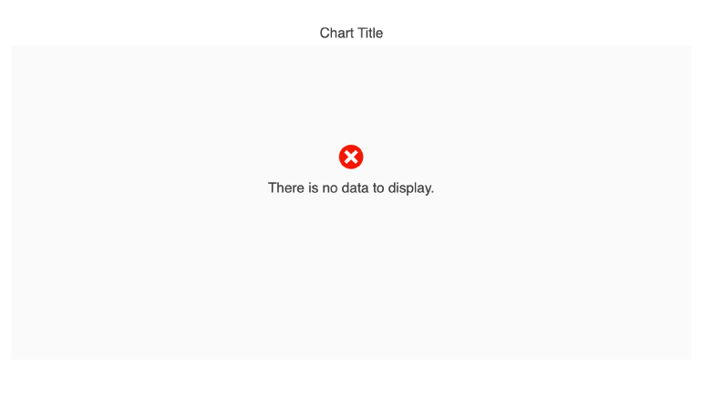
No Data Template
This ready-to-use template improves the user experience in those tricky empty-state scenarios when there is no data to visualize.
-
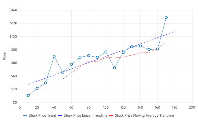
Trendlines
The Angular Charts’ Trendlines are automatically generated indicators that illustrate data trends over time. Choose between the following trendline types:
- Linear trendline
- Exponential trendline
- Logarithmic trendline
- Power trendline
- Polynomial trendline
- Moving average
-
Panning and Zooming
Support users with extra navigation tools when datasets are too large to fit within one chart area due to screen real estate or chart element size. The Angular Charts built-in panning allows users to scroll horizontally over an axis, moving left and right, to navigate through large sets of data with ease. Zooming allows users to use the scroll wheel of a mouse or drag the mouse across an area to zoom in on a selected area.
-
Chart Animations
Enhance data visualizations with chart animations. Animate a series as it renders or animate real-time value changes to create an engaging user experience. The Kendo UI for Angular Charts come with built-in animations that are enabled by default and can be turned off if required.
-
Canvas and SVG Rendering
Kendo UI for Angular Charts have support for both SVG and Canvas, allowing you to control which HTML element to use with a single configuration option.
-
Responsive Design Support
Display your charts on any desktop or mobile browser. The responsive design of Kendo UI for Angular Charts flexibly adapts to changes in the available viewport as users change the size of their browser. It automatically handles resizing like rotating labels on the axes, as well as fitting and wrapping content inside the chart area - all without the need to do calculations or update the rendering on your own.
-
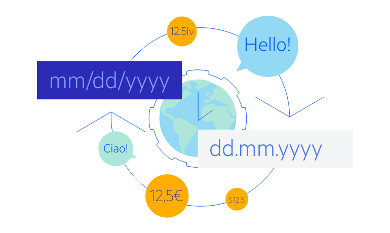
Globalization
The Angular Chart library fully supports internationalization and localization. Messages can be translated, and symbols conform to locale. You can also utilize right-to-left support for the Angular Charts.
-
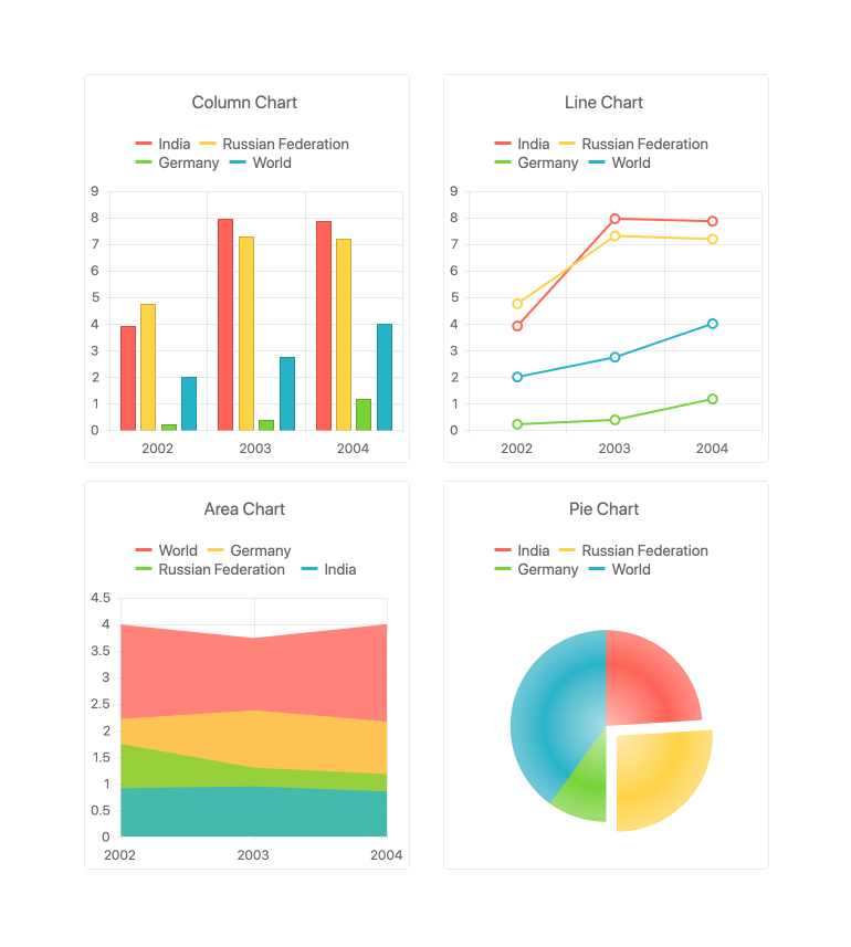
Extensive List of Angular Charts
The Kendo UI for Angular Chart components offer a rich variety of charts and series types. You can use each series type independently or add multiple different series to a single chart, rendered together.
Available Angular Chart Types:
-
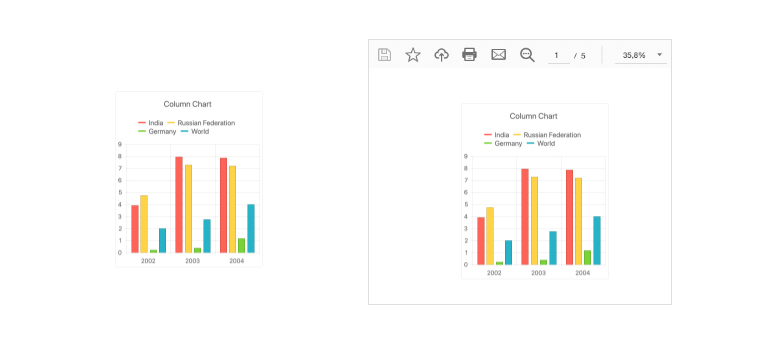
Export Options
Export Kendo UI for Angular Charts as a PDF file, an SVG element and various image formats. The integration with Kendo UI for Angular Drawing package allows you to export the entire Angular Chart with a single method to let users save the chart locally.

Get Started with Kendo UI for Angular