
Kendo UI for Angular
Angular Floating Action Button
- Add instant and robust interactivity to your Angular UI by showing options on a sleek dial when a button is clicked.
- Part of the Kendo UI for Angular library along with 110+ professionally-designed components.
- Includes support, documentation, demos, virtual classrooms, Visual Studio Code Extensions and more!
-
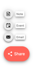
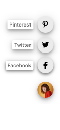
Show Primary Action Options on Click
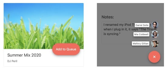
The Kendo UI for Angular FloatingActionButton presents the user with the most primary action on a screen by appearing in front of all other content. When clicked, it shows additional options on a dial. It is commonly used to create new items, such as emails or records.
-
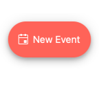
Icon Floating Action Button
You can enhance the textual content of the Angular Floating Action Button by adding a predefined or custom icon to it. Choose an icon from our icon libraries like FontAwesome or upload a custom image.
-
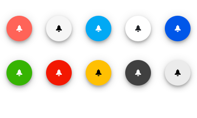
Appearance and Position
Make the Angular Floating Action Button fit into any design with a huge array of options such as theme colors, shapes, and size. You can also control positioning with settings for fixed/absolute, alignment, and offset. Additionally, your default theme will automatically be applied.
-
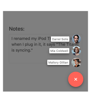
Dial Items
The dial is an integral part of the Angular Floating Action Button. When clicked, it displays a collection of related items. With Kendo UI for Angular FloatingActionButton you can control the disabled/enabled state, dial animation, and display overlay.
-
Controlling the Open State
With Kendo UI for Angular FloatingActionButton, you can control the open state of the component by determining the initial state and preventing open and close.
See the Angular FloatingActionButton Controlling the Open State demo
-
Templates
The Kendo UI for Angular FloatingActionButton allows you to customize both the Angular Floating Action Button and its related Dial Items through templates.
-
Keyboard Navigation
The Kendo UI for Angular FloatingActionButton supports keyboard navigation such as up and down arrow to navigate through the items and open and close the popup.
See the Angular FloatingActionButton Keyboard Navigation demo
-
Accessibility
The Kendo UI for Angular FloatingActionButton is WAI-ARIA and Section 508 compliant.


Get Started with Kendo UI for Angular
