
Kendo UI for Angular
Angular ChunkProgressBar
- Display the progress of a task through a predefined number of chunks with a horizontal or vertical progress bars.
- Part of the Kendo UI for Angular library along with 110+ professionally-designed components.
- Includes support, documentation, demos, virtual classrooms, Visual Studio Code Extensions and more!
-
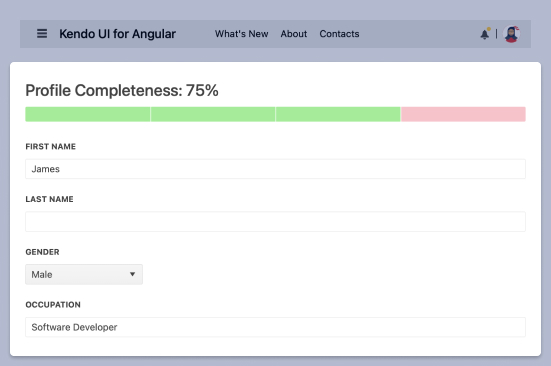
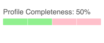
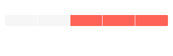
Track Process Progress in Segments
The Kendo UI for Angular ChunkProgressBar displays and tracks progress of a task or process in your application through a predefined number of chunks. The component supports both horizontal and vertical rendering modes.

-
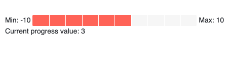
Value and Ranges
By default, the Kendo UI for Angular ChunkProgressBar can showcase a process broken down into any number of chunks between zero and 100. You can define both the minimum and maximum value of the ChunkProgressBar to ensure that the component properly represents the underlying process or task.
-
Disabled ChunkProgressBar
When you disable the Kendo UI for Angular ChunkProgressBar, the component immediately changes its visual style, communicating an inactive state to users.
See Angular ChunkProgressBar Disabled ChunkProgressBar demo.

-
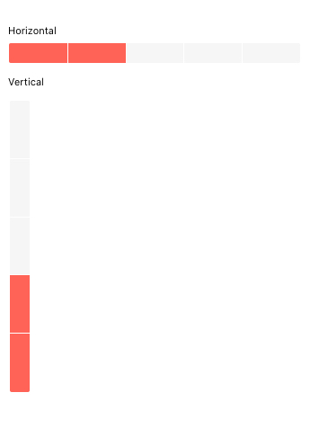
Orientation
The Kendo UI for Angular ChunkProgressBar component can be rendered in both horizontal and vertical orientations.
-
Direction
When in horizontal mode, the Kendo UI for Angular ChunkProgressBar builds progress from left to right or from right to left. When in vertical mode, the Angular ChunkProgressBar can progress from the bottom to the top or from the top to the bottom. Progress direction can be reversed with a single configuration option.

-
Appearance
Many aspects of the appearance of the Kendo UI for Angular ChunkProgressBar can be customized through configuration options. This includes setting the height and width of the component, as well as define different styles for completed, empty and uncompleted chunks.
-
Globalization
The Kendo UI for Angular ChunkProgressBar has support for globalization scenarios by allowing the component to be rendered in an RTL (right-to-left) mode.

Get Started with Kendo UI for Angular
