Kendo UI for Angular
Angular PanelBar
- Quickly build Angular UI with this popular Angular accordion element that provides expandable/collapsible navigation.
- Part of the Kendo UI for Angular library along with 110+ professionally-designed components.
- Includes support, documentation, demos, virtual classrooms, Visual Studio Code Extensions and more!

-
Display Hierarchical Content in Panels (aka Accordions)
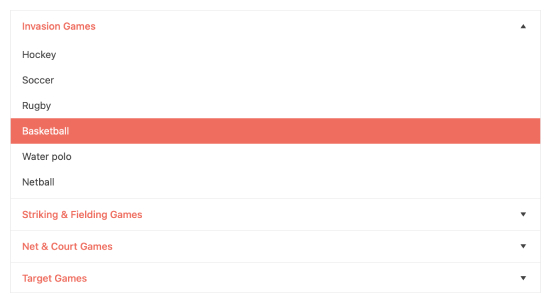
The Kendo UI for Angular Panel Bar, also known as the Angular Accordion, showcases hierarchical or multi-level content in a component, whose individual items can be expanded or collapsed. The Angular Accordion component is perfect as a side-navigation element, provides many configuration options to help with customization, and integrates with Angular routing to facilitate further navigation.

-
Animations
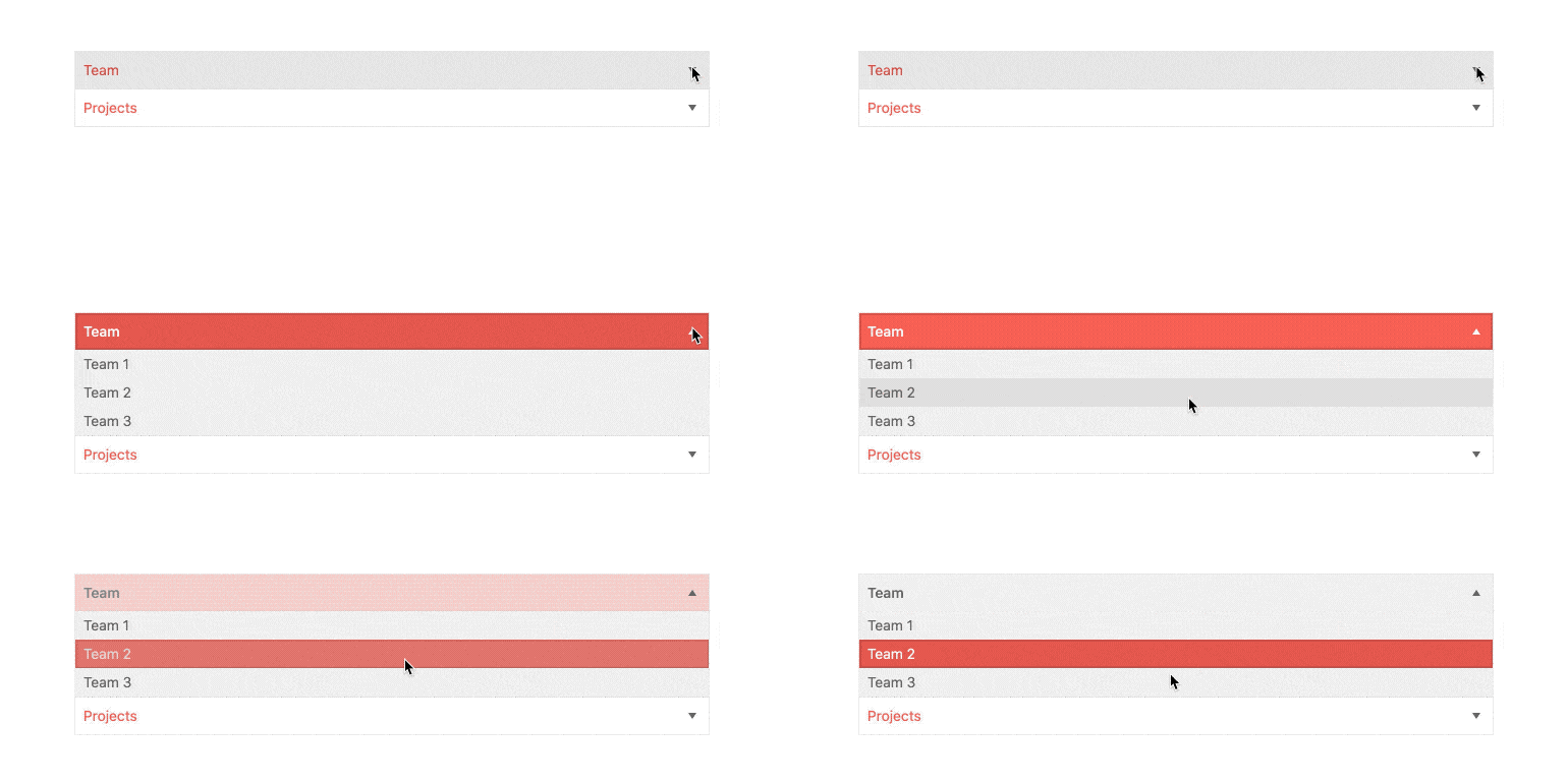
The Kendo UI for Angular PanelBar comes with a wide variety of eye-catching and sleek animations for a dynamic and engaging user experience.

-
Expand Modes
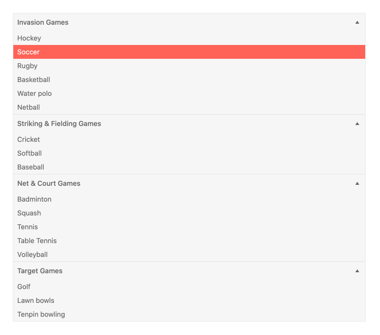
Every item within the Kendo UI for Angular PanelBar can be expanded and collapsed. The Angular Accordion comes with two different expand modes: single and multiple expansion. Single expansion allows users to expand just one item at a time. Multiple expansion allows users to expand any and all items within the Angular Accordion simultaneously.

-
Data Binding
When building out the items within the Kendo UI for Angular PanelBar, you can choose between binding each item to an underlying data source or create them manually through declarative programming.
-
Routing
Since the PanelBar is suited mainly for navigation, integration with Angular router is critical. By default, every item within the Angular Accordion has configuration options to facilitate a smooth integration of the items with Angular router.
-
Keyboard Navigation
The Kendo UI for Angular Accordion comes with built-in keyboard navigation to provide fast and intuitive interaction with the collapsible accordion items.
-
Accessibility
The Kendo UI for Angular PanelBar is compliant with Section 508 and WAI-ARIA standards, and is rated AAA with WCAG 2.0.

All Kendo UI for Angular Components
Charts
- Area Chart
- Bar Chart
- Box Plot
- Bubble Chart
- Bullet Chart
- Chart Wizard New
- Charts
- Donut Chart
- Funnel Chart
- Heatmap
- Line Chart
- Pie Chart
- Polar Chart
- Pyramid Chart
- Radar Chart
- Range Area Chart
- Sankey Diagram
- Scatter Chart
- Sparkline
- Waterfall Chart
Editor
TreeList
Scheduler
Buttons
- Button
- ButtonGroup
- Chip
- ChipList
- DropdownButton
- Floating Action Button
- Speech To Text Button New
- SplitButton
Common Features
Conversational UI
Indicators
Progress Bars
Date Inputs
Dialogs
Labels
Icons
Design
Navigation
Diagrams and Maps
Dropdowns
Gauges
Grids
Upload
Inputs
- Checkbox
- ColorGradient
- ColorPalette
- ColorPicker
- FlatColorPicker
- Form New
- FormField
- MaskedTextBox
- NumericTextBox
- RadioButton
- RangeSlider
- Rating
- Signature
- Slider
- Switch
- TextArea
- TextBox
- TreeView
Bar & QR Codes
Data Tools

Get Started with Kendo UI for Angular
