
Kendo UI for Angular
Angular ArcGauge
- Represent data across an arc shape with this sleek and customizable Angular gauge component.
- Part of the Kendo UI for Angular library along with 110+ professionally-designed components.
- Includes support, documentation, demos, virtual classrooms, Visual Studio Code Extensions and more!
-
Show Values on a Semicircle
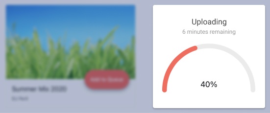
The Kendo UI for Angular ArcGauge is designed to represent value ranges across an arc shape. The component allows you to set the arc range from 0 to 360 degrees, define a minimum and maximum angle and display the current value within the arc. You can also control the complete look and feel of the ArcGauge’s center with a customizable template to match your brand.

-
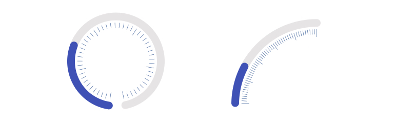
Scale Options
By default, the Kendo UI for Angular ArcGauge is an arc ranging from 0 to 180 degrees without any ticks or labels displayed. Give users more context and information with the scale options of the ArcGauge. You can make the arc range from 0 to 360, show ticks along certain intervals, display labels along said ticks and provide different colors for the labels and ticks.
-
Center Template
The Center Template of the Kendo UI for Angular ArcGauge can be completely customized, allowing you full control over the content inside the Kendo UI for Angular Arc Gauge.

-
Color Ranges
Allow the Angular ArcGauge color to reflect changes in the displayed value. You can define a range of different colors, each corresponding to a particular range of values.

-
Globalization
The Kendo UI for Angular ArcGauge supports right-to-left rendering, ensuring it can fit into any globalization scenario.

-
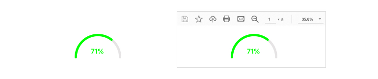
Export Options
Thanks to the built-in integration with the Kendo UI for Angular Drawing library, you can export the ArcGauge to various formats, including images, PDF and SVG files.

Get Started with Kendo UI for Angular
