
KendoReact
Free React DatePicker
- Customizable and feature-rich, the React DatePicker will save you from struggling with date formats and accessibility.
- Part of the KendoReact library along with 120+ free and paid enterprise-grade UI components.
- This component is free to use, including in production—no sign-up or license required!

-
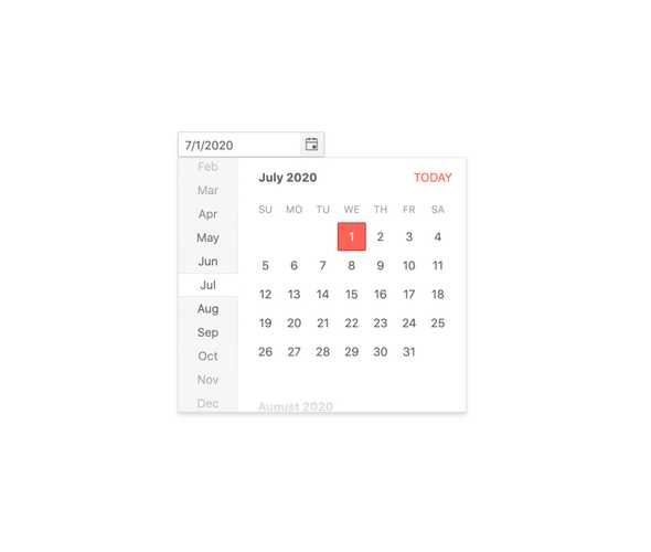
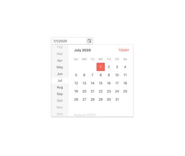
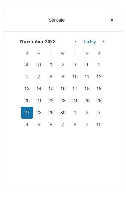
Show a Popup Calendar for Date Selection
The React DatePicker component, part of KendoReact, offers a highly customizable interface for end users to enter and pick dates supporting different locales. Sporting an input element for manual insertion of a date, the component also features a popup calendar to select dates in a more intuitive and visually pleasing way.
-
Disabled DatePicker
Certain scenarios may call for the KendoReact DatePicker to be disabled and prevent users from inputting a date. A disabled DatePicker has a clear visual indication that the component is disabled without impeding on the look and feel of the rest of the application.
-
Default Value
By default, the value of the KendoReact DatePicker is empty and the calendar popup is hidden. By using a couple of configuration options, the default value of the React DatePicker can be set ahead of time and the component can initially render with its popup open.
-
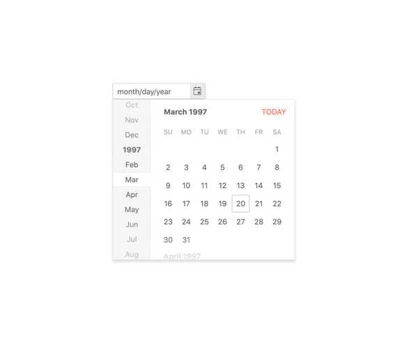
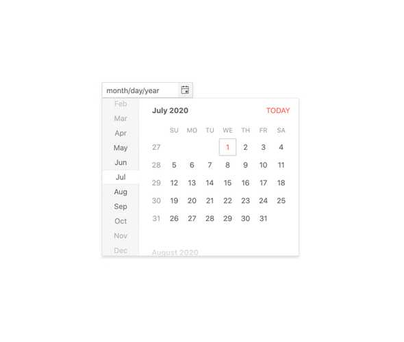
Focused Dates
The calendar featured in the KendoReact DatePicker always has a focused date, a date that is highlighted and rendered differently from other dates on the calendar, which by default is today's date. To focus any other date, one simply has to pass in a new date to the focused Date property.
-
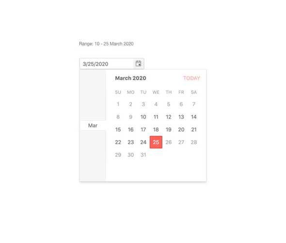
Date Limits
Out of the box the KendoReact DatePicker can handle any date in the future or in the past. This may be too broad of a range depending on application requirements. That's why the DatePicker can be configured to only allow dates within a particular range, limiting what can be manually typed into the component, as well as limiting what dates can be navigated to in the calendar.
-
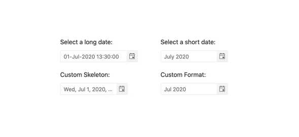
Formats
The question of how to format a date has many answers and this is where the standard date and time format strings come in to play. The KendoReact DatePicker component can accept any valid date format string and can even be updated on the fly if the requirements call for it.
-
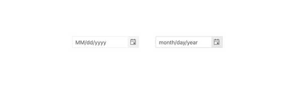
Placeholders
When dealing with dates an extremely useful feature is to indicate to the user exactly what kind of date a form element is expecting, and this is where the placeholder comes in to play. The KendoReact DatePicker features some shorthand settings for common date formats, along with the ability to set a completely custom placeholder format.
-
Floating Label
The React DatePicker supports adding floating labels as part of its input. This feature displays an initial message within the component, which then floats outside the component when the user enters the input. The floating label is then replaced by the mask of the component, ensuring that users are aware of the content format they should adhere to.

-
Week Number Column
As a part of the built-in React Calendar component, the KendoReact DatePicker has a configuration option to show or hide the number of the week next to every week displayed in the calendar.
-
Custom Rendering
While many of the available configuration options in the KendoReact DatePicker relate to making the DatePicker your own through quick configurations, there may come a time where a deeper level of customization is needed. With this in mind, the KendoReact DatePicker offers a custom renderer for every aspect of the UI component, including the DateInput, Calendar, PopUp, the ToggleButton and more. This allows a developer to take full control over the look and feel of every piece of the KendoReact DatePicker.
-
Adaptive Rendering
The KendoReact DatePicker supports an adaptive mode, enabling a mobile-friendly rendering of the component popup. The component automatically adapts to the current screen size and alters its rendering accordingly.
-
Forms Support
The React DatePicker is a perfect component to be used in any form where a date may need to be selected. Beyond the default behavior, this React UI component also has styling and properties that can flag the component as invalid, and the KendoReact DatePicker can easily be integrated into a plain HTML form element, the KendoReact Form component, or any other React form library.
-
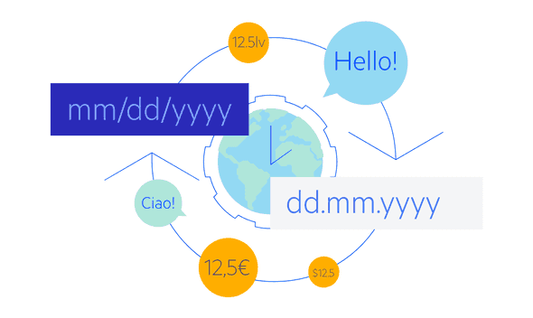
Globalization
The KendoReact DateInput component supports globalization out of the box, which means that the format of the date placeholder and date can change depending on the locale of the user without needing to manually reconfigure the React component.
-
Controlled and Uncontrolled Modes
By default, the KendoReact DatePicker is in an uncontrolled state, meaning that the form data tied to the component is handled by the DOM itself. However, making the DatePicker work in a controlled mode, when the form data is handled by the React component itself, can easily be done by just defining the date value of the component.
-
Keyboard Navigation
The KendoReact DatePicker features several different ways to select dates using just keyboard navigation. This includes typing in the date, incrementing the value of each slot of a date with the arrow keys or opening the calendar and traversing through the displayed days to select a particular date.
-
Accessibility
Creating accessible React UI components is a core concept of KendoReact, and the DatePicker is certainly no exception! This is why the DatePicker, out of the box, is compliant with Section 508 and WAI-ARIA standards and is AAA rated with WCAG 2.0.

