KendoReact
React Donut Chart
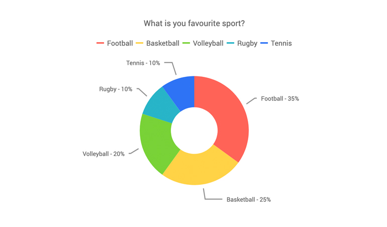
- Illustrate a breakdown of a total by its dimensions using the KendoReact Donut Chart.
- Part of the KendoReact library along with 120+ free and paid enterprise-grade UI components.
- Includes legendary technical support, design resources, comprehensive documentation, demos, and more!
-
Create Dynamic Data Visualizations with a Customizable React Donut Chart
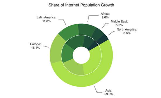
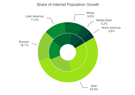
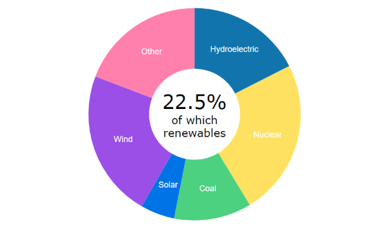
The KendoReact Donut Chart is used to show how a total is divided by its parts in a circular graph with slices. An evolved version of the React Pie Chart, the Donut Chart has the capability to exhibit multiple nested series as outer segments or rings of the circle. The central blank area, built-in legend and series labels enable you to include contextual information, enabling users to understand and interpret the data with ease.
-
Data Binding
Easily populate the React Donut Chart with data from different sources, including numbers, arrays and objects (or models). Simply specify the desired fields during the configuration.
-
Multiple Series
The KendoReact Donut Chart enables you to display multiple data series. Each plotted data series adds a ring to the chart, originating from the center. Upon hovering over the corresponding inner slice, a pop-up label will appear, providing information about the variable.
-
Displaying Information in the Donut Chart Center
Integrate custom content in the center of the React Donut Chart using the Center template or drawing visuals. The Center template is an HTML overlay that can place at the chart’s center. The drawing visual, on the other hand, is a vector element that has the advantage of seamlessly incorporating its content as an integral part of the component when exported.
-
Rendering
The React Donut Chart can render data in both the Canvas (bitmap) and SVG (vector graphics) formats. SVG serves as default format, ensuring an always crips data presentation. When prioritizing performance, you can seamlessly transition to a canvas format with a single configuration option. This guarantees the chart’s capacity to effectively manage substantial data volumes and real-time updates without any interruptions.
-
Export Options
Exporting your React Donut Chart to PDF, SVG, PNG and the Kendo UI drawing format is made easy. The component’s user-friendly export method enables you to preserve the chart’s quality and rendering in cases when you need to adjust the image size or fit the chart to a specific paper size when exporting to PDF.
-
Appearance
Personalize the series colors of the KendoReact Donut component with one of our predefined color sets, including Default (our own styling), Material (based on the Material Design guidelines), Bootstrap (resembles the Bootstrap styling) and Fluent (based on Microsoft Fluent UI). For even greater customization, you have the option to modify any of the built-in themes or create a completely new theme that alignts with your brand identity using Progress ThemeBuilder.
See the React Donut Chart appearance demo
-
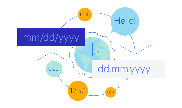
Globalization
The KendoReact Donut Chart offers globalization and localization capabilities to ensure seamless compatibility with various languages and regions. Additionally, you have the option to enable right-to-left (RTL) support for languages that utilize right-to-left scripts.
See the React Donut Chart globalization demo