KendoReact
Free React ExpansionPanel
- Easily add an expandable and collapsible UI element with built-in animations.
- Part of the KendoReact library along with 120+ free and paid enterprise-grade UI components.
- This component is free to use, including in production—no sign-up or license required!
-
Organize Content in Expandable/Collapsible Panels
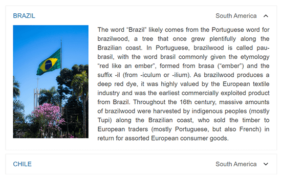
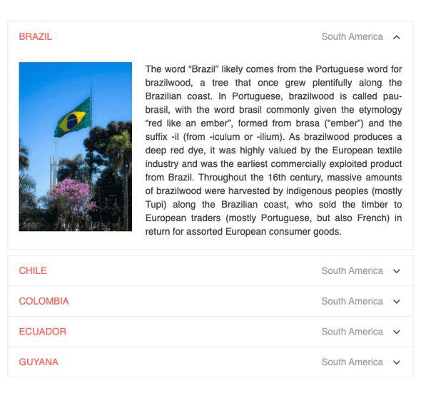
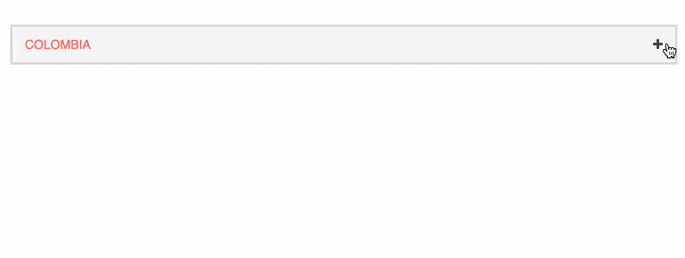
The ExpansionPanel is a fundamental UI layout component that organizes any content into a UI element consisting of a title bar and expandable and collapsible content. It comes in handy when you want to save some real estate on the page. The React ExpansionPanel component supports any type of content within its content area, can expand and collapse with built-in animations, provides custom icon support and much more.
-
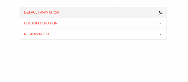
Animations
The React ExpansionPanel allows you to animate user interactions by adding expand and collapse animations. Developers have full control over this behavior, e.g., you can set the duration of the animation or disable it altogether.
-
Disabled Expansion Panel
By default, the React ExpansionPanel is enabled, but you can easily disable it when required and control whether an end-user can interact with the component. All you need to do is change a single configuration option and you can disable the whole group of buttons or a single button. See Disabled React

-
Custom Icons
If your project has specific design requirements, you can easily change both the expand and collapse icons with custom font icons to have the component look and feel match the rest of your application.
-
Keyboard Navigation
Users can expand or collapse the React ExpansionPanel component using the mouse as well as keyboard shortcuts.
See the React ExpansionPanel Component demo: Keyboard Navigation
-
Accessibility
The KendoReact ExpansionPanel is accessible by screen readers. It is compliant with Section 508 and provides full WAI-ARIA support, following its accessibility best practices.