KendoReact
React Pyramid Chart
- Easily visualize data within a pyramidal structure organized into horizontal segments.
- Part of the KendoReact library along with 120+ free and paid enterprise-grade UI components.
- Includes legendary technical support, design resources, comprehensive documentation, demos, and more!

-
Overview
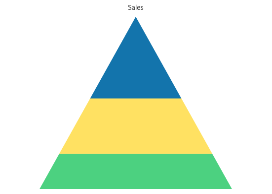
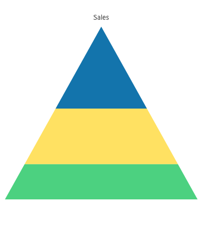
The KendoReact Pyramid Chart is used to visualize data in a pyramidal structure with horizontal segments. It facilitates a different size for each section, effectively illustrating the hierarchy of topics through their respective width. The Pyramid Chart is particularly useful for visualizing stages within a sales process and for demonstrating the potential revenue from each stage. Additionally, it can be effectively used to identify potential issues and for illustrate multiple values.

-
Fixed Height
By default, the height of the pyramid segments is proportional to its value. To establish a fixed height for all segments, simply set the dynamicHeight property to false.
-
Export Options
You can easily export your React Pyramid Chart to PDF, SVG, PNG and the Kendo UI drawing format. If you need to change the image size or fit the chart to a specific paper size, the user-friendly export method will help you to preserve the chart’s quality and rendering in the output file.
-
Appearance
You can easily tailor the series colors of the KendoReact Pyramid Chart with one of our predefined color sets, including Default (our own styling), Material (based on the Material Design guidelines), Bootstrap (resembles the Bootstrap styling) and Fluent (based on Microsoft Fluent UI). Moreover, you have the flexibility to tailor any of the built-in themes or create a completely new theme to match your branding using the Progress ThemeBuilder.
-
Globalization
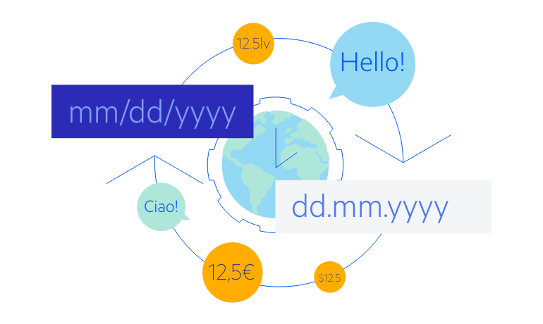
The KendoReact Pyramid Chart supports globalization and localization capabilities to ensure a seamless experience with any application’s language and locale. Additionally, you can also utilize the right-to-left support for languages whose scripts are read right to left.

All KendoReact Components
Animation
Barcodes
Buttons
- Button
- ButtonGroup
- Chip
- ChipList
- DropDownButton
- Floating Action Button
- SmartPasteButton New
- Speech-to-Text Button
- SplitButton
- Toolbar
Charts
Conversational UI
Data Query
Data Grid
Data Tools
Spreadsheet
Date Inputs
Date Math
Dialogs
Drawing
Dropdowns
Excel Export
File Saver
Form
Gantt Chart
Gauges
Indicators
Editor
Inputs
- Checkbox
- ColorGradient
- ColorPalette
- ColorPicker
- FlatColorPicker
- Input
- MaskedTextBox
- NumericTextBox
- RadioButton
- RadioButtonGroup
- RangeSlider
- Rating
- Signature
- Slider
- Switch
- TextArea
- TextBox
Layout
ListBox
ListView
Map
Labels
Notifications
PDF Processing
PivotGrid
Common Utilities
Popup
Progress Bars
