KendoReact
Free React ButtonGroup
- A handy container for two or more React Button components, which can be separately configured.
- Part of the KendoReact library along with 120+ free and paid enterprise-grade UI components.
- This component is free to use, including in production—no sign-up or license required!
-
Manage Button Groups with Ease
The KendoReact ButtonGroup is a container for two or more React Button components which can be separately configured to display only textual content, or show predefined icons, images and custom icons. It also renders a combination of textual and image content.

-
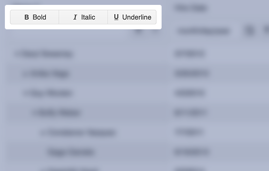
ButtonGroup with Icons
Each button within the KendoReact ButtonGroup can be displayed with text and icons, or with just icons. These icons can come from the built-in icons from KendoReact, as custom images, or from any font icon library like FontAwesome.

-
Accessibility
As a part of our commitment to accessibility, the KendoReact ButtonGroup is compliant with Section 508 and WAI-ARIA standards and has a WCAG 2.0 AAA rating.

-
Disabled ButtonGroup
The React ButtonGroup can easily transition from enabled, its default state, to disabled, which provides a distinct visual and prevents interaction. All this with a single configuration option.