KendoReact
Free React Breadcrumb
- Add this customizable and accessible React Breadcrumb to your app to offer user-friendly interactive navigation.
- Part of the KendoReact library along with 120+ free and paid enterprise-grade UI components.
- This component is free to use, including in production—no sign-up or license required!
-
Customizable React Breadcrumb Component
The React Breadcrumb component provides users with an easy way to navigate within a folder structure or a web page and trace their way back. Breadcrumbs are often used as a secondary navigation element in collaborative and knowledge-management platforms, ecommerce websites, documentation and more. You can customize the appearance of the component by adding icons (font and custom) to the breadcrumb items, substituting the item with icons or removing them completely, for a fun twist, and changing how the visual separator between the items looks. Fully accessible, the KendoReact Breadcrumb is Section 508 and WAI-ARIA compliant.

-
Appearance
Out of the box, the KendoReact Breadcrumb component displays each level of navigation as text. To give it a custom look and feel, you can customize each Breadcrumb item to include icons, text and icons or just an icon.
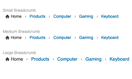
You can also choose between several predefined size options to change the breadcrumb size.
-
Delimiter
The Delimiter separates the navigation items in the React Breadcrumb component and is normally rendered as a greater than symbol (>). When your requirements call for a different style, you can create your own delimiter by passing a custom renderer to display the required shape. The possibilities are endless!

-
Disabled Mode
There may be scenarios where the entire Breadcrumb component or just individual items need to be disabled. This prevents users from interacting with the component and individual elements. You can disable the entire KendoReact Breadcrumb component through a single property, and individual items within the component can be disabled on an item-by-item basis.

-
Accessibility
Offering accessible React UI components is a core concept of KendoReact. Out of the box, the React Breadcrumb component is compliant with Section 508 and WAI-ARIA standards and is AAA rated with WCAG 2.0.