
KendoReact
Free React MaskedTextBox
- The React MaskedTextBox component offers built-in masks and the ability to create custom rules.
- Part of the KendoReact library along with 120+ free and paid enterprise-grade UI components.
- This component is free to use, including in production—no sign-up or license required!
-
Easily Enforce Standard Input Rules in Form Fields
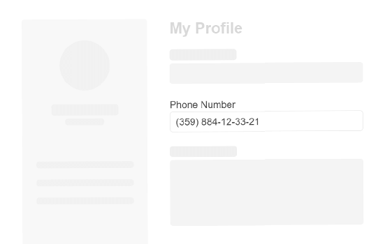
A HTML input can be responsible for quite a wide range data. Beyond text there may be certain data types that need to be entered like zip codes, phone numbers and many more that each can be varied by different locales. Components like the KendoReact MaskedTextBox provide built-in masks to not only indicate to the user what kind of format is expected, but can also enforce this mask as the user is inserting data, then validate data when a form is submitted. The React MaskedTextBox provides built-in masks, but custom rules can be applied as well.

-
Masks
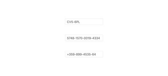
The KendoReact MaskedTextBox supports a set of built-in masks like requiring digits, letters or special symbols and characters. These can be combined to create any custom mask to adhere to any data format requirement.
-
Prefix and Suffix Adornments
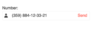
When working with the React MaskedTextBox component, you can add prefix and suffix adornments. These are custom items, usually an icon or button, inside the field before or after the input area.
-
Disabled MaskedTextBox
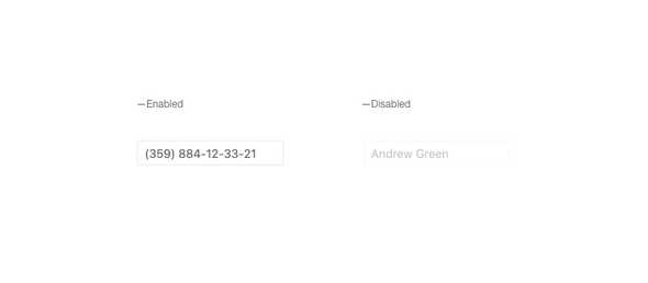
By default, the KendoReact MaskedTextBox will be enabled and can be interacted with, but certain requirements may call for users to be restricted from entering data. With a single property toggle, the MaskedTextBox can be disabled, preventing user input and visually indicating that the component is in a disable state.
-
Read Only MaskedTextBox
The KendoReact MaskedTextBox features the ability to enter read only mode, preventing the user from entering additional data, while still displaying the current information and allowing for selection of the text available in the React MaskedTextBox input.

-
Forms Support
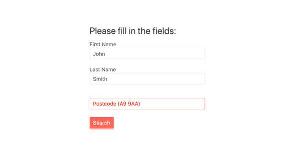
The KendoReact MaskedTextBox can be added to any HTML form element, a KendoReact Form component, or integrated to any third-party React form library. That's thanks to built-in styles and messaging around validation, as well as the ability to adhere to rules of any form.
-
Accessibility
One of the core aspects of KendoReact is compliance with various accessibility standards. The KendoReact MaskedTextBox is no exception and adheres to Section 508 and WAI-ARIA standards and is AAA rated with WCAG 2.0.

All KendoReact Components
Animation
Barcodes
Buttons
- Button
- ButtonGroup
- Chip
- ChipList
- DropDownButton
- Floating Action Button
- SmartPasteButton New
- Speech-to-Text Button
- SplitButton
- Toolbar
Charts
Conversational UI
Data Query
Data Grid
Data Tools
Spreadsheet
Date Inputs
Date Math
Dialogs
Drawing
Dropdowns
Excel Export
File Saver
Form
Gantt Chart
Gauges
Indicators
Editor
Inputs
- Checkbox
- ColorGradient
- ColorPalette
- ColorPicker
- FlatColorPicker
- Input
- MaskedTextBox
- NumericTextBox
- RadioButton
- RadioButtonGroup
- RangeSlider
- Rating
- Signature
- Slider
- Switch
- TextArea
- TextBox
Layout
ListBox
ListView
Map
Labels
Notifications
PDF Processing
PivotGrid
Common Utilities
Popup
Progress Bars
