KendoReact
Free React Card
- Organize your app's layout with the React Card that supports a variety of types and layouts, action buttons and more.
- Part of the KendoReact library along with 120+ free and paid enterprise-grade UI components.
- This component is free to use, including in production—no sign-up or license required!

-
Group Information and Related Actions into Cards
The KendoReact Card component represents a common layout item in many modern design languages. The React Card component contains content and actions about a single subject and can work well on its own, as well as when combined with components like the KendoReact ListView to display a collection of cards. Each Card comes with content, title and subtitle, action button areas, images and footers.

-
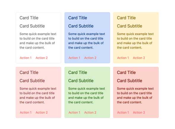
Card Types
While the KendoReact Card component has a default look -and -feel which can be customized to fit any UX requirements, it does also come with several built-in styles to cut down on the number of customizations needed. This includes styles for "warning" or "error" content, among several others.
-
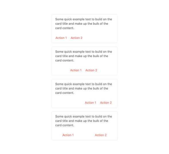
Action Buttons
Every React Card has a dedicated area for action buttons related to the content. The content of these action items, as well as their overall layout and orientation, is completely customizable through the available configuration options.
-
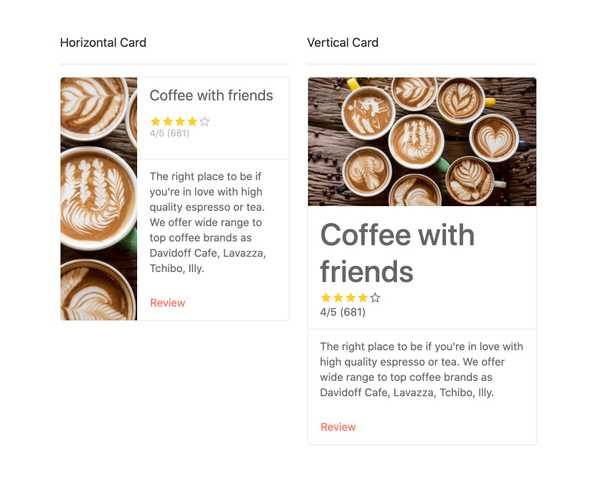
Orientation
The KendoReact Card component allows for developers to arrange its content either vertically or horizontally, automatically rearranging the building blocks of the Card component to fit the selected orientation.
-
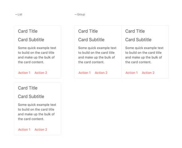
Layouts
When rendering multiple KendoReact Card components, there are several built-in layouts to help display cards in various ways, including building a list from top to bottom as well as rendering the cards side-by-side.
-
Globalization
Out of the box, the KendoReact Card component supports rendering the Card and its content in a right-to-left fashion, supporting many globalization requirements.

-
Accessibility
Accessibility is a foundational piece of the KendoReact UI library and the React Card component is no exception. With this in mind, the KendoReact Card is AAA rated with WCAG 2.0 and supports both Section 508 and WAI-ARIA accessibility standards.