KendoReact
Free React RadioButton
- Add a radio button to your React app that automatically applies the design of your application's theme.
- Part of the KendoReact library along with 120+ free and paid enterprise-grade UI components.
- This component is free to use, including in production—no sign-up or license required!
-
Customizable React Radio Button
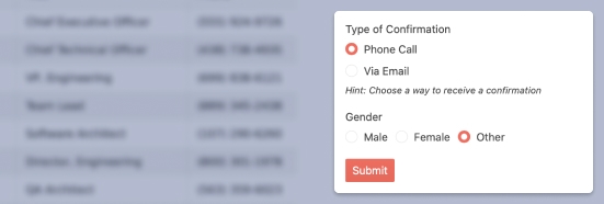
The KendoReact RadioButton allows developers to style React RadioButtons to fit the existing KendoReact theme and have a uniform look and feel throughout their entire application. This allows even notoriously difficult UI elements to be styled to fit into the rest of the design of any React application.

-
Disabling RadioButton
By default, the KendoReact RadioButton can be interacted with when it has been added to a page. When requirements call for the React RadioButton to be disabled to prevent users from interacting with the component, this can be done by setting a single property.

-
Labels
Each KendoReact RadioButton comes with a built-in label property that displays a label either before or after the circular element representing the RadioButton element. Additionally, the KendoReact RadioButton can work with custom labels and default HTML label elements.

-
Accessibility
The KendoReact RadioButton is compliant with Section 508 and WAI-ARIA standards and is rated AAA for WCAG 2.0.