KendoReact
React Line Chart
- Illustrate patterns of change over time with the KendoReact Line Chart.
- Part of the KendoReact library along with 120+ free and paid enterprise-grade UI components.
- Includes legendary technical support, design resources, comprehensive documentation, demos, and more!
-
Create Dynamic Data Visualizations with the KendoReact Line Chart
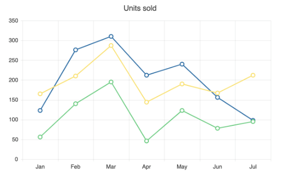
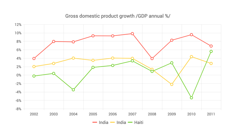
The KendoReact Line Chart visualizes data through a series of individual values connected by a straight line. The Y axis represents the quantitative dimension, the X axis represents the category axis and the markers represent each data point. As an essential tool for visualizing data progression over time, the React Line Chart is ideal for displaying trends and tracking key metrics. You can also plot multiple lines and observe changes across several series segments.
-
Data Binding
The React Line Chart accommodates different data sources containing numbers, arrays and objects (or models). You can link the component to the series and categorical data like the axes and labels either separately or in a combination.
-
Line Style
You have the flexibility to set the line appearance for each React Line Chart series to one of the three available styles, including normal (default, straight line), step (horizontal and vertical lines) and smooth (fitted curve). Moreover, you can configure the dash style of the line choosing from different combinations of dashes and dots.
-
React Line Chart Rendering Modes
The React Line Chart visualizes data in both Canvas (bitmap) and SVG (vector graphics) formats. By default, the SVG format is employed to ensure a crips data presentation . When prioritizing performance, you can seamlessly transition to a canvas format using a single configuration option. This will ensure your chart can effectively manage substantial data volumes and real-time updates without any distuptions.
-
Export Options
You can export your React Line Chart to PDF, SVG, PNG and the Kendo UI drawing format. In case you need to adjust the image size or fit the chart to a particular paper size, the user-friendly export method will ensure you preserve chart’s quality and rendering in the output file.
-
Panning and Zooming
Utilize the built-in pan and zoom capability to empower users to focus on specific ranges within the KendoReact Line Chart. You can easily disable the panning and zooming for a given axis to restrict users from vertical or horizontal movements across the chart plot area.
-
React Line Chart Appearance
You can easily customize the series colors of the KendoReact Line Chart component with one of our predefined color sets, including Default (our own styling), Material (based on the Material Design guidelines), Bootstrap (resembles the Bootstrap styling) and Fluent (based on Microsoft Fluent UI). For even greater customization, you can tailor any of the built-in themes or create your own new theme to reflect your branding using Progress ThemeBuilder.
-
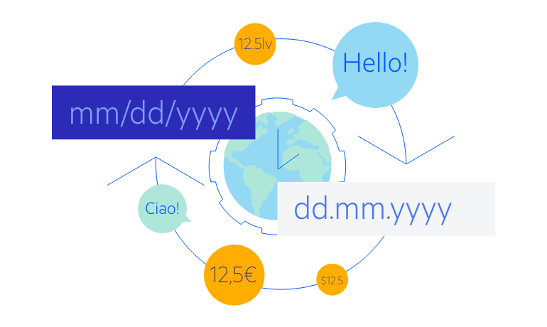
Globalization
The KendoReact Line Chart includes globalization and localization capabilities, ensuring seamless support for various languages and locales within your React app. Additionally, you have the option to enable the right-to-left (RTL) rendering for languages that use right-to-left scripts, such as Arabic and Hebrew.