
KendoReact
Free React Drawer
- This popular navigational component can be permanently displayed, shown and hidden on command.
- Part of the KendoReact library along with 120+ free and paid enterprise-grade UI components.
- This component is free to use, including in production—no sign-up or license required!
-
Customizable Slide-out Menu
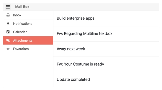
Popularized by mobile applications, the React Drawer component has become a staple as a navigational component for desktop and responsive web applications alike. The KendoReact Drawer component offers a navigation that can be permanently displayed, shown and hidden on command, and offers various styles for presenting navigation items.
-
Display Modes
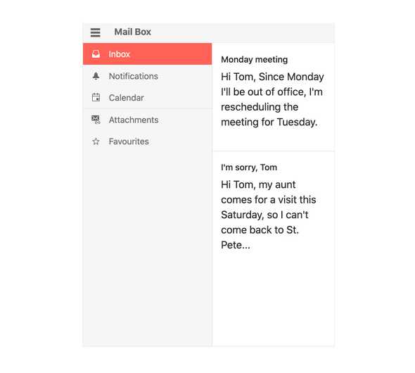
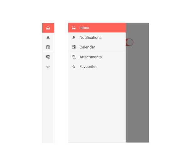
The KendoReact Drawer component offers several display modes. This includes controlling if the React Drawer pushes content to the side as it expands or if it is displayed as an overlay on top of the content. Developers can also control whether navigation items are displayed with text and icons or just icons via the compact mini view.
-
Positioning
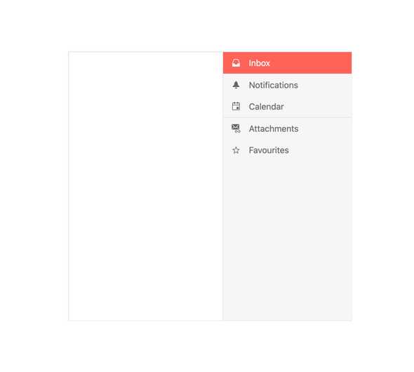
Thanks to its position property, the KendoReact Drawer can be specified to be rendered in any position in relation to the page content.
-
Routing
As the component will often be used for navigation, the KendoReact Drawer component can easily integrate into any router library and be passed the appropriate routes for each Drawer item.
-
Custom Rendering
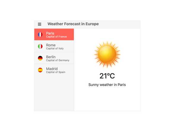
The KendoReact Drawer enables developers to customize the content of each of its items by utilizing a custom renderer.
-
Globalization
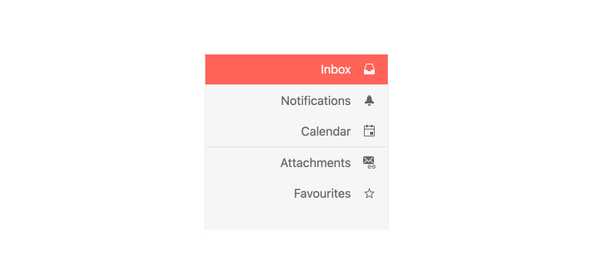
By default, the React Drawer component will be rendered on the left-hand side, but for applications that require right-to-left display, the Drawer can easily be rendered on the right-hand side.
-
Support for Left and Right Drawers
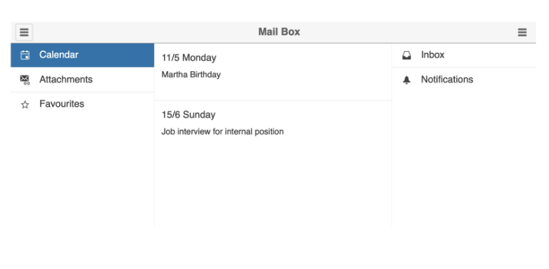
Depending on your specific requirements, you can have both left and right drawers simultaneously, boosting your application's UI and making it more compact and user-friendly.
All KendoReact Components
Animation
Barcodes
Buttons
- Button
- ButtonGroup
- Chip
- ChipList
- DropDownButton
- Floating Action Button
- SmartPasteButton New
- Speech-to-Text Button
- SplitButton
- Toolbar
Charts
Conversational UI
Data Query
Data Grid
Data Tools
Spreadsheet
Date Inputs
Date Math
Dialogs
Drawing
Dropdowns
Excel Export
File Saver
Form
Gantt Chart
Gauges
Indicators
Editor
Inputs
- Checkbox
- ColorGradient
- ColorPalette
- ColorPicker
- FlatColorPicker
- Input
- MaskedTextBox
- NumericTextBox
- RadioButton
- RadioButtonGroup
- RangeSlider
- Rating
- Signature
- Slider
- Switch
- TextArea
- TextBox
Layout
ListBox
ListView
Map
Labels
Notifications
PDF Processing
PivotGrid
Common Utilities
Popup
Progress Bars
