
KendoReact
Free React Input
- The React Input component provides additional styling to fit with all KendoReact themes.
- Part of the KendoReact library along with 120+ free and paid enterprise-grade UI components.
- This component is free to use, including in production—no sign-up or license required!
-
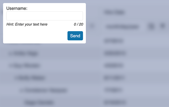
Enables Users to Submit a Value on a Single Line
The React Input component builds on top of a traditional HTML input element and provides additional KendoReact styling to fit with all KendoReact themes, as well as the ability to provide a label as a floating label.

-
Floating Labels
Popularized by Material Design, the concept floating labels have become a standard to many other design languages. This is why the KendoReact Input component supports floating labels out of the box, regardless of chosen KendoReact theme.

-
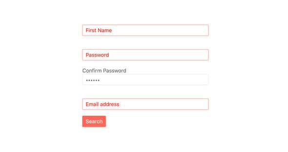
Forms Support
With built-in styling for invalid states, as well as the ability to set custom validation messages, the React Input element can easily be integrated with any HTML form element, any third-party React form library or the KendoReact Form component.
All KendoReact Components
Animation
Barcodes
Buttons
- Button
- ButtonGroup
- Chip
- ChipList
- DropDownButton
- Floating Action Button
- SegmentedControl New
- SmartPasteButton
- Speech-to-Text Button
- SplitButton
- Toolbar
Charts
Conversational UI
Data Query
Data Grid
Data Tools
Spreadsheet
Date Inputs
Date Math
Dialogs
Drawing
Dropdowns
Excel Export
File Saver
Form
Gantt Chart
Gauges
Indicators
Editor
Inputs
- Checkbox
- ColorGradient
- ColorPalette
- ColorPicker
- FlatColorPicker
- Input
- MaskedTextBox
- NumericTextBox
- RadioButton
- RadioButtonGroup
- RangeSlider
- Rating
- Signature
- Slider
- Switch
- TextArea
- TextBox
Layout
ListBox
ListView
Map
Labels
Notifications
PDF Processing
PivotGrid
Common Utilities
Popup
Progress Bars
