KendoReact
Free React Window
- An essential React Window component including positioning & dragging, resizing and keyboard navigation.
- Part of the KendoReact library along with 120+ free and paid enterprise-grade UI components.
- This component is free to use, including in production—no sign-up or license required!
-
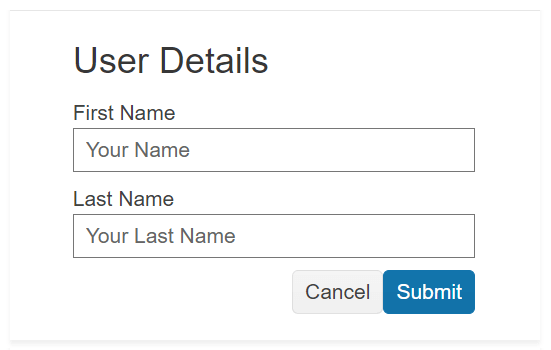
Customizable React non-Modal Window
The React Window displays content in a non-modal fashion and allows for the window to be moved throughout the page as well as resized based on user requirements.
-
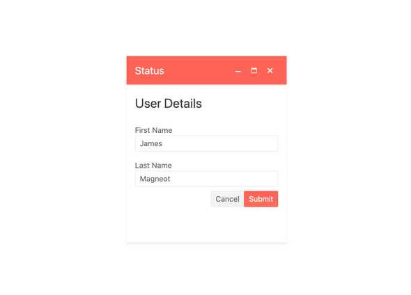
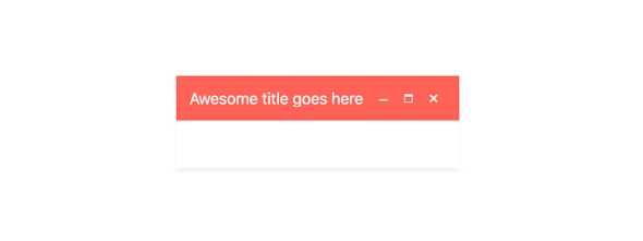
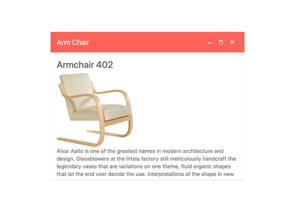
Title
Every KendoReact Window component has a title area that can be blank or contain custom text to give the user context around the content of the Window.
-
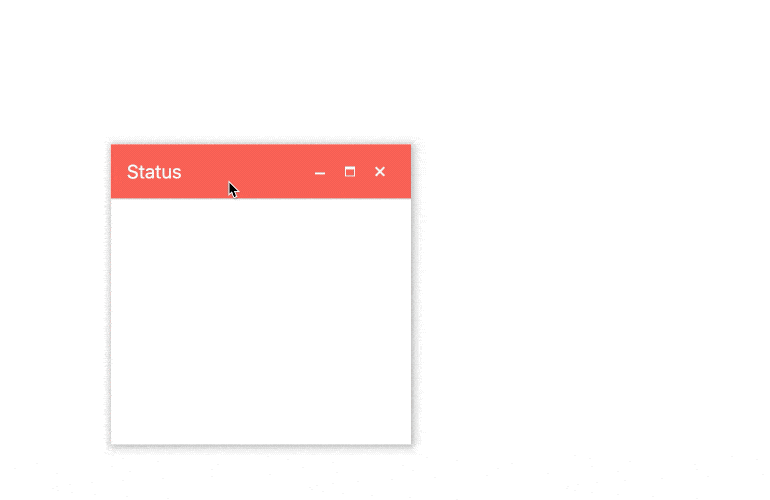
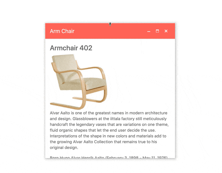
Positioning & Dragging
While the React Window can be initially displayed anywhere on a page it also has built-in support for being repositioned by dragging the component around.
-
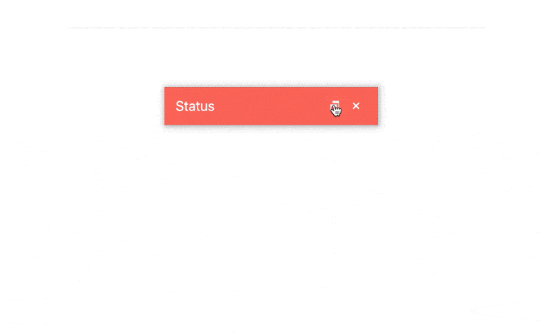
Minimizing and Maximizing
Each KendoReact Window has built-in action items for minimizing, maximizing and closing the window.
-
Dimensions
By default, the KendoReact Window has some internal calculations for height and width, but these can easily be overridden by using the width and height bindings of the Window component.
-
Resizing
With a single configuration option, the KendoReact Window can easily be resized by dragging the sides or the corner of the React component.
-
Controlled & Uncontrolled Modes
By default, the React Window is in an uncontrolled state and can be resized or moved depending on its internal logic. For scenarios that require a controlled component, every aspect of the window can be maintained by controlling the state of the component.
-
Keyboard Navigation
To help users traverse the KendoReact Window component with keyboard navigation, the component has several built-in keyboard shortcuts that can be used to not just interact with the Window component itself, but also elements contained within it.
-
Accessibility
Continuing a tradition of putting accessibility at the forefront of building React UI components, the KendoReact Window is AAA rated for WCAG 2.0, and compliant with both WAI-ARIA and Section 508 standards.