KendoReact
React Timeline
- Display a collection of events in a chronological order with the KendoReact Timeline UI component.
- Part of the KendoReact library along with 120+ free and paid enterprise-grade UI components.
- Includes legendary technical support, design resources, comprehensive documentation, demos, and more!
-
Layout
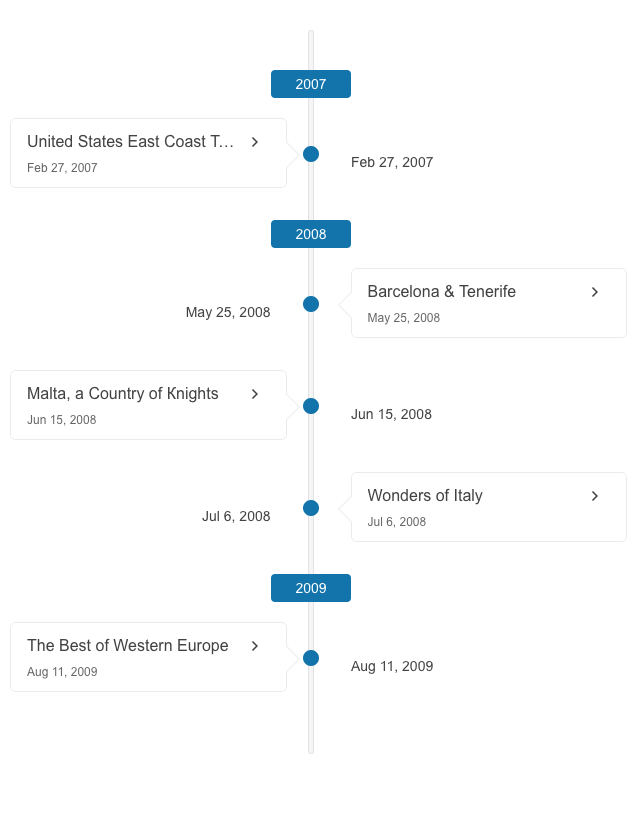
With the KendoReact Timeline component, you have the possibility to render events either on one or on both sides of the axis.
-
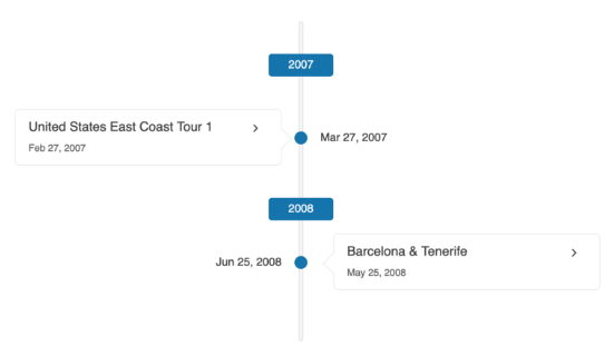
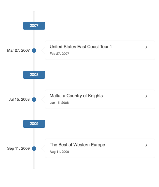
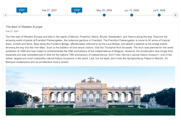
Orientation
The KendoReact Timeline component supports both a vertical and a horizontal mode. In the horizontal node, you have the flexibility to enable or disable scrolling. The vertical mode enables you to have collapsible events.
-
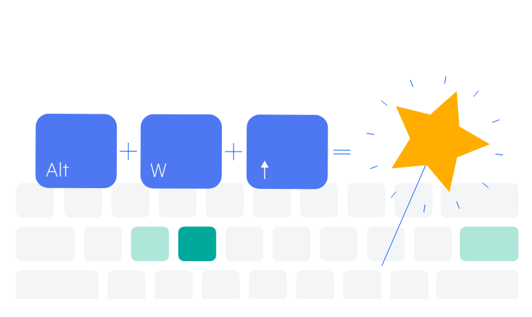
Keyboard Navigation
Enhance accessibility and productivity through keyboard-only navigation. The Timeline component includes keyboard navigation support, enabling users to navigate and interact with its items efficiently using only the keyboard.
See the React Timeline Keyboard Navigation demo
-
Events
The KendoReact Timeline component exposes the following events to easily handle different actions:
-
OnActionClick – triggered when a card action is clicked
-
OnChange – triggered when a card is toggled
See the React Timeline Events demo
-
-
Easily Showcase a Set of Events in a Chronological Order
The KendoReact Timeline component enables you to display events in chronological order, making it suitable for showcasing company history or visualizing significant milestones. The component offers a horizontal and a vertical mode in which the events can be collapsed for a neat and structured view.
See the React Timeline Overview demo