KendoReact
React FlatColorPicker
- Helps you add a Color Picker component right on the page and comes with customizable header and footer.
- Part of the KendoReact library along with 120+ free and paid enterprise-grade UI components.
- Includes legendary technical support, design resources, comprehensive documentation, demos, and more!
-
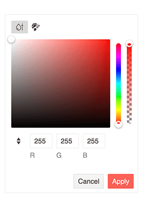
Enable Users to Select and Submit Color Values
The new KendoReact FlatColorPicker component adds another option for your users to select colors in React applications. It provides a flat view for the React ColorGradient and the React ColorPalette components and adds a header and footer. Unlike the React ColorPicker component, the React FlatColorPicker is not rendered within a popup or dropdown but immediately to the page.
-
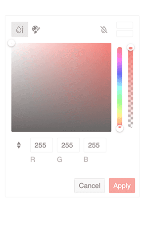
Disabled FlatColorPicker
For scenarios that require the React FlatColorPicker to prevent user interactions, this component can switch between being enabled (fully operational) or disabled (prevent user interactions) through a single configuration option. The disabled state also automatically updates the appearance of the React TextArea component to ensure there is a clear visual cue for users that the UI element is not active.
-
Props
The React FlatColorPicker component includes the following props:
- defaultValue: enables you to set a default color value, ensuring a consistent starting point for color selection.
- format: provides the ability to specify the default input format for the gradient input editor. You can choose between "rgb," "hex," or "rgba" to align with your preferred color format.
- opacity: offers more flexibility by allowing you to display the opacity slider. With this feature enables, users can select transparency along with their color choices.
-
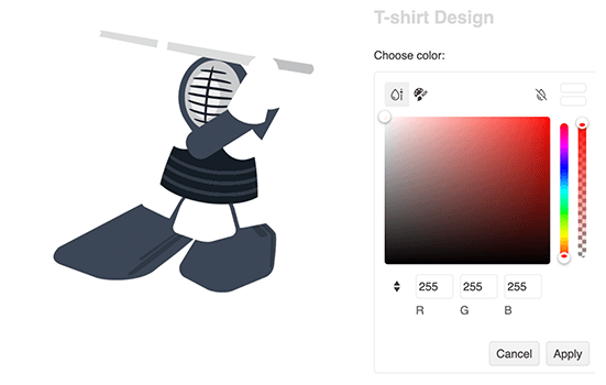
Header & Footer Customization
Make the React FlatColorPicker your own with a variety of out-of-the-box customization options. You can customize what elements to appear in the header and the footer of the component as well as hide them completely. Having a footer comes in handy when you want to enrich the interactivity of the FlatColorPicker, for example by adding buttons. If that's not part of the requirements, you can simply hide the footer area altogether.