KendoReact
React SplitButton
- Enable users to execute a default action that is bound to a Button or choose an action from a predefined drop-down list.
- Part of the KendoReact library along with 120+ free and paid enterprise-grade UI components.
- Includes legendary technical support, design resources, comprehensive documentation, demos, and more!

-
Customizable React Split Button
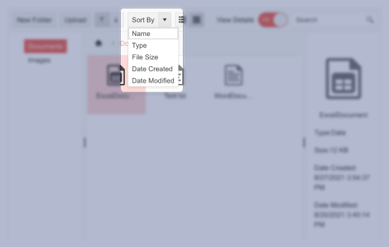
The KendoReact SplitButton allows the user to execute a default action which is bound to a Button or to choose a predefined action from a drop-down list.

-
Disabled SplitButton
For scenarios that require that the KendoReact SplitButton is visibly disabled and users cannot interact with it, the enabled property can be set to false which puts the React SplitButton in a disabled state.

-
Icon SplitButton
Each item within the KendoReact SplitButton can be rendered as just text, text along with an icon, or just as an icon. These icons can be added from the list of KendoReact icons, as a custom image or imported from third-party font icon libraries like FontAwesome.

-
Data Binding
The KendoReact SplitButton can be defined declaratively and can also be bound to an array of strings, or an array of objects.
-
Custom Rendering
Thanks to built-in support for custom renderers, the KendoReact SplitButton can be customized to fit any requirements by overriding the default template for rendering items, or customizing the popup responsible for listing out all items.

-
Keyboard Navigation
The React SplitButton features several keyboard shortcuts to help interact and select items through keyboard navigation.
-
Accessibility
Accessibility is at the heart of KendoReact and as a part of this commitment the KendoReact SplitButton is WCAG 2.0 AAA rated and is compliant with Section 508 and WAI-ARIA standards.

All KendoReact Components
Animation
Barcodes
Buttons
- Button
- ButtonGroup
- Chip
- ChipList
- DropDownButton
- Floating Action Button
- SmartPasteButton New
- Speech-to-Text Button
- SplitButton
- Toolbar
Charts
Conversational UI
Data Query
Data Grid
Data Tools
Spreadsheet
Date Inputs
Date Math
Dialogs
Drawing
Dropdowns
Excel Export
File Saver
Form
Gantt Chart
Gauges
Indicators
Editor
Inputs
- Checkbox
- ColorGradient
- ColorPalette
- ColorPicker
- FlatColorPicker
- Input
- MaskedTextBox
- NumericTextBox
- RadioButton
- RadioButtonGroup
- RangeSlider
- Rating
- Signature
- Slider
- Switch
- TextArea
- TextBox
Layout
ListBox
ListView
Map
Labels
Notifications
PDF Processing
PivotGrid
Common Utilities
Popup
Progress Bars
