KendoReact
Free React ChipList
- Create compelling UX in your React app by displaying information in stylized containers called chips or pills.
- Part of the KendoReact library along with 120+ free and paid enterprise-grade UI components.
- This component is free to use, including in production—no sign-up or license required!

-
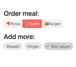
Display and Manage a Collection of React Chips
The React ChipList component takes the React Chip and provides additional functionality related to managing a collection of KendoReact Chip components. Users can add and remove items and manage currently selected items from a list of chips.
-
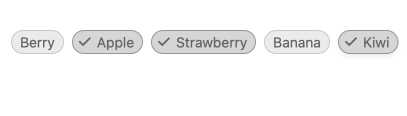
Selection Mode
To ensure flexibility, the KendoReact ChipList component provides several selection modes. The default mode is ânoneâ, which means no chips can be selected, yet you can enable single and multiple selection to help users manage their items individually or in bulk.
-
Data Binding
As the KendoReact ChipList component deals with displaying and manipulating a collection of items, you can bind it to different data sources. This enables React developers to utilize existing datasets generated from a database or elsewhere in a React application in order to populate the React ChipList items.
-
Disabled ChipList
The entire KendoReact ChipList component can be disabled through a single configuration option, letting developers control when an end-user can interact with the React ChipList items.
-
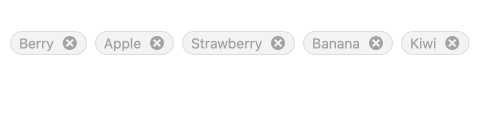
Customization
Since the KendoReact ChipList component is built on top of the existing React Chip component every Chip displayed can be fully customized to fit any design requirements. This includes aspects like color and style of the ChipList, whether or not to display a remove icon, and adding avatars or icons as a part of the React ChipList component content.

-
Keyboard Navigation
The KendoReact ChipList has built-in keyboard support to help navigate the application using just a keyboard.
-
Accessibility
One of the core aspects of KendoReact is compliance with accessibility standards. The KendoReact team understands how important accessibility is for the web and this drives the team to build accessibility into every component. The KendoReact ChipList supports Section 508, Keyboard Navigation, and WCAG 2.0 compliance with an AAA rating.