KendoReact
React AutoComplete
- Improve UX by adding word suggestions based on the user input.
- Part of the KendoReact library along with 120+ free and paid enterprise-grade UI components.
-
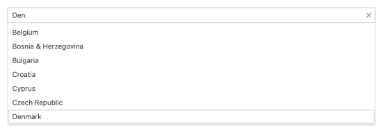
Enable Users to Filter and Select Items From a List of Available Options
The React AutoComplete component, part of KendoReact, lets your end-users type text into an input element and a list of suggested items will appear in a popup beneath. This is a common scenario that has been popularized by the user experience in Google Search, suggestions in Word processors, or Intellisense in code editors.
-
Filtering
The Filtering option of the KendoReact AutoComplete lets the developer define exactly how to filter down the list of suggested items. Some options include filtering down by "starts with" and "contains" just to name a few.

-
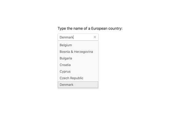
Suggestions
With suggestions turned on, the React AutoComplete will fill in the input field with suggestions from the underlying data, saving the user a lot of time when selecting data in the AutoComplete.

-
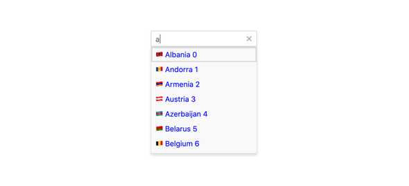
Custom Rendering
Custom renderers are at the heart of React components, and the AutoComplete from KendoReact is no exception. Every aspect of the AutoComplete can be overridden with a custom renderer. Want to insert your own input element in the component? Not a problem. You can also define templates for each individual item to make the list contain more than just text.
-
Disabled Items
You have the flexibility to disable certain items within the React AutoComplete. Once an item is disabled, it cannot be selected as a value for the component, but it might still remain focusable or non-focusable when navigating through the items using the keyboard.
-
Floating Labels
Popularized by Material Design, the floating label starts off as a placeholder in an input element only to animate out and float above the input and act as a label. The KendoReact AutoComplete component comes with support for floating labels built-in, no matter what design language you chose to incorporate it with.

-
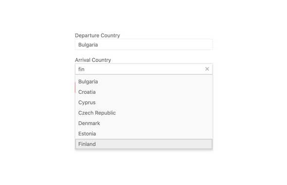
Forms Support
If thereâs one thing that is certain it is that every web application needs a form of some sort. Our React AutoComplete component contains built-in functionality like validation styles and messages to help the component easily integrate into any form in any application.
-
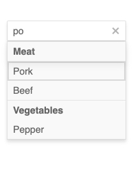
Grouping
The React AutoComplete component allows you to group similar data items in logical categories to help users quickly and easily navigate through the drop-down list. Specify the field responsible for each category when you bind your dataset to the KendoReact AutoComplete component.
-
Prefix and Suffix Adornments
Elevate user interactivity leveraging the option for adding prefix and suffix adornments. These are custom items, usually an icon or button, inside the field before or after the input area. Typical prefix adornments are currency symbols or unit indicators, while suffix adornments are often used for password visibility toggles, formatting or clearing the input.
-
Keyboard Navigation
Whether it stems from users trying to be as productive as possible, or for accessibility reasons, keyboard support in React UI components is important. Of course, the AutoComplete has built-in keyboard support to help navigate every aspect of the application using just a keyboard.
-
Accessibility
One of the core aspects of KendoReact is compliance with various accessibility standards. The KendoReact team understands how important accessibility is for the web and this drives the team to build in accessibility with every component.
The KendoReact AutoComplete is no exception and supports Section 508, Keyboard Navigation, and WCAG 2.0 (with a AAA rating) compliance.