KendoReact
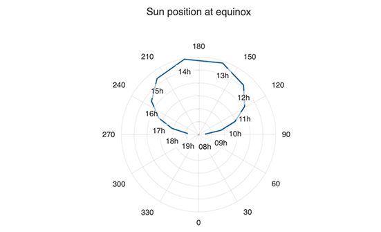
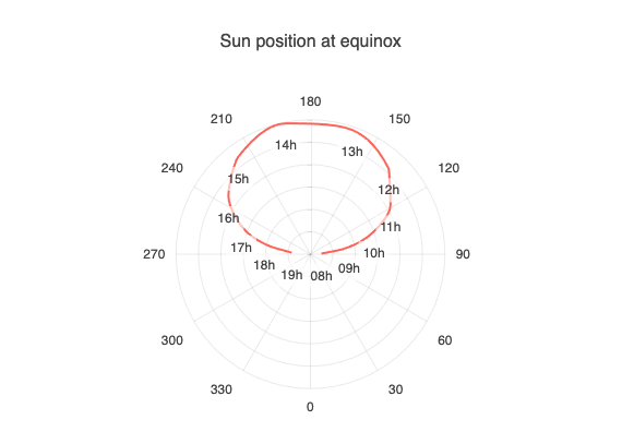
React Polar Chart
- Compare multivariate data with the KendoReact Polar Chart.
- Part of the KendoReact library along with 120+ free and paid enterprise-grade UI components.
- Includes legendary technical support, design resources, comprehensive documentation, demos, and more!
-
Craft Powerful Data Visualizations with the KendoReact Polar Chart
The KendoReact Polar Chart is used to display data points from multiple variables on a two-dimensional graph using polar coordinates. Each variable is associated with its own axis, and the series are represented as lines connected by the data points on the different axes. You can utilize various customization options for multiple axes, flexible data binding, modern themes, and more.
See the React Polar Chart demo
-
Data Binding
You have the flexibility to bind the KendoReact Polar chart to different data sources, including simple arrays with X and Y values and advanced data types and objects with fields. Moreover, the component enables you to bind axes and series to custom data sources.
-
Rendering Modes
The React Polar Chart can render data in both the Canvas and SVG formats. By default, the SVG default format ensures an always crips presentation of your data. However, when prioritizing performance, you can easily switch to a canvas format with a single configuration option. This will ensure your React Polar Chart can handle substantial amounts of data and real-time updates without any issues.
-
Export Options
You can easily export your React Polar Chart to PDF, SVG, PNG and the Kendo UI drawing format. In case you need to adjust the image size or fit the chart to a specific paper size, the user-friendly export method will enable you to preserve the chart’s quality and rendering in the output file.
-
React Polar Chart Appearance
Tailor the series colors of the KendoReact Chart component with one of our predefined color sets, including Default, Material, Bootstrap and Fluent. Additionally, you have the flexibility to further customize any of the built-in themes or craft a completely new theme to reflect your brand identity using Progress ThemeBuilder.
-
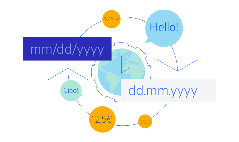
Globalization
The KendoReact Polar Chart offers globalization and localization capabilities to ensure effective support for various languages and locales. Moreover, you can utilize the right-to-left (RTL) support for languages that use right-to-left scripts, such as Arabic and Hebrew.