KendoReact
React TreeList
- A powerful data component that can handle paging, sorting, filtering and editing of multiple data items with ease.
- Part of the KendoReact library along with 120+ free and paid enterprise-grade UI components.
- Includes legendary technical support, design resources, comprehensive documentation, demos, and more!

-
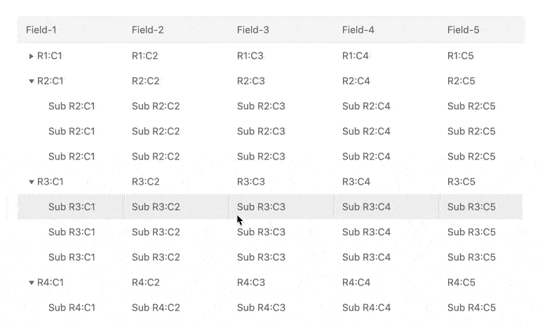
Display Hierarchical Data in a React Tree Grid View
The KendoReact TreeList, also known as a React Tree Grid, is one of the most powerful data components available to React developers. The React TreeList is perfect for homogenous hierarchical data, and contains must-have features like paging, sorting, filtering and editing, along with the ability to handle thousands and hundreds of thousands of data items. This React Tree Grid also has column interactions like reordering and resizing columns, a context menu to assist with actions based on the current column and data item, as well as support for custom renderers to make the component your own.
-
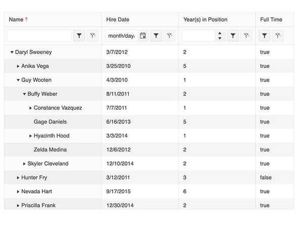
Paging
The KendoReact TreeList Grid can enable paging through a single configuration option. Paging offers the ability to page through data with a specific page size, which can be changed programmatically or in a drop down, with intuitive controls to help navigate through next and previous pages and pick a specific page based on a page number.
-
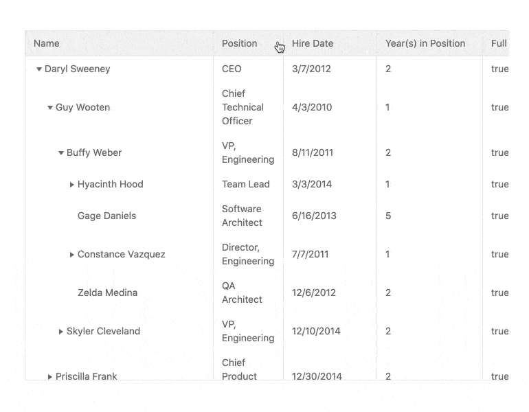
Sorting
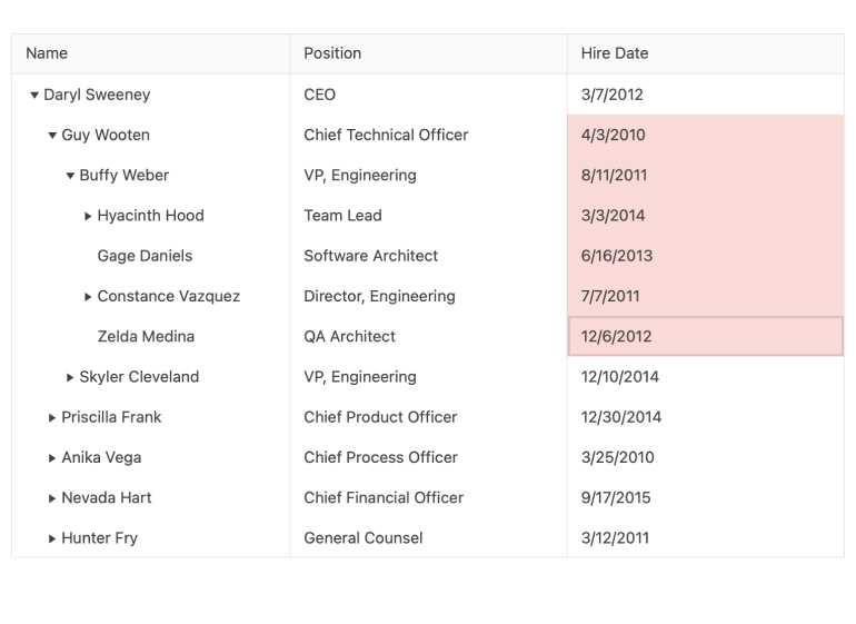
With sorting enabled in the React TreeList, any column can be sorted in an ascending or descending order with simple user interactions. Clicking a column header multiple times will cycle through ascending order, descending order or unsorted. The KendoReact Tree Grid can be presorted, defining which columns to sort, and in which order, ahead of time and also offers the ability to sort over multiple columns with indicators showing which order the columns have been sorted in.
-
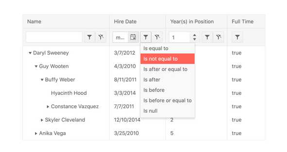
Filtering
With the filtering mechanism of the KendoReact TreeList end users can quickly filter down data based on any filter expression that they desire. Featuring multiple filter options like a dedicated filter row or a filter menu that appears upon clicking a filter icon in a column header, the React Tree Grid can also be extended to provide a custom component to handle filtering.
-
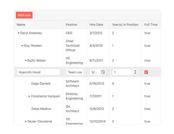
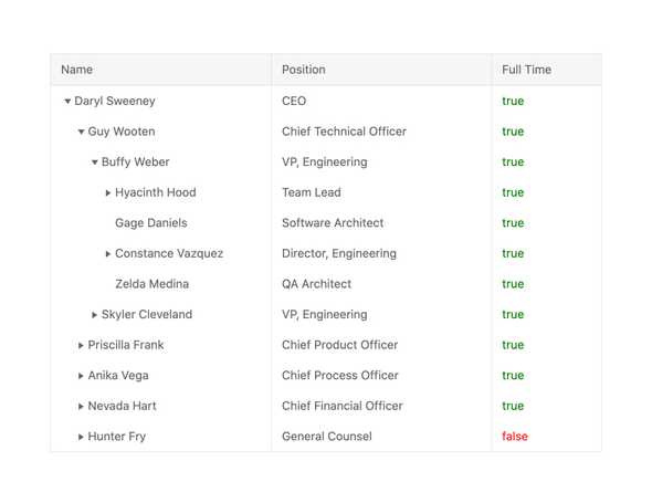
Editing
With editing enabled the KendoReact TreeList allows users to edit data items in various ways. These range from being able to click in to individual cells and edit the value of one cell, placing the entire row in edit mode by clicking on an Edit button or action item, as well as modifying data in a form hosted outside of the KendoReact Tree Grid.
-
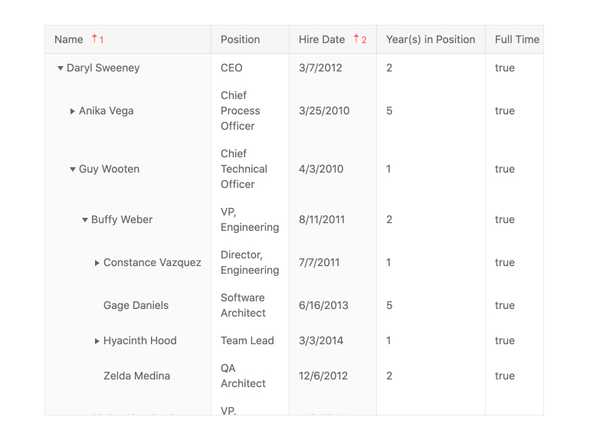
Column Interactions
The React TreeList allows for any column to be resized, reordered and can configured to be displayed or hidden with a single property. Each option can be applied across all columns across the entire data table or defined on a column-by-column basis.
-
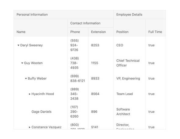
Multi-Header Columns
With the multi-header column feature of the KendoReact TreeList columns can be defined to have parent column headers to help organize columns. Each parent column header can also be interacted with like a regular column.
-
Frozen Columns
The KendoReact TreeList allows for frozen, or locked, columns to be added to both the left-hand and right-hand sides of the rendered table. These can be dynamically added by the user through column menu interactions, or can be defined ahead of time. Additionally, the React Tree Grids allow for sticky columns that will be added to the locked columns as they are scrolled in to view and can be removed once scrolled over again.
-
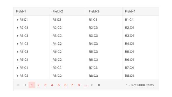
Row and Column Virtualization
The KendoReact TreeList can easily handle thousands or hundreds of thousands of data items. Thanks to built-in virtualization for both columns and rows, scrolling through large data sets both horizontally and vertically is buttery smooth.
-
Selection
The KendoReact TreeList features selection in multiple forms, either through simply clicking on a row or selecting an item via the built-in checkbox column. The selection can be programmatically set and the KendoReact Tree Grid provides methods for extracting and interacting with selected rows.

-
Range Selection and Multiple Cell Selection
The TreeList component enables range selection quickly and easily through the new built-in Cell Selection and Range Selection support for rows and cells. The user has the standard options of dragging and dropping or using Control/Command key and click combinations to select multiple cells or a range of cells.
-
Custom Cells
The KendoReact TreeList has built-in default components for displaying data in read-only mode as well as components to be used when an item is being edited. Any cell within the React Tree Grid can utilize a custom renderer in both read and edit modes, giving developers full control over what is displayed within the React TreeList.
-
Keyboard Navigation
The KendoReact TreeList is a powerful component with a large set of features, and thanks to built-in keyboard navigation, interacting with the tree grid can be done with simple keyboard interactions.
-
Accessibility
Accessibility is one of the main pillars of the KendoReact library and this can be seen across all available UI components. In this vein, the KendoReact TreeList is AAA rated with WCAG 2.0 and is compliant with Section 508 and WAI-ARIA standards.