
UI for Blazor
Blazor PromptBox
- Streamline user‑AI interactions with Telerik UI for Blazor PromptBox that provides intuitive, feature‑rich interface for composing prompts.
- Part of the Telerik UI for Blazor library along with 120+ professionally-designed UI components.
- Includes support, documentation, demos, virtual classrooms, Visual Studio Code Extensions and more!
-
Smarter Input Experience for AI or Chat Apps
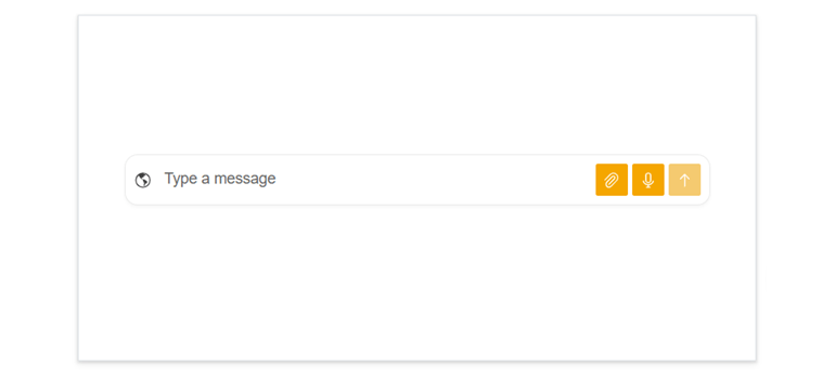
The Telerik UI for Blazor PromptBox delivers a modern, consolidated input interface built for chat experiences and AI‑powered workflows. It unifies text input, speech‑to‑text, file attachments, integrated action buttons, and adaptive layouts into a single, flexible component. With automatic mode switching and customizable adornments, the Blazor PromptBox streamlines how users craft prompts and interact with AI systems.
-
Rendering Modes
The Blazor PromptBox offers three rendering modes that define how the input area behaves as users type. These modes help you tailor the component to the needs of your chat or AI-driven app, whether you want a compact message box, a flexible adaptive input, or a space designed for longer content.
- Auto mode (default): Adapts automatically to user input, starting as a single-line field and expanding into a multi-line area as content grows. Once the limit is reached, scrolling kicks in. Ideal for dynamic, fluid input experiences.
- Single line mode: Keeps the input compact with a fixed height. When text exceeds the available width, horizontal scrolling is enabled. Perfect for short messages or UI where vertical space should remain constrained.
- Multi line mode: Starts with a multi-line text area (three lines by default) and expands vertically as content increases, until reaching the configured maximum height. After that, vertical scrolling appears. Ideal for longer-form prompts or rich text entry scenarios.
-
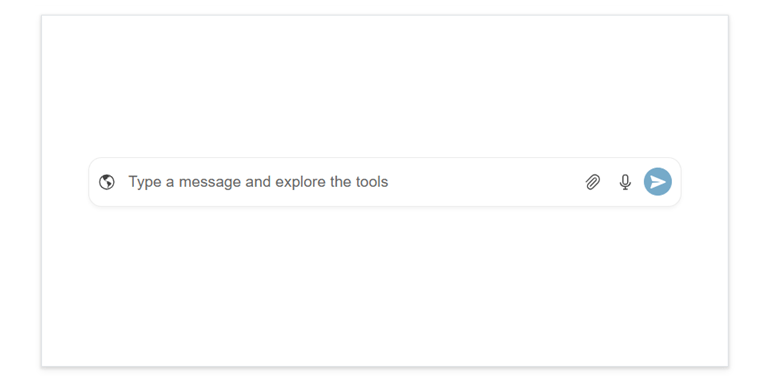
Input Tools
Three tools that enrich user interactions are built in the Telerik UI for Blazor PromptBox. Each tool can be enabled independently, allowing you to tailor the input experience to your needs.
- File select button: Allows users to attach files directly to their messages. You can configure multiple file selection, set size limits, and restrict allowed extensions. The button position and behavior are fully customizable, so it fits naturally into your UI.
- Speech‑to‑Text button: Lets users dictate messages through the browser’s Web Speech API. Configure language options (8+ supported), turn on continuous listening, and show interim results.
- Action button: A customizable submit button that lets users send or confirm their input with a single click. You can choose its icon (Arrow Up, Paper Plane, Check, Plus), tooltip, and loading behavior through the component’s settings.
-
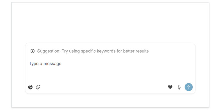
Adornments
The Blazor PromptBox offers flexible affix templates that let you enhance the input area with custom content in three key positions: start, end, and top.
- Start affix: Adds custom content at the beginning of the input area. It appears on the left in single‑line and auto modes, and at the bottom‑left in multi‑line mode. This placement is ideal for icons, indicators, or actions that should appear before the user starts typing.
- End affix: Places content at the end of the input area, typically on the right side, or bottom‑right in multi‑line mode. This is a great spot for extra action buttons or features that complement the main send action.
- Top affix: Available in multi‑line mode, this template displays content above the text area. It’s perfect for showing contextual info, suggestions, or helper text that guides users as they compose longer messages or prompts.
-
Appearance
Style the Telerik UI for Blazor PromptBox built-in buttons with ease. You can adjust their fill mode, corner radius, size, and theme color to match your app’s design, whether you customize them individually or apply a unified look.
-
Events
The Telerik UI for Blazor PromptBox includes different events for handling input changes, managing processing states, responding to action button clicks, and capturing speech‑to‑text results.
See the Telerik UI for Blazor PromptBox events documentation
-
Keyboard Navigation
The PromptBox component supports full keyboard navigation, following the standard tab order. Users can focus the input and all affix buttons individually and use familiar keys to work efficiently. Keyboard navigation ensures fast, accessible interaction for all users.
See the Telerik UI for Blazor PromptBox keyboard navigation demo
