
UI for Blazor
Blazor DropDownTree
- Enable hierarchical selection from complex data structures with a responsive Telerik UI for Blazor DropDownTree.
- Part of the Telerik UI for Blazor library along with 120+ professionally-designed UI components.
- Includes support, documentation, demos, virtual classrooms, Visual Studio Code Extensions and more!
-
Clear, Structured Selection for Complex Data
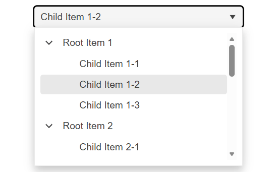
The Telerik UI for Blazor DropDownTree allows users to select a single value from a hierarchical set of options, making it easy to navigate structured data within a familiar dropdown interface. It blends the simplicity of a DropDownList with the visual clarity of a TreeView and supports both flat collections and deeply nested data. For larger datasets, the component can load child nodes on demand, ensuring smooth performance as users explore the hierarchy.
-
Flat Data
The Telerik UI for Blazor DropDownTree can work with flat data collections, even when your items aren’t organized in a nested structure. Each item in the list identifies its parent, allowing the component to automatically build the hierarchy for you. To ensure the tree behaves as expected, each item simply needs to indicate whether it has children so that expand arrows appear where needed. This approach keeps your data source lightweight while still enabling a fully functional hierarchical view.
See the Telerik UI for Blazor DropDownTree flat data support demo
-
Hierarchical Data
The Blazor DropDownTree works seamlessly with hierarchical data, too, where each parent item contains its own collection of child items. The component automatically detects and displays expandable nodes when a parent has children, ensuring users can easily navigate through multiple levels of data. It’s ideal when your data is already organized into nested objects and you want the component to reflect that structure naturally.
See the Telerik UI for Blazor DropDownTree hierarchical data support demo
-
Load on Demand
The component can load child nodes only when users expand a parent item, helping your app stay fast and responsive, especially with large datasets. You can choose to display just the first levels initially, and as users open nodes, the component fetches the next level of data on the fly. This reduces upfront data load and improves overall performance while keeping the experience seamless for users.
See the Telerik UI for Blazor DropDownTree load on demand support demo
-
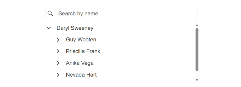
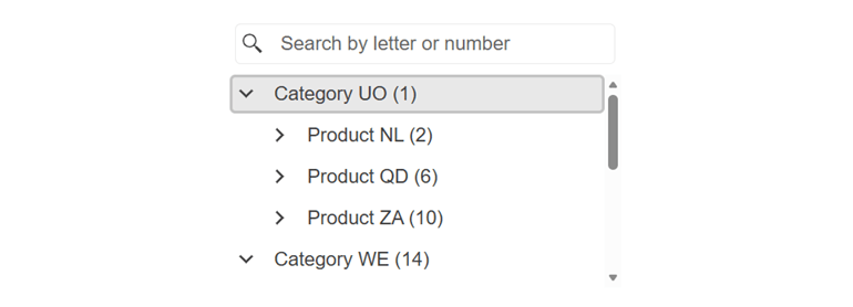
Filtering
The Telerik UI for Blazor DropDownTree can display a filter box that helps users quickly narrow down items as they type. This makes it easier and faster to locate the right option in large or complex hierarchies.
See the Telerik UI for Blazor DropDownTree filtering documentation
-
Templates
The Blazor DropDownTree offers flexible templating options that let you customize how items, headers, and selected values appear inside the dropdown and its popup. You can tailor the look of individual nodes, adjust how selected items are displayed, or add custom content to the popup.
-
Events
The component includes events that let you react to user interactions and manage the component’s behavior as items are selected, expanded, or loaded. These events help you handle selection changes, load data on demand, and update your UI based on how users navigate the hierarchy.
See the Telerik UI for Blazor DropDownTree events documentation
-
Keyboard Navigation
The Telerik UI for Blazor DropDownTree supports full keyboard navigation, allowing users to open the dropdown, move through hierarchical items, expand or collapse nodes, and make selections. This ensures faster interaction and improves accessibility for all users.
See the Telerik UI for Blazor DropDownTree keyboard navigation demo
