
UI for Blazor
Blazor TaskBoard
- Manage tasks in a Kanban-style interface with the Telerik UI for Blazor TaskBoard component.
- Part of the Telerik UI for Blazor library along with 120+ professionally-designed UI components.
- Includes support, documentation, demos, virtual classrooms, Visual Studio Code Extensions and more!
-
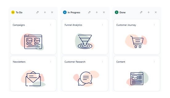
Visualize and Manage Workflows with Ease
The Telerik UI for Blazor TaskBoard component lets you manage tasks in a Kanban-style interface with ease. Cards are organized into columns based on status and can be moved via drag and drop for quick updates. A built-in toolbar provides search functionality for filtering by title or description, along with an option to add new columns, helping you maintain clear and flexible work tasks.
The component is well suited for scenarios such as task tracking, project management, issue tracking, and workflow visualization across teams.
-
Data Binding
The Blazor TaskBoard supports flexible data binding, allowing you to bind cards and columns to collections of data items. You can map fields such as title, description, status, and category, making it easy to integrate the component with existing data models.
See the Telerik UI for Blazor TaskBoard data binding documentation
-
Editing
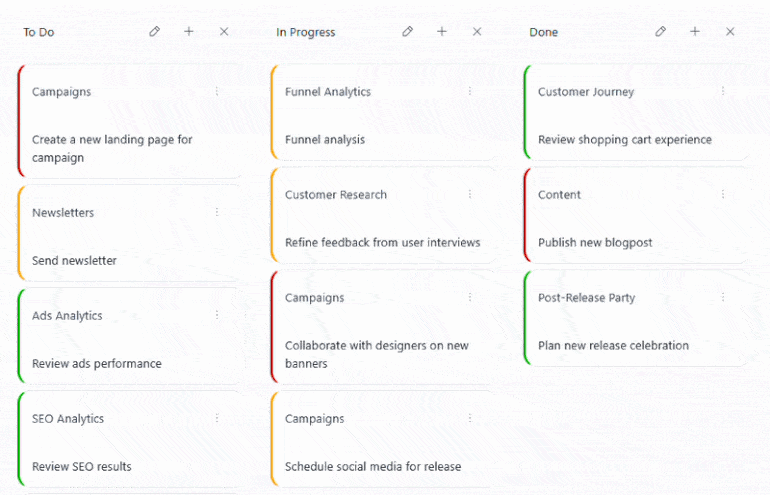
Enable built-in editing in the Telerik UI for Blazor TaskBoard to allow users to create, update, and delete cards directly within the component. Editing is configured through a dedicated form and integrates with the data model by applying changes to the underlying data source.
-
Drag and Drop
Drag and drop is available in the Telerik UI for Blazor TaskBoard to support intuitive task movement and workflow updates directly in the UI.
- Reorder cards: Allows users to change the order of cards within the same column to reflect priority or sequence.
- Drag cards: Enables dragging cards between columns to update their status and reflect task progress.
See the Telerik UI for Blazor TaskBoard drag and drop documentation
-
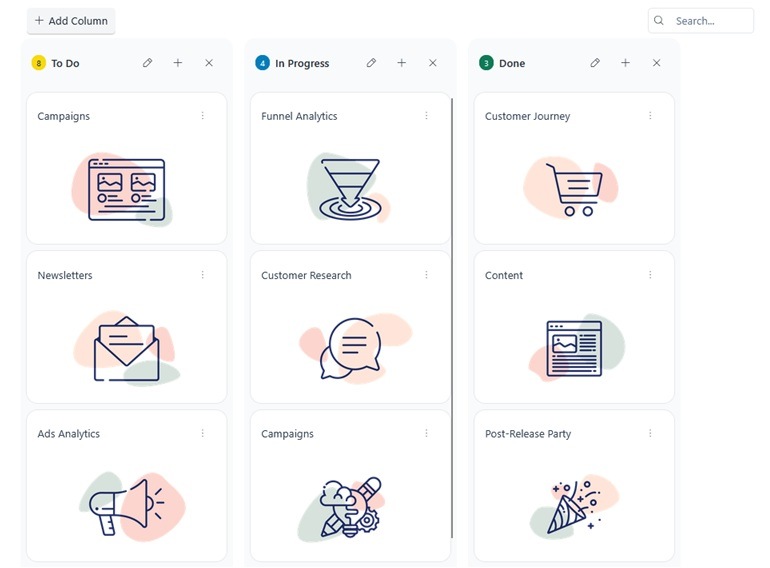
Toolbar
Customize the toolbar in the Telerik UI for Blazor TaskBoard. The component includes several built-in tools and supports full extensibility through custom tools.
- Search tool: Filters cards by title or description, enabling quick access to relevant tasks.
- Add Column tool: Provides a built-in action for dynamically adding new columns to the board.
- Separator: Adds a visual divider between toolbar items to improve organization and readability.
- Spacer: Inserts flexible space between items to control alignment and layout.
- Custom tools: Allow you to define additional toolbar actions tailored to your application needs, such as custom commands or integrations.
See the Telerik UI for Blazor TaskBoard toolbar documentation
-
Templates
Customize the Telerik UI for Blazor TaskBoard using built-in templates to control the rendering of columns, cards, and the edit pane. The ColumnHeaderTemplate replaces the default column header and provides access to the column data, state, and commands, while the CardTemplate allows full customization of the entire card layout. The CardBodyTemplate offers more granular control by customizing only the card content area without overriding the full layout. The EditPaneTemplate replaces the content area of the edit pane, giving you full control over the editing UI while taking over the Save and Cancel actions.

-
State
The TaskBoard state contains the current configuration of columns, cards, and their properties, and can be retrieved or updated at runtime through exposed methods. This enables scenarios where different users can work with personalized layouts or where the UI needs to persist and restore specific board configurations dynamically.

-
Events
Handle user interaction and data operations in the Telerik UI for Blazor TaskBoard through a comprehensive set of events that cover both cards and columns, as well as selection changes.
- OnCardClick: Fires when a card is clicked or activated via keyboard, enabling custom interaction logic.
- OnCardCreate: Triggered when a new card is created, allowing you to initialize and add it to the data source.
- OnCardUpdate: Occurs when a card is edited and saved, enabling you to persist changes.
- OnCardDelete: Fires when a card is deleted, giving you control over removal logic.
- OnCardMove: Triggered when a card is dragged to a new position or column.
- OnColumnCreate: Occurs when a new column is added to the board.
- OnColumnUpdate: Fires when a column is edited.
- OnColumnDelete: Triggered when a column is removed.
- OnColumnReorder: Occurs when columns are rearranged through drag-and-drop.
- SelectedCardChanged: Fires when the selected card changes, enabling you to track selection state.
-
Keyboard Navigation
Improve accessibility and usability in the Telerik UI for Blazor TaskBoard with built-in keyboard navigation. Users can navigate between cards and columns, trigger actions, and manage tasks using standard keyboard interactions.
See the Telerik UI for Blazor TaskBoard keyboard navigation demo
