UI for Blazor
Blazor Expansion Panel
- Organize information in expandable and collapsible sections with the Telerik UI for Blazor ExpansionPanel component.
- Part of the Telerik UI for Blazor library along with 120+ professionally-designed UI components.
- Includes support, documentation, demos, virtual classrooms, Visual Studio Code Extensions and more!
-
Organize Content with Interactive Expandable Panels
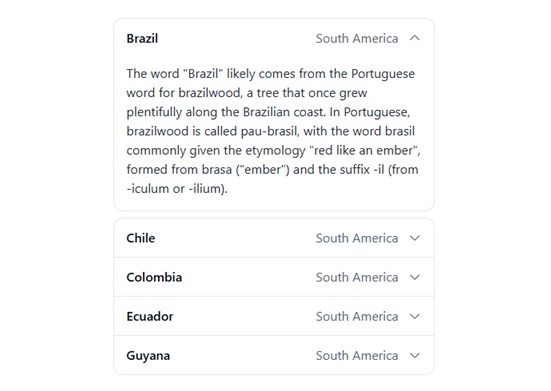
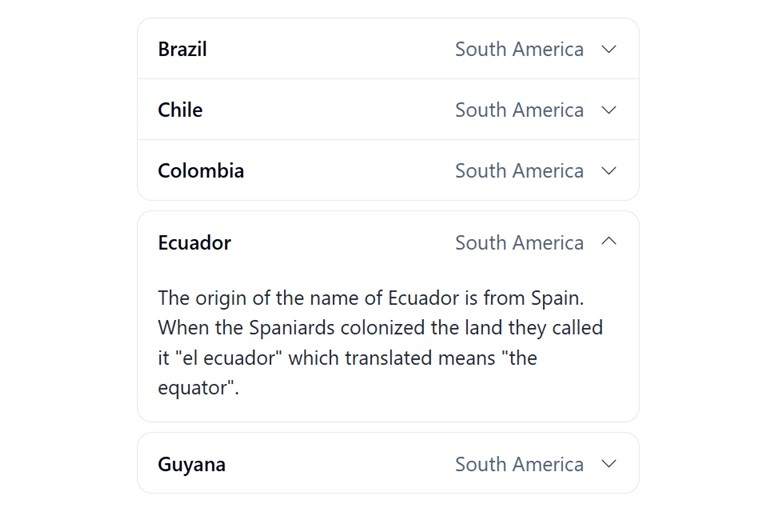
The Telerik UI for Blazor ExpansionPanel helps you organize content in compact, expandable sections, allowing users to reveal or hide additional information on demand. It's ideal for FAQs, settings pages, configuration panels, detailed forms, product information, and any scenario where reducing visual clutter improves the user experience. The component combines a customizable header, animated expand/collapse behavior, and flexible content areas for a clean, intuitive interface.
-
Expand and Collapse
Present content in collapsible containers with smooth animations that help users focus on the information that matters most. Panels can be expanded or collapsed by user interaction or programmatically through the component API. -
Templates
Create rich, engaging panel headers with dedicated TitleTemplate and SubTitleTemplate options. Add icons, formatted text, badges, or other Blazor components to deliver a more personalized user experience.
See the Telerik UI for Blazor Expansion Panel templates documentation
-
Events
React to user interactions with the built-in ExpandedChanged event. Track expansion state changes, synchronize application data, trigger business logic, or update related UI elements when panels open and close.
See the Telerik UI for Blazor Expansion Panel events documentation
-
Keyboard Navigation
Deliver an accessible experience with built-in keyboard support. Users can navigate and interact with the Telerik UI for Blazor ExpansionPanel using standard keyboard commands, helping meet accessibility requirements and improving usability for keyboard-first users.
See the Telerik UI for Blazor Expansion Panel keyboard navigation demo
-
Right-to-Left (RTL) Support
Build global applications with native right-to-left rendering support. The Blazor ExpansionPanel automatically adapts to RTL languages such as Arabic and Hebrew, ensuring a consistent and localized user experience.