UI for Blazor
Blazor Diagram
- Effortlessly visualize relationships and processes with the Telerik UI for Blazor Diagram.
- Part of the Telerik UI for Blazor library along with 120+ professionally-designed UI components.
- Includes support, documentation, demos, virtual classrooms, Visual Studio Code Extensions and more!
-
Visualize Relationships and Processes with Blazor Diagram
The Telerik UI for Blazor Diagram component helps you illustrate complex relationships, structures, and flows directly in your app. Use built-in shapes and flexible layouts to create organizational charts, process flows or custom diagrams. Easily define one-way, two-way, or non-directional connections, and customize the size, position, and geometry of every element to match your exact scenario.
-
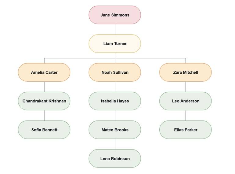
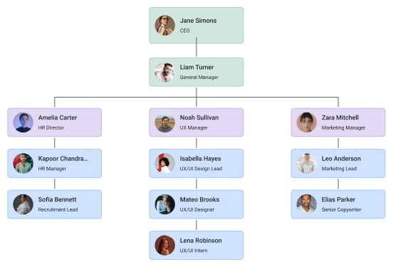
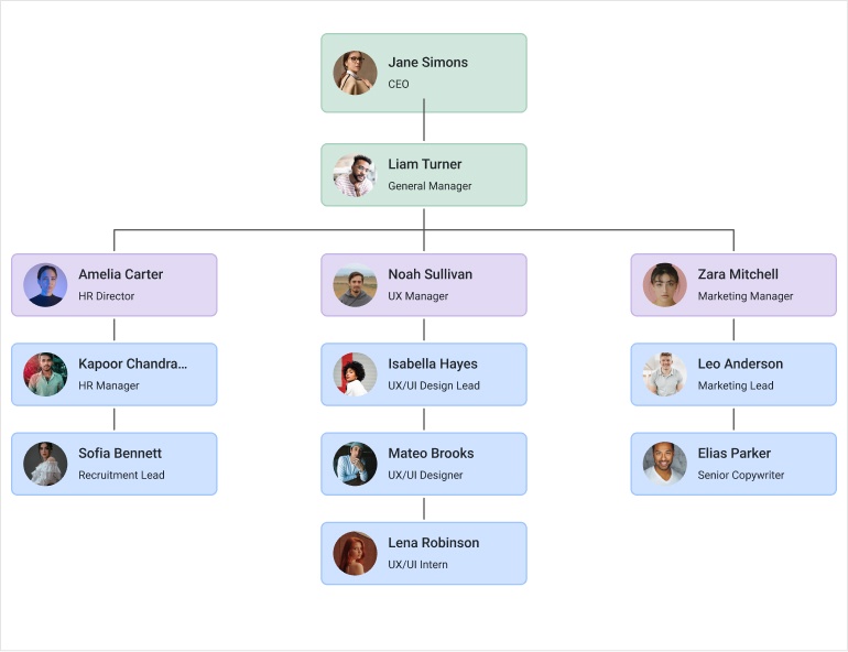
Diagram Layouts
The Telerik UI for Blazor Diagram includes several built-in layouts, so you don’t have to manually arrange shapes and connections. Choose from popular algorithms to best represent your data and flows:
- Tree layout: Arranges shapes in a hierarchical structure, ideal for organizational charts and team structures.
- Layered layout: Places shapes in horizontal or vertical layers, minimizing connection lengths and crossings for clean, directional flows.
- Force layout: Uses a physics-based simulation where connections act like springs, creating natural-looking diagrams with balanced spacing.
-
Diagram Shapes
The Telerik UI for Blazor Diagram comes with flexible, customizable shapes to represent your nodes. Start with built-in options like rectangles or create unique designs with custom paths. Easily adjust size, text, and position to match your scenario and bring clarity to your diagrams.
-
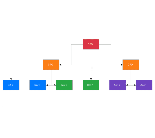
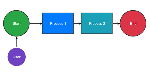
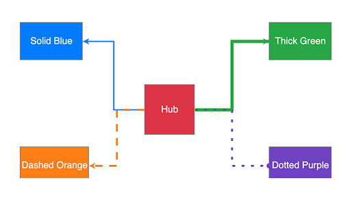
Diagram Connections
The Telerik UI for Blazor Diagram lets you define connections to illustrate relationships between shapes. You can use different routing styles like cascading or polyline, apply various end caps such as arrows or circles, and add labels for clarity. Connections can also be customized in appearance and behavior, either globally or individually.
-
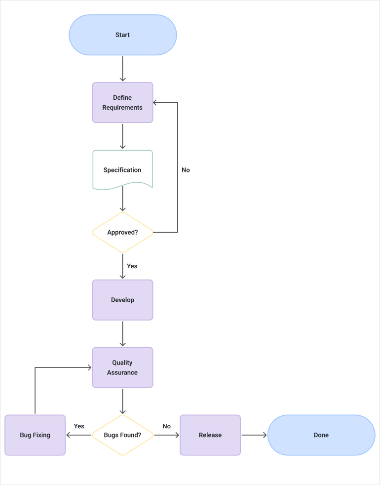
Workflow Diagram
The Telerik UI for Blazor supports a Workflow Diagram (a.k.a. flow chart) that uses specialized shape types to represent algorithms, tasks, and events. While these shapes are tailored for workflows, they’re versatile enough for any diagram scenario.
-
Diagram Events
The Telerik UI for Blazor Diagram supports interactive events, letting you respond to clicks on shapes and connections for dynamic, user-driven diagrams.
-
Declarative Shapes
Define diagram structures more easily in the Telerik UI for Blazor Diagram by using declarative shapes. This approach allows you to configure shapes directly in markup rather than creating them programmatically, simplifying setup and improving readability. Declarative shapes are especially useful for static or predefined diagrams, enabling faster development and clearer component structure.
See the Telerik UI for Blazor Diagram declarative shapes demo