
UI for Blazor
Blazor Wizard
- The Blazor Wizard component lets you breakdown long processes into by multiple steps by exposing just one form at a time.
- Part of the Telerik UI for Blazor library along with 110+ professionally-designed UI components.
- Includes support, documentation, demos, virtual classrooms, Visual Studio Code Extensions and more!
-
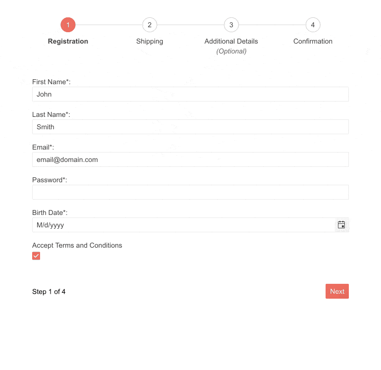
Simplify the User Experience of Multi-Step Processes with Blazor Wizard
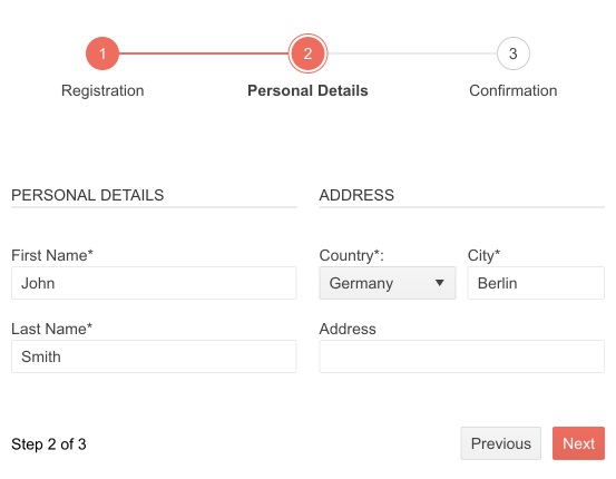
The Telerik UI for Blazor Wizard component enables you to create multi-step processes and guide users step-by-step in your application. You can integrate the Wizard with a Form component to achieve ultimate UX by breaking long processes into smaller steps and only asking users to fill one form at a time. Implementing the Form component lets you use the built-in form validation for the input data making users fill all required fields before proceeding to the next step.
Check out the Blazor Wizard demo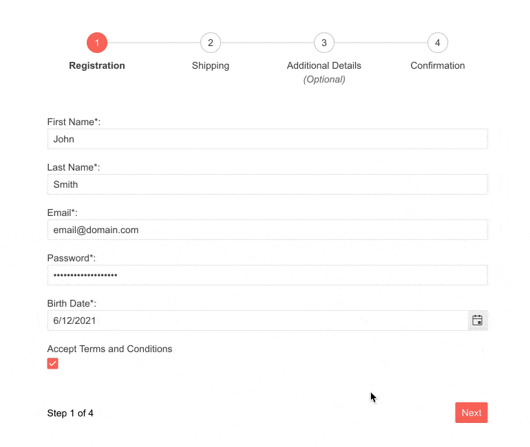
-
Form Integration
To save development time and improve the overall UX, you can integrate the Form component within the Wizard. Thus, each step of the Wizard will function as a separate Form, which enables the use of all input component functionalities, such as custom textboxes, labels and data validation.
Check out the documentation on Blazor Wizard Form Integration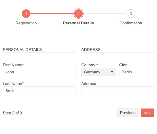
-
Configuration
Multiple options for configuration are available for the Wizard component. The stepper can be positioned in 4 different places – top, bottom, left or right relative to the content. You can choose to disable certain steps of the process using the Disabled parameter and customize step type by choosing to display either number and label or only label. The width and the height can both be adjusted, the pager of the Wizard can be shown or hidden, and the component can be configured in linear mode. Linear mode implies that completion of a previous step would be required to proceed to the next one, or users can go back and forth only one step at a time.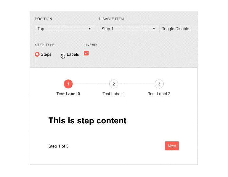
-
Button Options
The Wizard component allows you to easily change the default buttons for each step. The default options include buttons such as Previous, Next, Clear and Submit. If these don’t satisfy your project’s needs, you can always add your own custom buttons.
See the documentation on Blazor Wizard Buttons -
Events
The Blazor UI Wizard component provides several events allowing you to control the whole process when changing the steps and finishing the process in the wizard. For example, the ValueChanged event triggers right after the step has changed, the OnChange event triggers before the step has changed and the OnFinish event is fired when the Done button of the Wizard is clicked. -
Theming
The Wizard component has several built-in themes such as Default (our own styling), Material (based on the Material Design guidelines), Bootstrap (which looks like the Bootstrap styling to integrate better) and Fluent (based on Microsoft Fluent UI). Each theme predefines several series colors, so your data is visualized according to your design guidelines. You can further customize any of the out-of-the box themes, style a specific chart component or create new theme to match your colors and branding by using the Telerik SASS ThemeBuilder application.
-
Keyboard Navigation
With keyboard navigation users can use the arrows to switch between different steps of the Wizard. Home and End buttons serve to navigate to the first and last step of the process.
-
Also Available...
The Wizard component is also available for the following popular Web frameworks:
-
Right-to-Left (RTL) Support
The Telerik UI for Blazor Wizard component supports right-to-left configuration. The RTL functionality is supported by most of our components to accommodate users who communicate in a right-to-left language script, such as Arabic and Hebrew.
Learn more in our Blazor Right-to-Left Support documentation

