UI for Blazor
Blazor Numeric TextBox
- The Blazor Numeric TextBox control allows only decimal values and no text. Customize values and more.
- Part of the Telerik UI for Blazor library along with 110+ professionally-designed UI components.
- Includes support, documentation, demos, virtual classrooms, Visual Studio Code Extensions and more!
-
Use Numeric Values Seamlessly with Blazor Numeric TextBox
The Blazor Numeric TextBox component allows users to enter numerical values in both Blazor WebAssembly (WASM) and Server-side Blazor apps. It is used to get number inputs from users and has several out-of-the-box features such as up/down spinner arrows, number format support, max, min and step values, validation, keyboard navigation, globalization, built-in themes and more.
-
AutoComplete Control
Sometimes you want your input elements to ignore the autocomplete action. If the input field, for example, requires a numeric value like a year or age, it is better for the browser to not offer previous values as suggestions. With the Telerik UI for Blazor NumericTextBox component, you can disable AutoComplete suggestions.
-
Numeric Keyboard Support
The Numeric TextBox component enhances the user experience with support for a numeric-only virtual keyboard. Typing on a mobile device is much faster when you can disregard 90% of the keys on the keyboard and use just the digit buttons!
-
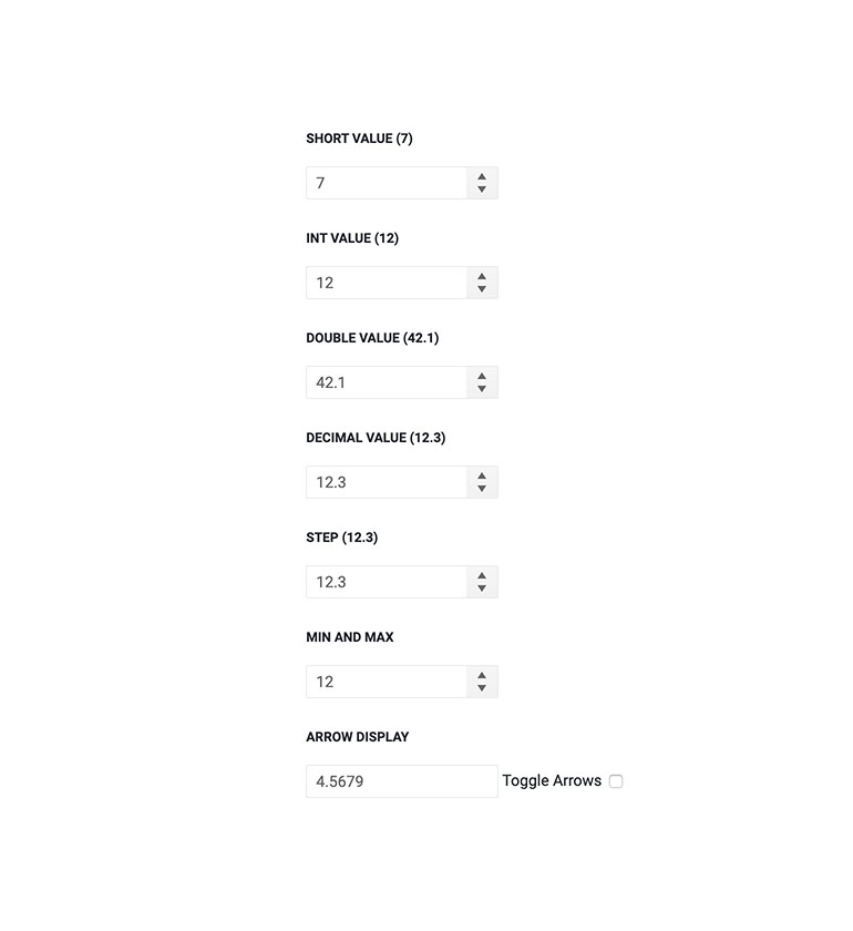
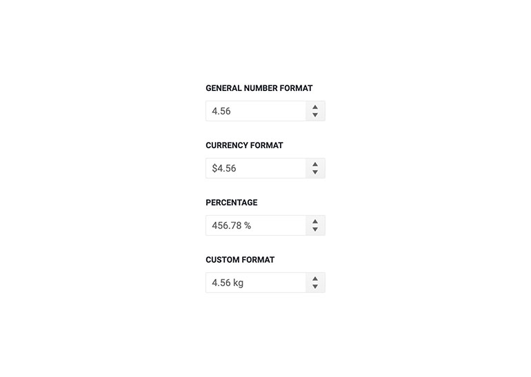
Numeric TextBox Formats
Format the Numeric TextBox with one of the large number of formats listed by Microsoft. Through number formatting, you can easily achieve percentage and currency TextBox behavior in Blazor apps.
-
Numeric TextBox Custom Formats
The Numeric TextBox also supports any custom format. Using a custom format, you can place any symbol or text as a prefix or suffix to the input number.
Example of custom kilograms Numeric TextBox formatting in Blazor.
-
Numeric TextBox Validation
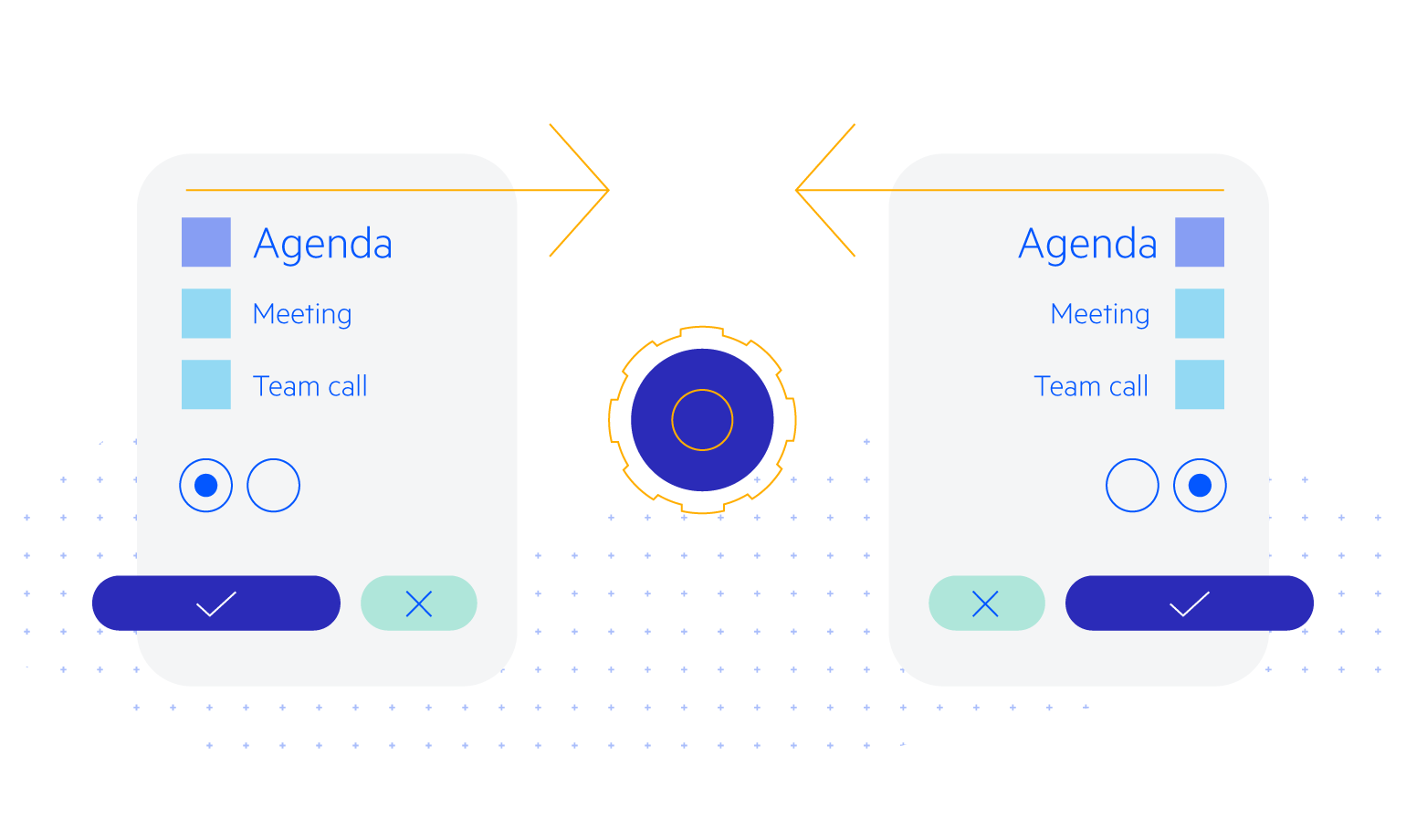
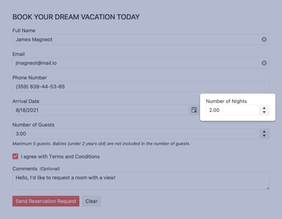
The Telerik UI for Blazor suite supports and integrates seamlessly into Blazor's Forms and Validation infrastructure. All Telerik UI for Blazor Input components (including simple inputs such as TextBox, Numeric TextBox and DateInput) work out of the box when placed inside an EditForm, respond to EditContext changes and provide default invalid styles. You can choose whether validation is triggered on change, blur or while typing – whatever the best option is for each scenario.
When you need to validate user input for out of range values, the Telerik Numeric TextBox for Blazor is the perfect match.
Example of user input validation with Blazor Numeric TextBox component.

-
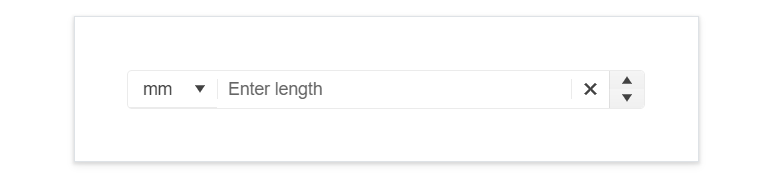
Prefix and Suffix Adornments
Elevate user interactivity leveraging the option for adding prefix and suffix adornments. These are custom items, usually an icon or button, inside the field before or after the input area. Typical prefix adornments are currency symbols or unit indicators, while suffix adornments are often used for password visibility toggles, formatting or clearing the input.
-
Numeric TextBox Events
The Numeric TextBox component exposes 3 events – OnChange, ValueChanged & OnBlur to let you handle user input any way you need to. They are triggered as their names suggest – when the value is submitted, on every keystroke and whenever it loses focus.

-
Numeric TextBox TabIndex
The Blazor Numeric TextBox component, just like all other Telerik UI for Blazor input components, supports keyboard navigation to switch between components thanks to the HTML TabIndex property. Pressing Tab will normally focus the next available input component, the same way your users are accustomed to when standard HTML inputs are used. Having the TabIndex setting lets you customize that order. -
Numeric TextBox Accessibility and Keyboard Navigation
Like all other Telerik UI for Blazor components, the Numeric TextBox component supports out of the box Keyboard Navigation and web accessibility standards implementation. This enables easy navigation through pages using just keyboard, as well as access to component content through assistive technologies.

-
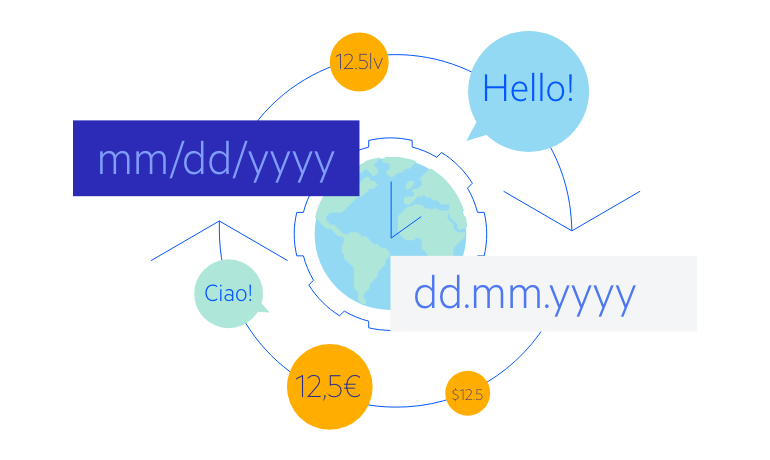
Numeric TextBox Globalization and Localization
The Numeric TextBox has built-in support for localization, which makes it easy to translate your Blazor app to any language your project may require. In addition, the component also features globalization capabilities, so it reflects the device culture and uses it to present the user with the appropriate culture-specific number formats.
-
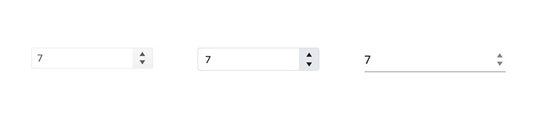
Numeric TextBox Theming
The Telerik Blazor Numeric TextBox component has several built-in themes such as Default (our own styling), Material (based on the Material Design guidelines), Bootstrap (which looks like the Bootstrap styling to integrate better) and Fluent (based on Microsoft Fluent UI). You can easily customize any of out-of-the-box themes, style specific component or create new theme using the Telerik Saas ThemeBuilder application.
-
Right-to-Left (RTL) Support
The Telerik UI for Blazor Numeric TextBox component supports right-to-left configuration. The RTL functionality is supported by most of our components to accommodate users who communicate in a right-to-left language script, such as Arabic and Hebrew.
Learn more in our Blazor Right-to-Left Support documentation