UI for Blazor
Blazor ColorPalette
- Use the Blazor ColorPalette component to render colors by using sets of predefined colors or a custom color palette.
- Part of the Telerik UI for Blazor library along with 110+ professionally-designed UI components.
- Includes support, documentation, demos, virtual classrooms, Visual Studio Code Extensions and more!
-
Play with Colors with Blazor ColorPalette
The Telerik UI for Blazor ColorPalette is a versatile color selection tool with customizable dimensions, colors to choose from and styling. Add a sprinkle of validation and keyboard navigation and you have a quality component to be used across your application.
See the Blazor ColorPalette Demo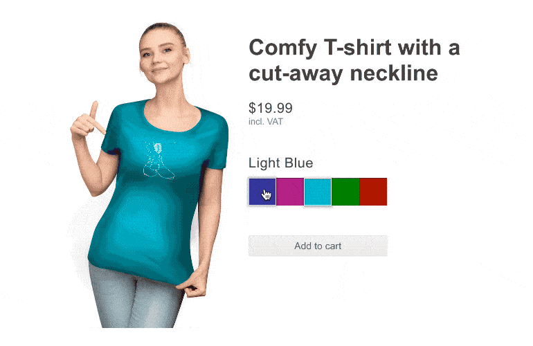
-
Layout and Customization
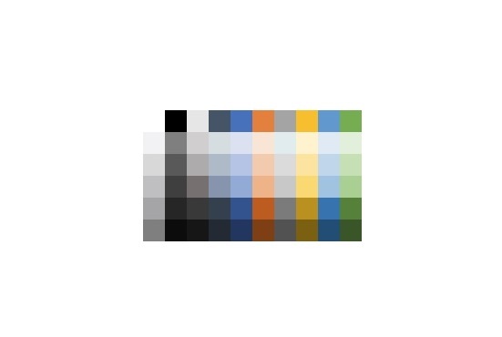
The ColorPalette displays the user with a grid of colors each aspect of which is customizable. You can provide a list of CSS colors (so any combination of RGB(A), HSL(A), hex or CSS names is valid). If you don’t have a concrete set of colors in mind, pick one of the predefined color palettes. The number of rows and columns of the grid and the size of each tile can be specified as well. Thanks to this you can make big single-row or single-column setups when you only need a handful of colors or large selection of tiny tiles.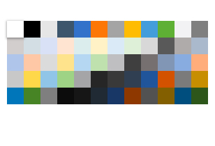
-
Validation
The component fits neatly in the validation system of Telerik UI for Blazor and you can use the standard validation attributes in your model to specify the constraints for the input e.g. by making the input required.
Learn more about the Blazor ColorPalette Validation -
Keyboard Navigation
Users can navigate the palette using the arrow keys and select the desired color by pressing Enter – neither of these requires any explanation and it’s only natural for any users to try to work with these keys.
-
Right-to-Left (RTL) Support
The Telerik UI for Blazor ColorPalette component supports right-to-left configuration. The RTL functionality is supported by most of our components to accommodate users who communicate in a right-to-left language script, such as Arabic and Hebrew.
Learn more in our Blazor Right-to-Left Support documentation