UI for Blazor
Blazor Pager
- Split your data collection into pages effortlessly, and even load items on demand as users browse through the list.
- Part of the Telerik UI for Blazor library along with 110+ professionally-designed UI components.
- Includes support, documentation, demos, virtual classrooms, Visual Studio Code Extensions and more!
-
Organize and Visualize Content in Pages with Blazor Pager Component
The Telerik UI for Blazor Pager is standalone UI component that gives you capability to split content and visualize it beautifully into pages. The Pager has multiple configuration options with which you can define the total number of items, number of items per page, number of visible page buttons, and support for loading data on demand for each page.
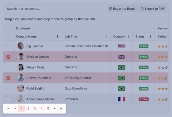
The component has built in support for Localization, Globalization, Keyboard Support and Accessibility and works in both Blazor WebAssembly (WASM) and Server-side Blazor apps. You can integrate paging with other Blazor components easily – just like we do with our Blazor Grid and ListView!
Telerik UI for Blazor Pager demo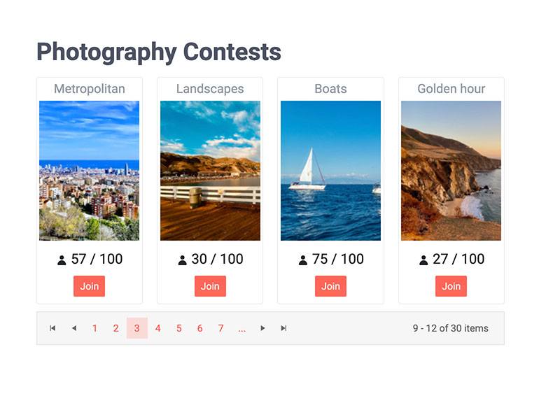
-
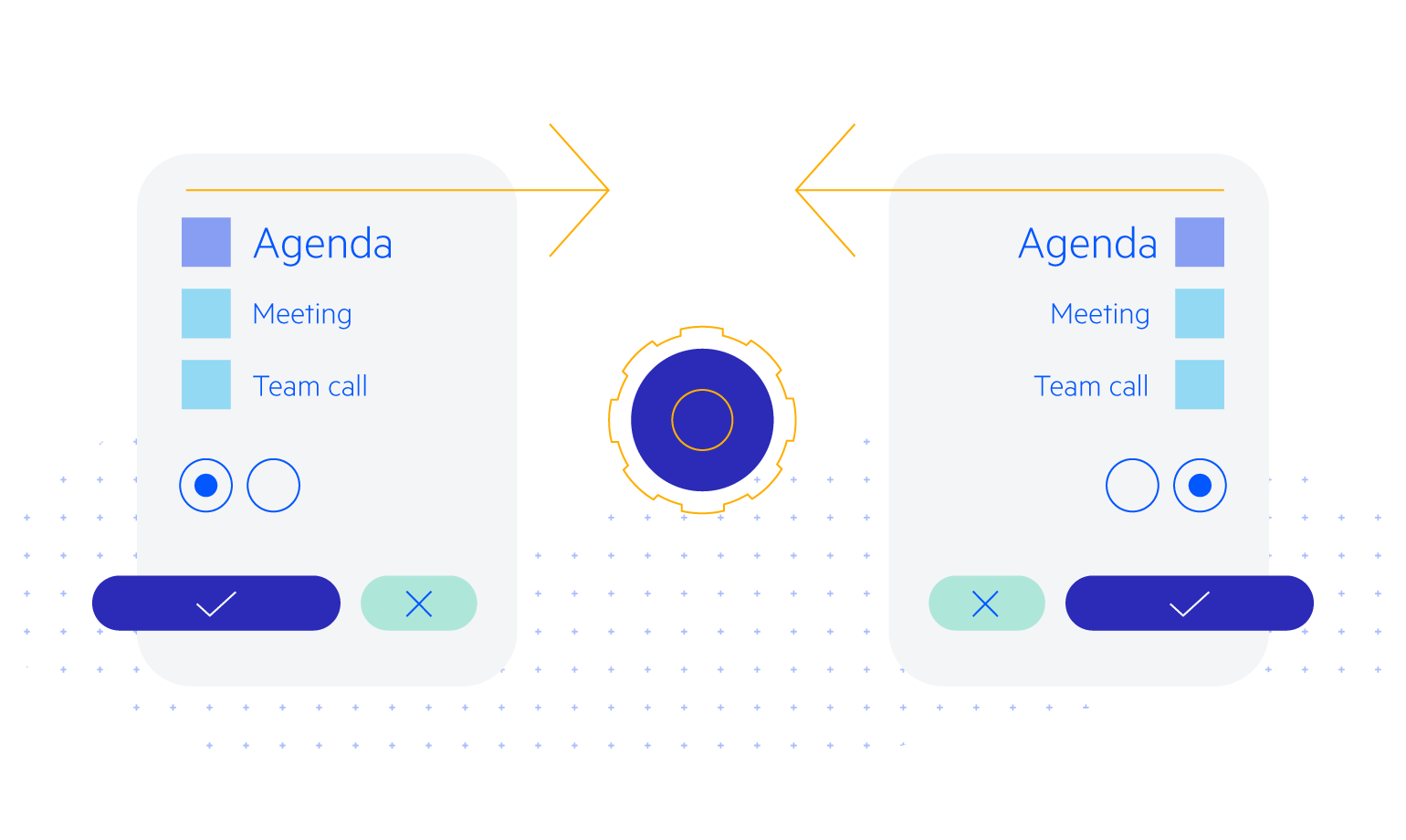
Blazor Pager Component Two-Way Binding
The two-way binding feature of the Pager allows the component to respond to changes from other elements and update them.
Example of Pager component when the page is selected from an outside input.

-
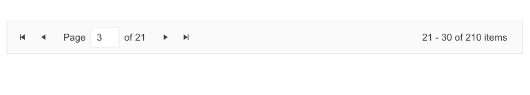
Configure Paging in Blazor Apps
You can easily add paging in Blazor apps and adapt it to your requirements using the multiple configuration options of the Pager component. The component comes handy with the following settings:
- Total - count of items in the data source/ Pager
- PageSize - the number of items to be presented on a page
- Page – current page index of the Pager component
- ButtonCount - maximum number of visible page buttons
- Class - the CSS class that will be rendered on the main wrapping element of the Pager
- Input type – button, rendering page numbers and input, displaying a numeric text box which allows users to type in the preferred page
-
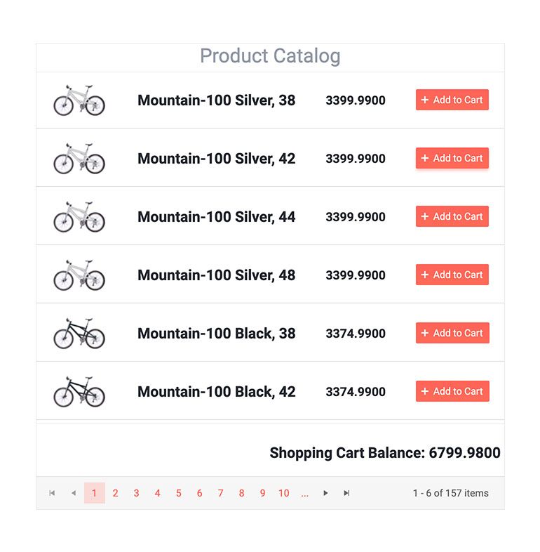
Pager Load Data on Demand
Loading a large data set all at once can sometimes be challenging. One of the most popular approaches is using incremental data loading as additional items need to be visualized, on-demand by the user. Telerik UI for Blazor Pager offers option to load data on demand when a new page is selected, and it allows you to fetch new subset of data for each page, as users browse through the content.
Example of how to implement paging in Blazor with load data on demand.
-
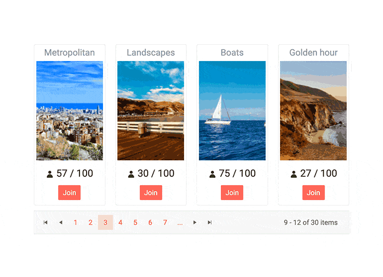
Pager Component Integration
We use the Pager component in our own Blazor components from the Telerik suite (like the Grid and the ListView), and now you can use it with your data and templates too!
-
Responsiveness and adaptability
The Telerik UI for Blazor Pager will look its best independently of the app resolution, aspect ratio, device orientation or other screen or device properties. In the smallest resolution, the buttons of the pager are rendered as a select element.
Check out the Blazor Pager adaptability demo

-
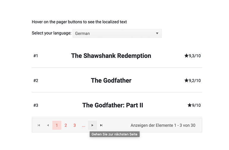
Pager Component Localization
The Pager Component has built-in localization support, which makes it easy to translate texts to any language that your Blazor app may require.
-
Pager Component Keyboard Navigation and Accessibility
Like all other Telerik UI for Blazor components, the Pager component supports out of the box Keyboard Navigation and web accessibility standards implementation (WCAG, Section 508 and WAI-ARIA attributes for screen readers). This enables easy navigation through pages using just keyboard, as well as access to component content through assistive technologies.

-
Pager Theming
The Telerik UI for Blazor Pager has several built-in themes such as Default (our own styling), Material (based on the Material Design guidelines), Bootstrap (which looks like the Bootstrap styling to integrate better) and Fluent (based on Microsoft Fluent UI). You can easily customize any of out-of-the-box themes with a few lines of CSS, or create new theme to match your colors and branding by using the Telerik SASS ThemeBuilder application.
-
Right-to-Left (RTL) Support
The Telerik UI for Blazor Pager component supports right-to-left configuration. The RTL functionality is supported by most of our components to accommodate users who communicate in a right-to-left language script, such as Arabic and Hebrew.
Learn more in our Blazor Right-to-Left Support documentation