UI for Blazor
Blazor MaskedTextBox
- The Blazor MaskedTextBox control ensures valid entry of specific formats - IBAN, SWIFT code, phone number, etc.
- Part of the Telerik UI for Blazor library along with 110+ professionally-designed UI components.
- Includes support, documentation, demos, virtual classrooms, Visual Studio Code Extensions and more!
-
Validate Text Data with Blazor MaskedTextBox
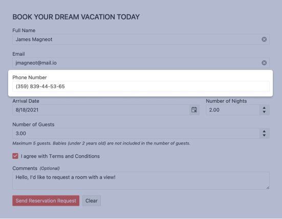
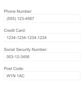
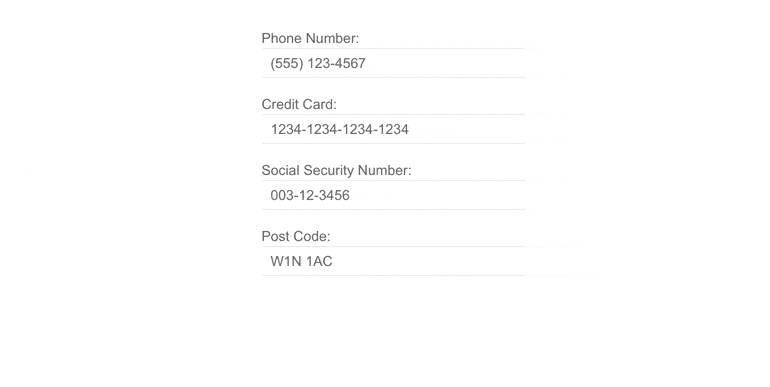
The Telerik UI for Blazor MaskedTextBox component is a text input control with the ability to validate a variety of text data like phone numbers, post codes, personal document numbers (e.g. passport IDs), credit card numbers. In addition to the common input masks you can define specific ones such as company-specific productid, employed etc.
-
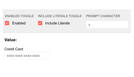
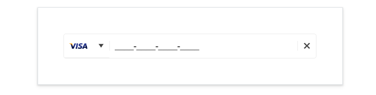
Mask & Prompt
The Mask of the MaskedTextBox is what defines what user input is allowed – the length of the input, the type of characters (e.g. a letter, a digit, etc.) and at what position. For example, the mask “0000-0000-0000-0000” limits inputs only to credit card numbers. The Prompt of the MaskedTextBox is the placeholder value displayed in the control to hint the user at expected type of input. The Prompt can be customized in a way very similar to the mask. Visit the MaskedTextBox docs on how the Mask and Prompt works.
-
Labels
Similarly, to the other text input components in our suite, the MaskedTextBox’s labels can be placed on top of the element statically, or as floating labels which initially appear as placeholder text and then are raised up over the element.
Explore the Blazor MaskedTextBox labels
-
TabIndex
The Blazor MaskedTextBox component, just like all other Telerik UI for Blazor input components, supports keyboard navigation to switch between components thanks to the HTML TabIndex property. Pressing Tab will normally focus the next available input component, the same way your users are accustomed to when standard HTML inputs are used. Having the TabIndex setting lets you customize that order. -
Validation Modes
Validation modes are available with the MaskedTextBox component, which helps you choose whether validation is triggered on change, blur or typing events, allowing you to apply the option best suited for your needs.
See Blazor MaskedTextBox validation examples. -
Prefix and Suffix Adornments
Elevate user interactivity leveraging the option for adding prefix and suffix adornments. These are custom items, usually an icon or button, inside the field before or after the input area. Typical prefix adornments are currency symbols or unit indicators, while suffix adornments are often used for password visibility toggles, formatting or clearing the input.
-
Events
The two standard OnChange and ValueChanged are exposed by the MaskedTextBox Component:
- OnChange is fired whenever the user confirms the new value – by pressing Enter or when the component loses focus. This event can be used with two-way binding.
- ValueChanged is fired on every keystroke. This event cannot be used simultaneously with two-way binding.
- OnBlur - an event which is triggered when it loses focus
Learn more about the Blazor MaskedTextBox Events in our documentation.
-
Theming
The Telerik UI for Blazor MaskedTextBox has several built-in themes such as Default (our own styling), Material (based on the Material Design guidelines), Bootstrap (which looks like the Bootstrap styling to integrate better) and Fluent (based on Microsoft Fluent UI). You can easily customize any of out-of-the-box themes with a few lines of CSS, or create new theme to match your colors and branding by using the Telerik SASS ThemeBuilder application.
-
Right-to-Left (RTL) Support
The Telerik UI for Blazor MaskedTextBox component supports right-to-left configuration. The RTL functionality is supported by most of our components to accommodate users who communicate in a right-to-left language script, such as Arabic and Hebrew.
Learn more in our Blazor Right-to-Left Support documentation