UI for Blazor
Blazor Loader
- Indicate that an operation is ongoing and embed the loader into the tightest app areas with the Blazor Loader.
- Part of the Telerik UI for Blazor library along with 110+ professionally-designed UI components.
- Includes support, documentation, demos, virtual classrooms, Visual Studio Code Extensions and more!
-
Showcase Load Progress with Blazor Loader
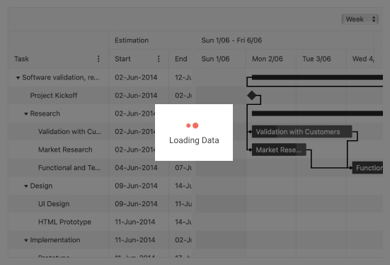
Use the Telerik UI for Blazor Loader component to visually communicate to the user that your application is doing work in the background. For example, when loading or submitting data or processing large amounts of data/updates. With its multiple configuration options, the Loader fits any app.
-
Customization
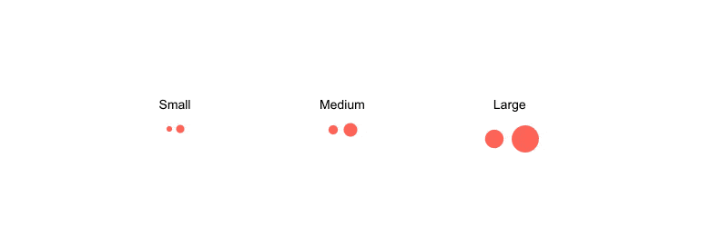
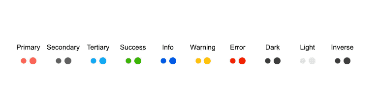
There are three main customization options for the Loader:
- The type of animation the Loader uses—Pulsing, Infinite spinner or Converging spinner
- The main color
- The loader size—choose between small, medium and large
-
Integration
The Loader can be easily integrated with other Telerik UI for Blazor components to indicate that an operation is executing. Check out an example on how to integrate a Loader indicator with a Button component
-
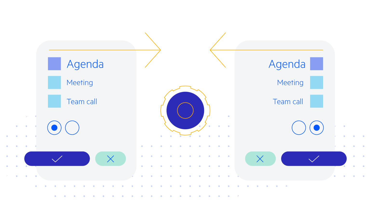
Right-to-Left (RTL) Support
The Telerik UI for Blazor Loader component supports right-to-left configuration. The RTL functionality is supported my most of our components to accommodate users who communicate in a right-to-left language script, such as Arabic and Hebrew.
Learn more in our Blazor Right-to-Left Support documentation