UI for Blazor
Blazor ColorGradient
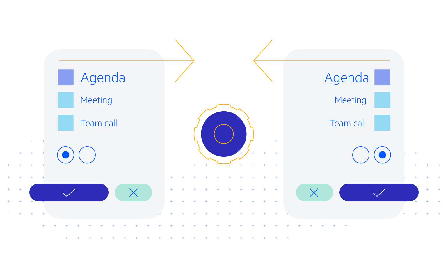
- Use the Blazor ColorGradient to customize colors through gradient canvases, hue and alpha sliders and editors.
- Part of the Telerik UI for Blazor library along with 110+ professionally-designed UI components.
- Includes support, documentation, demos, virtual classrooms, Visual Studio Code Extensions and more!
-
Customize Color Content with Blazor ColorGradient
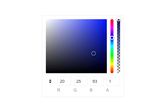
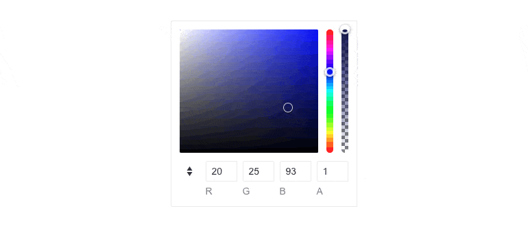
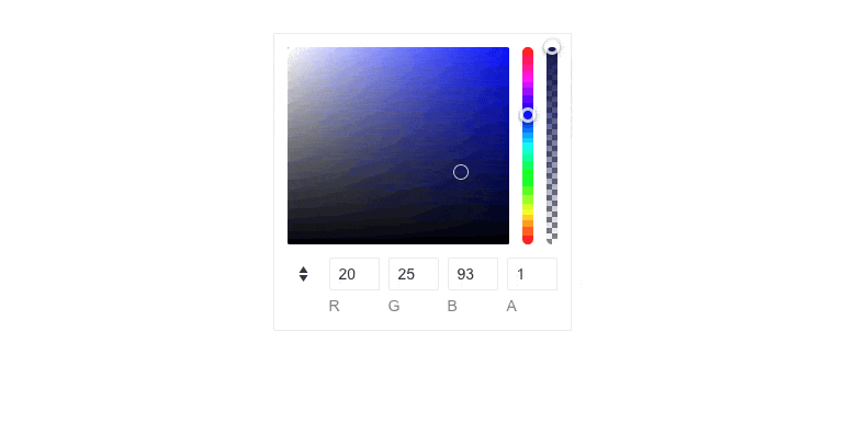
The Telerik UI for Blazor ColorGradient component allows you to customize color content through a HSVA canvas configurator, which includes a gradient canvas, hue and alpha sliders. You can input colors in the most popular formats, HEX and RGBA. The component is easy to configure, comes with built-in support for keyboard navigation and is compliant with accessibility standards.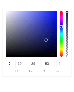
-
Choosing Color
Users can choose the color they want by utilizing the canvas, the sliders or the numeric editors. They can use all three to explore the different options and find the one that best suits their case. -
Configuration
You have full control over the ColorGradient component rendering. You can toggle the opacity slider, include both HEX and RGB formats, just one of them or none.
The ColorGradient can be customized through three parameters:
- Opacity
- Format
- Formats (HEX or RGB)
-
Accessibility
The ColorGradient component is compliant with WCAG contrast ratio, thus, you can rest assured that it is accessible to all users.
-
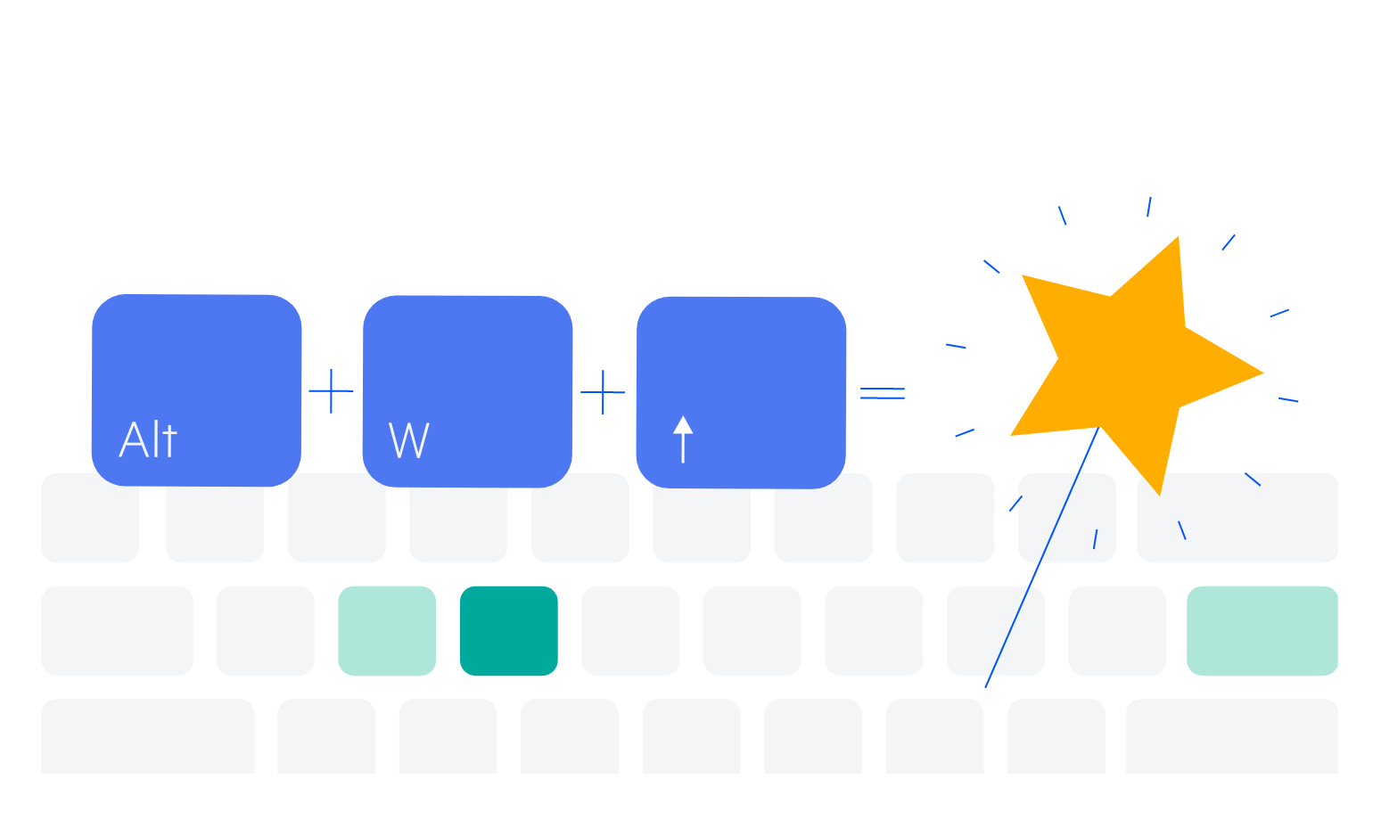
Keyboard Navigation
The component comes with built-in support for keyboard navigation, allowing users to navigate the canvas, sliders and numeric editors with their keyboard.
-
Theming
The Telerik UI for Blazor ColorGradient comes with four built-in themes and a variety of swatches, including Default (Main Dark, Nordic, Purple), Material (Arctic, Lime Dark, Nova), Bootstrap (Urban, Vintage, etc.) and Fluent. You can easily customize the available themes with a few lines of CSS or create a new one with the Progress Sass ThemeBuilder application.
-
Right-to-Left (RTL) Support
The Telerik UI for Blazor ColorGradient of component supports right-to-left configuration. The RTL functionality is supported by most of our components to accommodate users who communicate in a right-to-left language script, such as Arabic and Hebrew.
Learn more in our Blazor Right-to-Left Support documentation