
UI for Blazor
Blazor Circular Gauge
- Use the Blazor Circular Gauge to visualize numeric values on a radial scale.
- Part of the Telerik UI for Blazor library along with 110+ professionally-designed UI components.
- Includes support, documentation, demos, virtual classrooms, Visual Studio Code Extensions and more!

-
Simplify Data Visualization with Blazor Circular Gauge
Gauges come in many sizes and forms to fit many data visualization needs. Nothing says “This process has progressed this many percentage points” as the Telerik UI for Blazor Circular Gauge. Any user will immediately understand as the gauge shows the relation between the part of a whole in an obvious way.
See the Blazor CircularGauge demo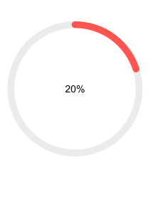
-
Scale Customization
The Gauge’s visual properties can be modified including the colors of the labels and ticks, whether labels and ticks are displayed at all or whether the Gauge’s value moves clockwise or counterclockwise.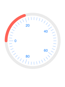
-
Center Template
The Circular Gauge obviously won’t be a circle if it doesn’t have a center point and what’s a better place to add additional information if not in the central place of the chart. The component supports changing how the label at the center looks and what it does – you only need to provide a template with whatever your vision is.
Check out the Blazor CirculaGauge Center Template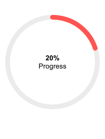
-
Right-to-Left (RTL) Support
The Telerik UI for Blazor Circular Gauge component supports right-to-left configuration. The RTL functionality is supported by most of our components to accommodate users who communicate in a right-to-left language script, such as Arabic and Hebrew.
Learn more in our Blazor Right-to-Left Support documentation

