
Kendo UI for Angular
Angular SegmentedControl
- Easily present a small set of mutually exclusive options with the Kendo UI for Angular Segmented Control
- Part of the Kendo UI for Angular library along with 110+ professionally-designed components.
- Includes support, documentation, demos, virtual classrooms, Visual Studio Code Extensions and more!
-
Faster Decisions, Clearer Choices
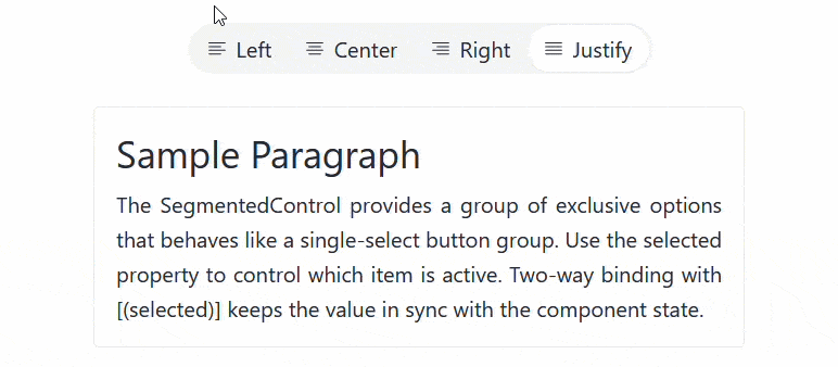
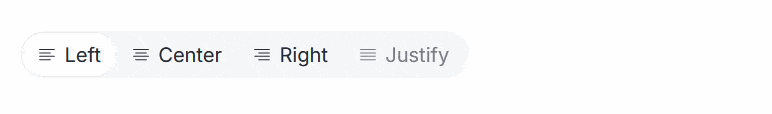
Kendo UI for Angular SegmentedControl enables you to present a small set of mutually exclusive options. It renders a group of buttons where only one item can be selected at a time, with a sliding indicator that clearly shows the current selection. This UI component makes it a good alternative to radio buttons or dropdowns when space is limited and quick switching is important.
-
Binding Items
Define each option with clarity and precision by binding it to a collection of configuration objects. By passing an array of SegmentedItemSettings to the items property, you can fully control how each button looks, behaves, and communicates its purpose.
See the Kendo UI for Angular Segmented Control binding items demo
-
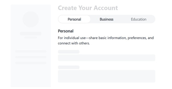
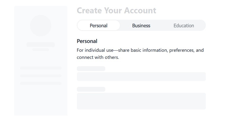
Selected Item
The Kendo UI for Angular SegmentedControl gives you direct control over which option is selected, making it easy to manage both the initial state and ongoing user interaction. By default, the first item is active, but you can set any option as the starting point by assigning the desired index.
See the Kendo UI for Angular SegmentedControl selected items demo
-
Disabled Items
Disable individual options when they are not available or relevant. By setting the disabled property to true for specific items in the configuration, you can prevent selection and clearly communicate limitations to users.
See the Kendo UI for Angular SegmentedControl disabled items demo
-
Layout Mode
The Kendo UI for Angular SegmentedControl allows you to select how options are sized and distributed, so you can match the layout to your design and content. You can define whether items take only the space they need or expand to fill the available width. It supports two straightforward modes:
- Compact (default): Each item is sized based on its content
- Stretch: All items expand evenly to fill the container
This flexibility helps you create interfaces that are both space-efficient and visually balanced.
See the Kendo UI for Angular SegmentedControl layout mode demo
-
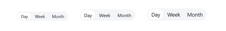
Appearance
The SegmentedControl includes built-in size options that let you adapt the component to different layouts and interaction needs. The available sizes are straightforward:
- Small: Compact and space-efficient
- Medium: Balanced default for most use cases Large: Increased visibility and easier interaction
See the Kendo UI for Angular Segmented Control appearance demo
.gif?sfvrsn=69d0ee3d_2)
-
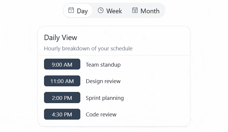
Icons
You can further enhance the content of the Kendo UI for Angular SegmentedControl items by displaying SVG icons, font icons, or a combination of icons and text.

-
Events
The SegmentedControl emits a selectedChange event whenever the user selects a different option, giving you a simple and reliable way to react to user input.

Get Started with Kendo UI for Angular
