
UI for ASP.NET Core
ASP.NET Core DropDownList
- Offer your users a choice between a list of predefined options with the ASP.NET Core DropDownList component.
- Part of the Telerik UI for ASP.NET Core library along with 110+ professionally designed UI components.
- Includes support, documentation, demos, virtual classrooms, Visual Studio Code Extensions and more!

-
Deliver Feature-rich Dropdown List of Items
ASP.NET Core DropDownList offers a lightweight but feature-rich drop-down list of items. Users can select a single item from a predefined list, they can search and filter the list. You have full control over the looks of your drop-down list thanks to the many built-in features such as grouping, virtualization, templates and themes. The semantic rendering improves app responsiveness and makes your web pages SEO friendly. And you also get a ton of standard features like the user-friendly interface, enhanced mobile support, keyboard support, RTL support, and a and rich API with a comprehensive set of events.
-
ASP.NET Core DropDownList Data Binding
Bind ASP.NET Core DropDownList to a wide range of data sources: static arrays, local or remote data, or even Web API endpoints. You can configure the data binding in just a few steps.

-
DropDownList Virtualization
With the built-in virtualization feature, the DropDownList component displays large data sets quickly and efficiently. When the user scrolls through the list, the control retrieves only a specified data size instead of requesting the whole data set at once.
-
Adaptive Mode
Setting the AdaptiveMode parameter to AdaptiveMode.Auto provides you with a mobile-friendly rendering of the DropDownList suggestion popup. This mode allows the picker component to change its rendering and automatically adapt to the current screen size.
See the Telerik UI for ASP.NET Core DropDownlist Adaptive Rendering Demo
-
DropDownList Floating Label
Save space while retaining the context of form fields with the DropDownList Floating Label feature. Create a smoother and more efficient experience for end-users by adding a label that moves above the input field upon clicking.
-
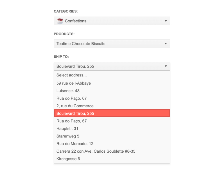
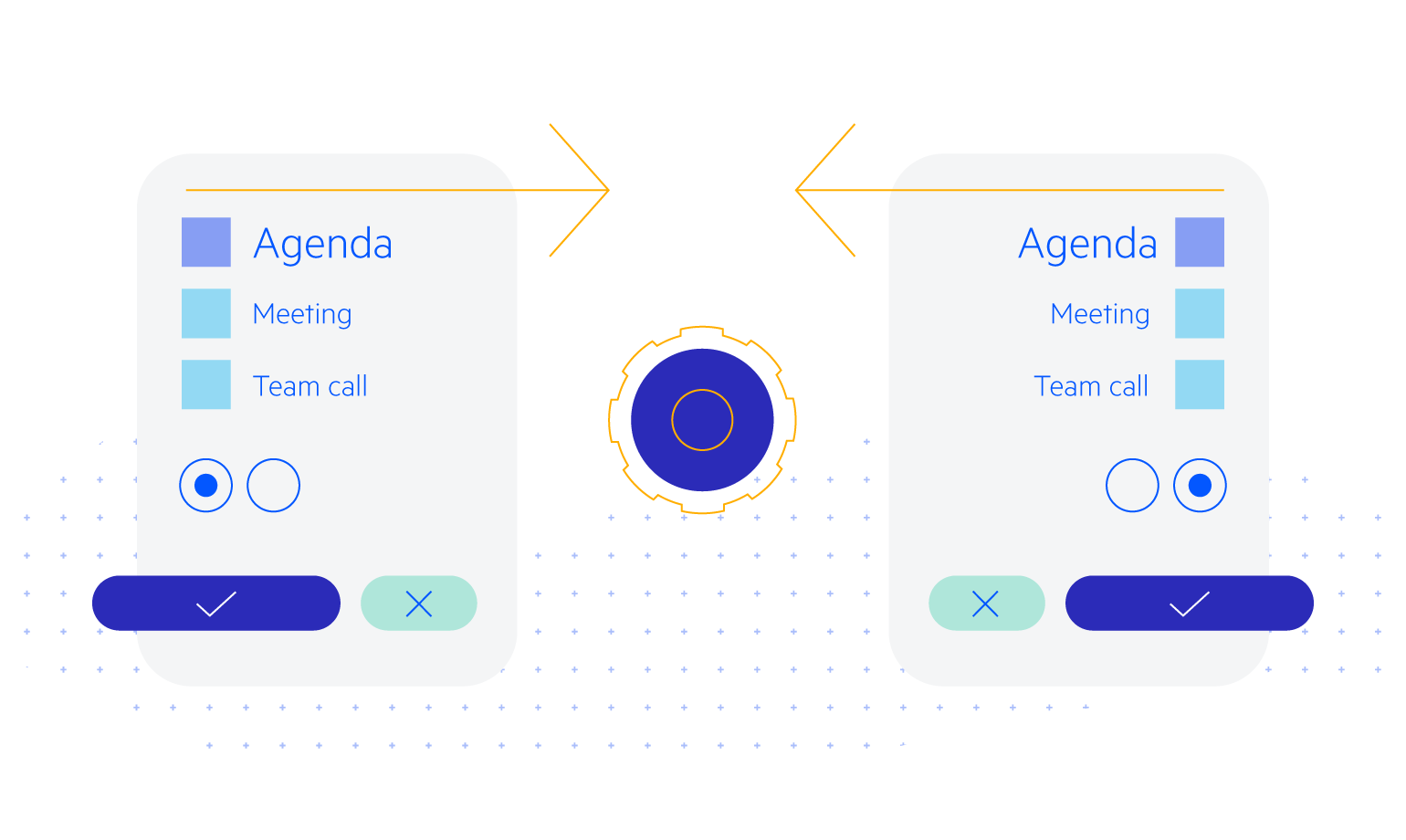
Cascading DropDownList
With the ASP.NET Core DropDownList control, you can easily cascade drop-down lists to create a hierarchy. This allows you to automatically filter the items in a subordinate list based on the selection in the superior list. As you would expect, the result is an improved user experience.
-
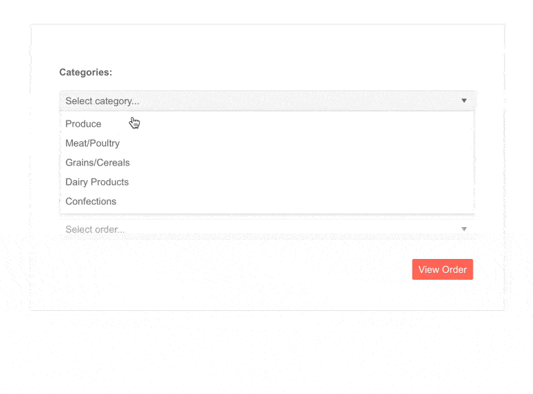
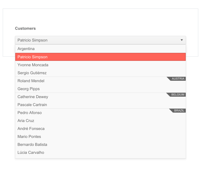
Grouping DropDown List Items
The ASP.NET Core DropDownList allows you to easily group similar items into categories. These groups are visual aids that ease the navigation and enhance the user experience.
-
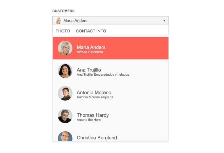
Customize DropDown Lists with Templates
Take advantage of the full control over the appearance of the ASP.NET Core DropDownList. Through our templates, you can command how an item, a selected value, or pop-up headers and footers are rendered.
-
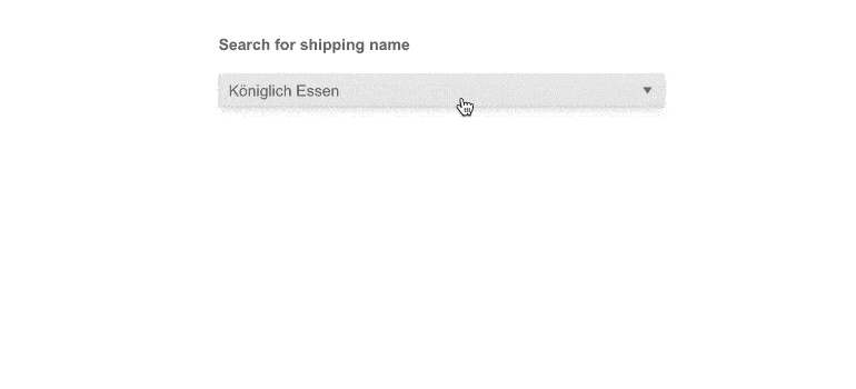
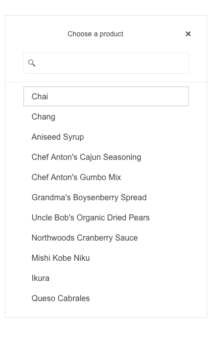
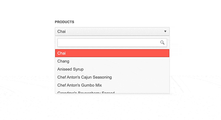
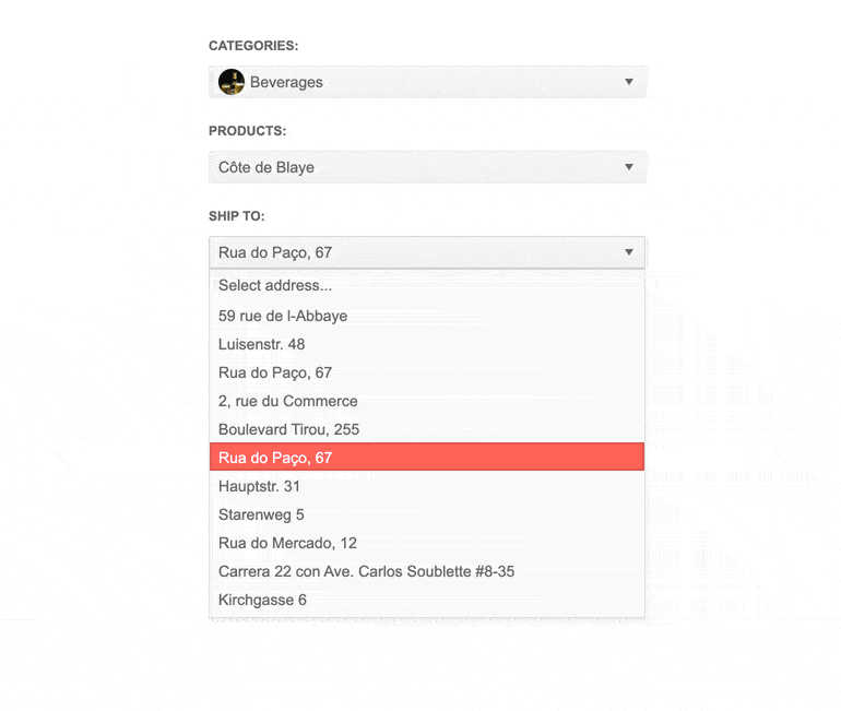
DropDownList Client and Server Filtering
Enhance the user experience with efficient filtering. The filter kicks in immediately after you start typing. With only a few settings, you can quickly adjust the ASP.NET Core DropDownList for client or server filtering.
-
DropDownList HTML Helpers and Tag Helpers
With Telerik UI for ASP.NET Core you are free to choose the development approach that best suits your needs. Enjoy the HTML-like development experience and the rich IntelliSense that come with the ASP.NET Core DropDownList Tag Helper. Or use the convenient HTML Helper. We have both, the decision is yours.

-
DropDownList Built-in Validation
Utilize the built-in client and server validation of ASP.NET Core with our ASP.NET Core DropDownList control. This ensures that you can properly display validation messages if a data processing error occurs
-
Rich API
Telerik UI for ASP.NET Core comes with a complete server-side API. You can configure all features of the DropDownList component with simple API calls designed to feel natural. Since the server-side wrappers output JavaScript, you also have full access to the client-side API for maximum control in the browser.

-
Declarative Initialization
Declarative initialization—a feature that serializes the component declaration as an MVVM declarative configuration instead of an inline initialization script—is supported in Telerik UI for ASP.NET Core DropDownList. It is beneficial in cases when the Content Security Policy (CSP) is enabled as it eliminates the requirement to call the methods that defer the initialization script generated after the component's HTML markup.
See Telerik UI for ASP.NET Core DropDownList declarative initialization demo
-
Right-to-Left (RTL) Support
Use the ASP.NET Core DropDownList control in any application. Even if you design it for languages like Arabic or Hebrew, where users read from right to left. With only a few settings, you can adjust the RTL (Right to Left) feature and rearrange the DropDownList in your application.
-
Accessibility and Keyboard Navigation
The Semantic HTML approach and the support of accessibility standards like WCAG, Section 508, and WAI-ARIA attributes for screen readers make it easier for users with disabilities to utilize the ASP.NET Core DropDownList.
Our control comes with a built-in keyboard navigation support that allows users to easily interact with the DropDownList in your application through their keyboard.

-
Theming
The Telerik UI for ASP.NET Core DropDownList has 20+ built-in themes and swatches. Explore the Default (our own styling), Material (based on the Material Design guidelines), Bootstrap (which looks like the Bootstrap styling to integrate better) and Fluent (based on Microsoft Fluent UI) themes and choose the swatch that best suits your application. You can easily customize any theme with a few lines of CSS or create a new one to match your colors and branding with the Progress SASS ThemeBuilder application.
-
Also Available...
The DropDownList component is also available for these popular Web frameworks:
