
Getting the Most out of the Telerik UI for ASP.NET Core DropDownList

Summarize with AI:
Let’s see how powerful the dropdown component from Telerik UI for ASP.NET Core really is. With a variety of customization options and easy integration into other components, this straightforward tool will be a big help!
From a user experience perspective, dropdowns are very handy when the user must choose an option from a predetermined set like a movie genre, a flavor of ice cream or a sock size.
However, a functional, well-styled dropdown is difficult to implement. Usually, a designer would create the appearance, a frontender would implement the design and a backend developer would set up the data binding. A large overhead for just one input.
Here comes the Progress Telerik UI for ASP.NET Core DropDownList, providing a quickly configurable dropdown packaged in .NET Core HtmlHelper and TagHelper wrappers.
Sound good? We’re just getting started.
The DropDownList component can be styled by a variety of pre-built themes, which handle its popup animation.
Its built-in messages have been translated to over 30 languages by the active community that uses Telerik UI.
Furthermore, complex scenarios can be easily implemented by configuring JavaScript handlers for the events of the DropDownList.
Table of Contents:
A Quick Setup
Like most dropdowns, the Telerik UI for ASP.NET Core component binds to a model and needs an Id field for its .DataValueField and a Text field for its .DataTextField configurations.
Bind it to data however you wish—by passing a static collection or configuring a server endpoint the response of which is consumed and added to the DropDownList by the DataSource configuration. The DataSource is a separate component that’s integrated with the DropDownList to handle its data operations and server communication.
“That sounds like a lot of work, I thought you said quick set up.”
All right, if you use Visual Studio or Visual Studio Code, the Telerik UI for ASP.NET Core productivity tools will enable you to get the basic configuration of the DropDownList by just writing one short line.
HtmlHelper
TagHelper

What’s left for you then is to set the name of the component. That name will be used for the id HTML attribute on the client side.
Set an OptionLabel to be displayed when no value is selected.
Choose if you’d like to use filtering or not.
Finally, configure an Action method in the Controller to supply the data for the component. Then configure the Read Transport of the DataSource to call the server endpoint.
.DataSource(source =>
{
		source.Read(read => {
read.Action("ActionName", "ControllerName"});
	})
When the server responds with the data, the binding will be done automatically based on the .DataValueField and .DataTextField configurations.
Expanded Functionality and Features
Alongside the basic functionality, the DropDownList provides some niche fеatures.
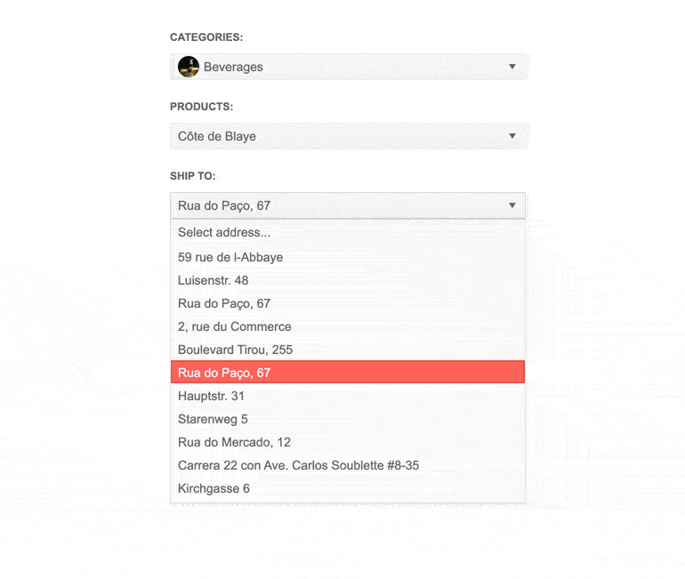
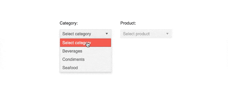
Cascading Dropdown
A set of DropDownLists can be configured to cascade from one another. Cascading is when the input in one component enables the other. This is useful when the selection of the parent DropDownList determines the data set of the child.
Cascading DropDownLists are also beneficial in cases when you want to present multiple options but consume as little screen real estate as possible. The cascading lists aim to speed up navigation, especially for those users who repeatedly interact with a particular application.
To set up a cascading child, ensure it is initially disabled by configuring it’s .Enable(false) and .AutoBind(false) properties. Then pass the name of its parent to the .CascadeFrom property. This way, when a value is selected in the parent the child will be enabled and will bind to data.
To filter the data response of the server, enable .ServerFiltering and add a Data property to the Read Transport of the DataSource.
.DataSource(source => source
     .Custom()
     .ServerFiltering(true)
     .Transport(transport => transport
     .Read(read =>
        {
          read.Action("Overview_Get_Products","DropDownList")
             .Data("filterProducts");
        }))
)
The string parameter passed to the Data property must correspond to a JavaScript handler function. In it, access the value of the parent with jQuery. The variable that is returned by the handler function will be attached to the Payload of the Read request. Use it to filter the data set of the child at the backend.
function filterProducts() {
    return {
        categories: $("#categories").val()
    };
}
Review the DropDownList Cascading in more detail by checking this Telerik REPL example.
Customize the Look of Your Dropdown with Templates
The REPL example above also showcases another powerful feature of the DropDownList. I’m referring to the Kendo UI Templates that you can use to customize the look of the Component.
The above listed example shows the Template, ValueTemplate and FooterTemplate configuration methods. These methods integrate Kendo UI Templates and enable you to add custom HTML, CSS and JavaScript to the respective part of the component to which they are applied.
Here is a snippet how you can configure an external Template to customize the items of the DropDownList:
.TemplateId("dropDownListTemplate")

<script id="dropDownListTemplate" type="text/x-kendo-template">
    <span class="k-state-default" style="background-image: url(" + Url.Content("~/shared/web/dropdownlist/") + "#:data.CategoryId#.jpg");" ></span>
    <span class="k-state-default" style="padding-left: 15px;">
        <h3>#: data.CategoryName #</h3>
    </span>
</script>
The DropDownList also exposes the following template configuration methods—GroupTemplate, HeaderTemplate, NoDataTemplate and OptionLabelTemplate. Click on their names and visit the server-side API to view more information about them.
The DropDownList custom templates open the door for endless customization by giving you the control to add images or icons or to style the selected values, and the popup headers. You can easily make the DropDownList content more personalized, hence more appealing and user friendly.
Let’s say you’re using the component to collect customer details or feedback—the templates can help improve the response rates by creating a more customized look and feel.
OptimizeYour Dropdown with Virtualization
Additionally, the DropDownList supports Virtualization. That is an optimization practice that improves the performance when large data sets are used.
It works by requesting a new page of data from the server every time the user scrolls out of the page that is loaded in the popup.
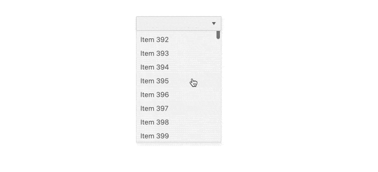
Leveraging the virtualization feature of Telerik UI for ASP.NET Core DropDownList component you can effortlessly improve the application performance when you deal with a lot of data that needs to be loaded. Often the virtualization feature won’t even be noticed by the end user as it optimizes the experience on a subconscious level.
To configure the Virtualization, you need to set the PageSize option of the DataSource. Then enable the .Virtual property by setting the .ItemHeight explicitly.
.Virtual(v => v.ItemHeight(26))
Optionally, if the component has an initial value or if you use the client-side value method also configure the .ValueMapper method to get the index of that value and subsequently load the appropriate page that contains it.
.Virtual(v => v.ItemHeight(26).ValueMapper("valueMapper"))
<script>
    function valueMapper(options) {
        $.ajax({
            url: "@Url.Action("Orders_ValueMapper", "DropDownList")",
            data: convertValues(options.value),
            success: function (data) {
                options.success(data);
            }
        });
    }

    function convertValues(value) {
        var data = {};

        value = $.isArray(value) ? value : [value];

        for (var idx = 0; idx < value.length; idx++) {
            data["values[" + idx + "]"] = value[idx];
        }

        return data;
    }
</script>
The Integration Way
Speaking of integration—no input stands alone. The DropDownList is no exception.
In most cases, the editor components are used in forms. We didn’t miss that fact when we created the Telerik UI for ASP.NET Core Form component. The Form’s items allow you to customize the way they are edited. Among other editor components, they also enable you to use a DropDownList.
If you need to collect feedback information from your customers—e. g., how they learned about your business—the easiest way to do that is to set up a form with a DropDownList containing the list of available options on the web app.
Adding a dropdown list to a web app form empowers users with a seamless and effortless way to provide information without any need for manual input.
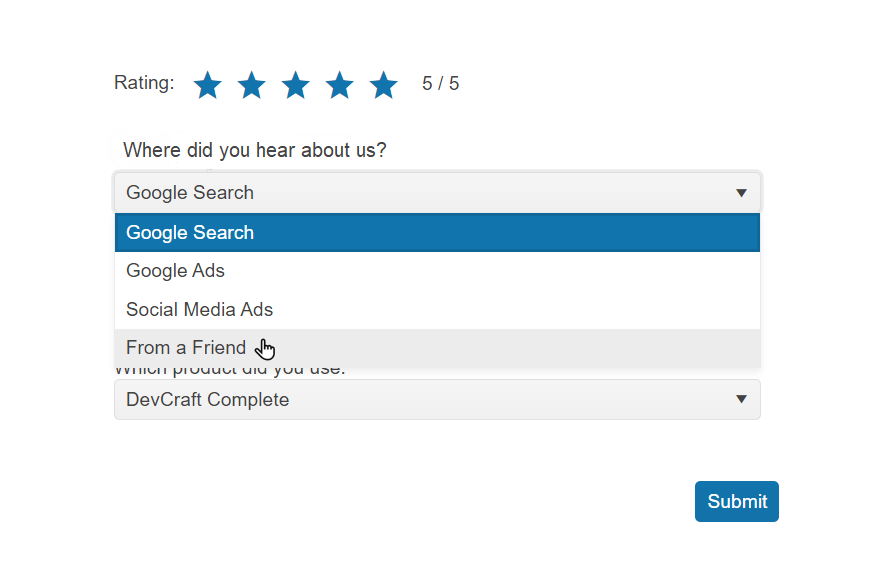
To achieve that, configure a DropDownList as the Editor property of the Form Item.
@(Html.Kendo().Form<Kendo.Mvc.Examples.Models.Form.FormItemsViewModels>()
        .Name("exampleForm")
        .Items(items =>
        {
            items.AddGroup()
                .Label("Registration Form")
                .Items(i =>
                {

                    i.Add()
                        .Field(f => f.ModelField)
                        .Label(l => l.Text("DropDownList:").Optional(true))
                        .Editor(e =>
                        {
                            e.DropDownList()
                                .HtmlAttributes(new { })
                                .OptionLabel("Select...")
                                .DataTextField("ProductName")
                                .DataValueField("ProductID")
                                .DataSource(source =>
                                {
                                    source.Read(read =>
                                    {
                                        read.Action("Items_GetProducts", "Form");
                                    })
                                    .ServerFiltering(true);
                                });
                        });
                });
        })
)
For more information on the configuration of the Form Component, refer to its related Form Docs and Form Demos.
Another common integration scenario is using a DropDownList to edit a column of the Telerik UI for ASP.NET Core DataGrid. Adding a dropdown list to a Grid component’s
column further facilitates data entry—it limits the entry choices for a selected column, speeds up data entry and reduces errors caused by fatigue.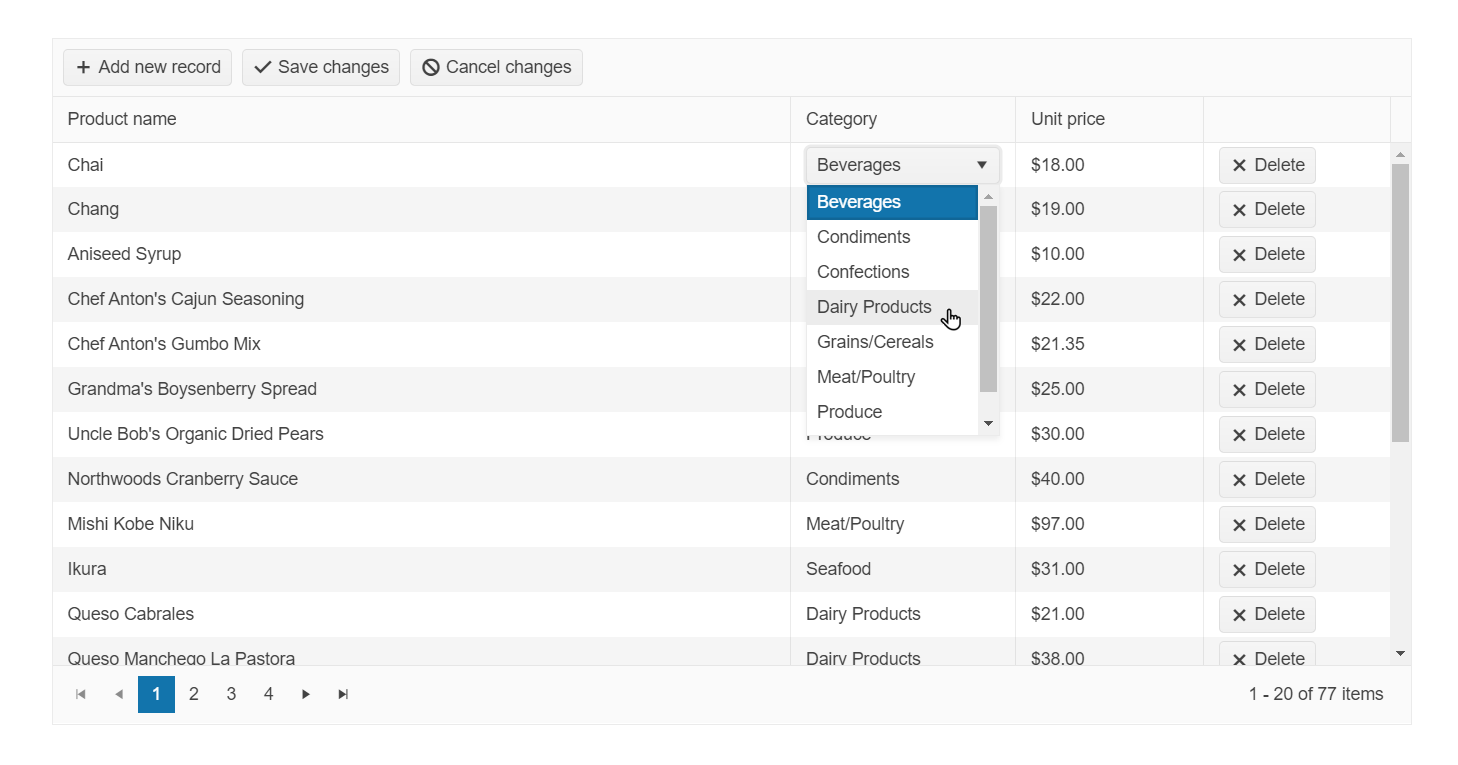
To integrate a DropDownList into a Grid, you can either add a UIHint data annotation to the field that binds to the particular column:
[UIHint("ClientCategory")]
public CategoryViewModel Category
{
  get;
  set;
}
Or configure an .EditorTemplateName of the column:
columns.Bound(p => p.Category).EditorTemplateName("ClientCategory");
In both cases, upon serialization the Grid will look for a ClientCategory.cshtml Partial View in the Views/Shared/EditorTemplates directory of the project.
There you have two options as well—using a static collection for the data:
@model Kendo.Mvc.Examples.Models.CategoryViewModel

@(Html.Kendo().DropDownListFor(m => m)
            .DataValueField("CategoryID")
            .DataTextField("CategoryName")
            .BindTo((System.Collections.IEnumerable)ViewData["categories"])
)
Or a DataSource:
@model Kendo.Mvc.Examples.Models.CategoryViewModel

@(Html.Kendo().DropDownListFor(m => m)
            .DataValueField("CategoryID")
            .DataTextField("CategoryName")
            .DataSource(source =>
           {
              source.Read(read =>
             {
               read.Action("ActionName", "ControllerName");
             })
            .ServerFiltering(false);
           })
)
As a next step, make sure that the .DataTextField of the DropDownList is displayed in the column by adding an inline ClientTemplate.
columns.Bound(p => p.Category).EditorTemplateName("ClientCategory") .ClientTemplate("#=Category.CategoryName#");
You can also set a default value in the Grid’s DataSource Model property. That value will be applied to the DropDownList when a new row is created.
.DataSource(dataSource => dataSource
            .Ajax()
            …
            .Model(model =>
            {
                model.Id(p => p.ProductID);
                model.Field(p => p.Category).DefaultValue(
                    ViewData["defaultCategory"] as Kendo.Mvc.Examples.Models.CategoryViewModel);
            })
            …
        )
An example of the approach can be seen in the Grid’s Custom Editing Demo.
Finally, in custom scenarios where you use complex Kendo UI Templates, you can add the DropDownList in them with the use of its .ToClientTemplate method.
<script id="ddlTemplate" type="text/x-kendo-template">
    @(Html.Kendo().DropDownList()
                 .Name("color")
                 .DataTextField("Text")
                 .DataValueField("Value")
                 .Events(e => e.Change("change"))
                 .BindTo(new List<SelectListItem>() {
                 new SelectListItem() {
                     Text = "Black",
                     Value = "1"
                 },
                 new SelectListItem() {
                     Text = "Orange",
                     Value = "2"
                 },
                 new SelectListItem() {
                     Text = "Grey",
                     Value = "3"
                 }
             })
                 .Value("1")
                 .HtmlAttributes(new { style = "width: 100%" })
           )
           .ToClientTemplate()
</script>
In conclusion, the DropDownList proves to be a versatile and simple to use tool to enhance the digital experience provided by your web project.
It is quick to set up if you’d like to take advantage of its basic features.
It is surprisingly powerful if you have a more complex requirement at your hands and need to dive deeper.
Try out the Telerik UI for ASP.NET Core DropDownList Today
Want to start taking advantage of the ASP.NET Core DropDownList, or any of the other 110+ ready-made components, like the ASP.NET Core Grid or the Scheduler? Start a free trial today and experience for yourself that building rich interactive applications for half the time is not a fairytale.
Try Telerik UI for ASP.NET Core
Sharing Is Caring
Once you try the DropDownList component, don’t forget to share your opinion and ideas either in the comment section below or by visiting the Telerik UI for ASP.NET Core’s Feedback Portal. Your input makes a difference!

Stoyan Goranov
Stoyan Goranov was a Technical Support Engineer on the Progress Telerik UI for ASP.NET MVC and Core team.
Related Posts
Comments
All articles
Topics
Web MobileMobile
Desktop
Design
Productivity
People
