
What’s New in R1 2023 with Telerik UI for Web

Summarize with AI:
R1 2023 brings a lot of helpful updates to Progress Telerik Web libraries for Blazor, ASP.NET Core, ASP.NET MVC and ASP.NET AJAX. Learn more!
Common Release Items
Accessibility Improvements
Ensuring the accessibility (A11Y) of all user interface components has been a priority for Telerik in recent years. The R1 2023 release of Telerik UI libraries includes enhancements to attributes and keyboard navigation to meet compliance standards such as WAI-ARIA, Section 508 and WCAG 2.1.
Additionally, the release includes updated documentation and demos focused on accessibility, as well as updated VPAT templates. To learn more about the specific A11Y improvements in each of the Telerik UI libraries (UI for Blazor, UI for ASP.NET Core, UI for ASP.NET MVC, UI for ASP.NET AJAX) please refer to the relevant product section below.

CSP Compliance
Pursuing the goal to be Content Security Policy (CSP) compatible and ultimately ensure strict CSP compliance for all Telerik and Kendo UI products, we have taken the first step in R1 2023 by removing any “eval” and “new Function” usages within our Kendo UI for jQuery source code with dynamic functions that are CSP compatible. Additionally, we have rewritten internal usages within the Kendo UI Templates. To ensure your template and apps are CSP compatible, check out the updated articles:
- Kendo UI for jQuery CSP templates
- Telerik UI for ASP.NET Core CSP Compliance
- Telerik UI for ASP.NET MVC CSP Compliance
Telerik UI for Blazor also remains CSP compliant with minor exceptions that will be improved in a future version. Read more details in the dedicated CSP compliance article.

Day 0 Support for .NET 7
Earlier in November we announced Day-Zero support for .NET 7 for Telerik UI for Blazor and UI for ASP.NET Core with the goal to let all our customers upgrade and take immediate advantage of the new features and performance improvements.

ThemeBuilder Pro
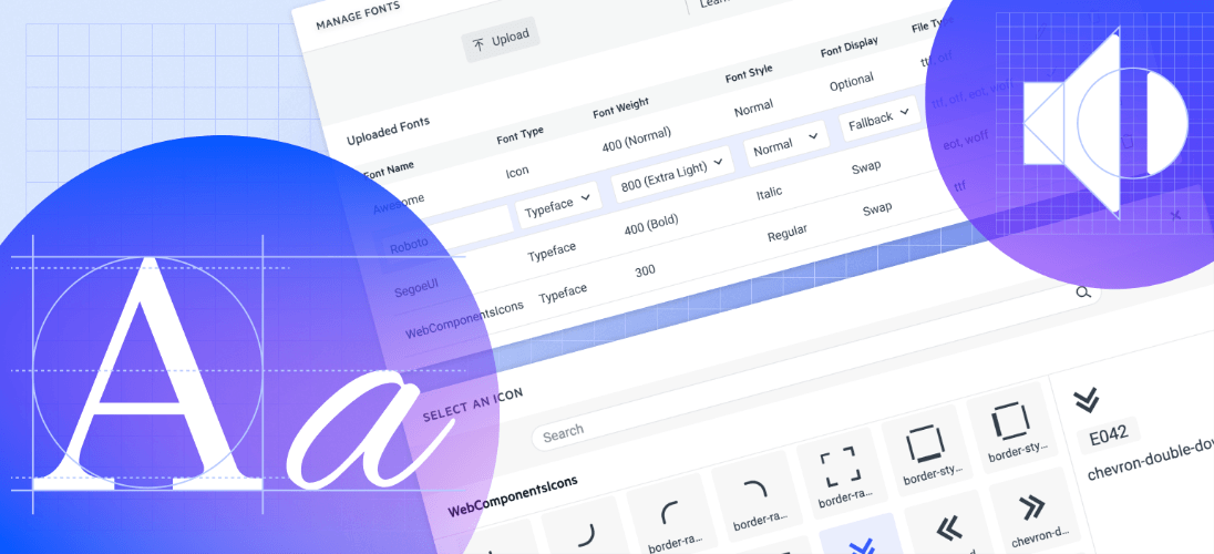
Custom Fonts Support
ThemeBuilder allows you to upload, use and manage custom fonts and font icons. You can use custom fonts to match your company style guide and create a unified experience across the application. Using custom font icons comes with a visual icon picker that enables you to screen faster over all available icons and pick the correct one instead of remembering each by name or code.
New in Telerik Document Processing Library
As we do with every release, we added new features to Telerik Document Processing Library, and customers of all Telerik UI libraries (web, desktop and mobile) can use them in their applications.
New Search API in the RadPdfProcessing Library
The updated search API offers the capability to search for specific text within PDF files, utilizing various methods to tailor search criteria and even searching using regular expressions. The search results provide the page and location of the searched text. For more information on this feature, please refer to the Document Processing Search section in our documentation.
Table of Contents in RadWordsProcessing
The table of contents—TOC and TC—fields enable you to dynamically include a table of contents in your documents through the use of various switches. Additionally, the table of authorities—TOA and TA—fields now provide support for adding tables of authorities to your documents as well. All supported fields can be viewed in the RadWordsProcessing Fields Overview section of our documentation.

New Encryption Mode Is Supported in the RadPdfProcessing Library
We have included support for Encryption Algorithm 5 with AES 256, which is a highly requested feature. Below is the list of encryption algorithms currently supported:
- For import: RC4 (V2), AES-128 (AESV2), AES-256 (AESV3)
- For export: RC4 (V2), AES-256 (AESV3)
The encryption algorithm can be managed using the EncryptionType property. For more information, please refer to the PDF Processing Export Settings.
Telerik UI for Blazor
New Blazor Signature UI Component
The new Signature component in Telerik UI for Blazor enables end users to easily add signatures to forms or PDF documents in Blazor applications. Users can draw their signature using a mouse or touch device, and take advantage of built-in configuration options such as canvas options, stroke width, size, color, background configuration, and read-only state.
To see an example of how to place a signature in a Blazor form, or to try out the Signature component, check out Telerik REPL, our browser-based code runner.

New Blazor Avatar UI Component
The new UI for Blazor Avatar component is an ideal solution for displaying small photos, custom icons, avatars or initials for entities in your applications. It is widely used for building forms, profile pages, navbar menus and other similar scenarios.
With its exposed appearance configuration options, the Avatar component can be easily integrated and customized to fit any application design. You can change its size, roundness, fill mode and coloring to match the desired look and feel.
The component also provides built-in size options like small, medium and large and also allows custom width and height settings to accommodate any design requirements. The Rounded parameter gives flexibility to adjust the avatar shape from rectangular to a complete circle. Additionally, the ThemeColor parameter can be set to various options to match the color scheme of the page.
See the demo of the Telerik UI for Blazor Avatar component.
.gif?sfvrsn=e82fd456_3 "Blazor Avatars")
New Chip and ChipList UI Components
With this update, we are happy to introduce the UI for Blazor Chip and ChipList UI components.
The Chip component is a compact form of a complex piece of information, including text, avatars, images, letters and close icons that can be clicked or removed, and it offers various styling options.
The ChipList component is used to manage a collection of Blazor Chip components, with the ability to data bind and manipulate a list of Chip elements. These components are commonly used for tasks such as tagging contacts and mail inboxes, selecting single or multiple options, and providing input to an application.
Both components offer multiple appearance configuration options (FillMod, RemoveIcon, Rounded and Size) and built-in keyboard navigation support.
See example of UI for Blazor Chip and ChipList components.

New Font Icon Component
The new Telerik UI for Blazor Font Icon component allows for the display of either built-in Telerik Blazor font icons or custom font icons.
The configuration parameters include:
- The ability to set the flip direction of the icon
- The option to select from the built-in Telerik Blazor font icons or to provide a custom CSS class for a third-party icon
- The ability to set predefined icon sizes with the option to use raw strings or the properties of the static ThemeConstants.Icon.Size class
- The option to set predefined icon colors with the default being the inheritance of the current CSS text color using the properties of the static ThemeConstants.Icon.ThemeColor class
New SVG Icon Component
The Telerik UI for Blazor SvgIcon component allows the display of either built-in Telerik Blazor SVG icons or custom SVG icons.
The parameters available for customization include:
- The ability to set the flip direction of the icon
- The option to use a built-in Telerik Blazor font icon by assigning a property of the SvgIcon static class or by implementing a custom SVG Icon class
- The ability to set predefined icon sizes with the option to use raw strings or the properties of the static ThemeConstants.Icon.Size class
- The ability to provide the HTML markup for a custom SVG icon
- The option to set predefined icon colors using the properties of the static ThemeConstants.Icon.ThemeColor class.
Compact Data Grid and Sizing Options
The Data Grid in UI for Blazor allows for customization of its density to improve visibility on smaller devices or to show larger volume data via its new Size parameter which supports two values—Small and Medium.
To achieve a compact data grid appearance, you can change the Size parameter to Small. This will decrease the padding in cells and also affect the inner components such as the Toolbar, Pager and editors, making them smaller and consistent with the overall styling of the UI for Blazor Data Grid.
See an example of smaller size UI for Blazor (compact Data Grid).

Telerik REPL for Blazor: Saving Your Own List of Code Snippets
The browser-based code runner Telerik REPL for Blazor has been enhanced with a very handy feature which allows you to save code snippets and easily reference them for future usage.
.png?sfvrsn=359d56a7_3 "Blazor REPL Snippets")
In order to add a snippet to “User Snippets” list, you need to either login with your Telerik account (existing users) or register and create a new one. Saving a snippet to your list occurs automatically once you are finished creating it and hit the share button. You can then give it a meaningful name, search, sort or remove it from the list.
Adaptive Rendering in Multiple Components
The adaptive and responsive UX of the UI for Blazor library has always been a focus and in the R1 2023 we ensured mobile-friendly rendering of all Date and Time picker and select-type components. The adaptive behavior can be provided via the new AdaptiveMode parameter which was added to the DatePicker, DateTimePicker, TimePicker, DateRangePicker, AutoComplete, ComboBox, DropDownList, MultiColumnComboBox and MultiSelect components for Blazor.
When set to Auto, the components will adjust their rendering based on the current screen size. Additionally, when in auto-adaptive mode, the DateTime pickers and select-type components will allow you to specify the title text that appears in the header of their pop-up window.

New Features in Scheduler Component
Scheduler OnCellRender Event
The OnCellRender event in the Scheduler component allows you to dynamically customize the slot cells. It is activated when each cell is rendered, and it enables you to add a custom CSS class to specific slots based on the event arguments. You can use the OnCellRender event in all the Scheduler views, both in the horizontal and vertical orientation.
See an example of how to customize Scheduler component slots.

Custom Scheduler Slots
In addition to the customization capabilities of the OnCellRender event, we have also shipped a Scheduler SlotTemplate feature which allows you to add custom content including text and icons.
See how to render arbitrary content in Scheduler appointments using the slot template feature.

Pager Position in Multiple UI Components
The UI for Blazor Data Grid, TreeList and
ListView components have been enhanced with a new PagerPosition parameter (e.g., <GridPagerSettings Position="@PagerPosition.Top"),
which allows you to easily configure the location of the Pager component within them to top or bottom. The Pager customization feature within the data-bound components is added to the already existing options to define page numbers, page size and
page input type.

Sizing Options for Multiple Components
You can now customize the appearance of the UI for Blazor Toolbar, Pager and Form components using the new Size parameter. It allows you to configure the dimensions to “Small,” “Medium” or “Large.”
See example of UI for Blazor Toolbar Sizing options.

Enhanced Date Editing UX
In R1 2023 we introduced multiple enhancements and features related to the date and time UI components for Blazor, namely the DateInput, DatePicker, DateRangePicker, DateTimePicker and TimePicker. In the section below we will review in detail what’s new on a per feature basis.
Auto-Tabbing Improvements
As user preferences and behavior differ when working with dates, we implemented a configuration option that controls the auto-tab behavior when editing year, month and date values. The configuration can be achieved using the two new properties:
- AutoSwitchParts – defines whether to switch to the next date segment when the current one is completed.
- AutoSwitchKeys – the default behavior for navigating with arrows remains, but the AutoSwitchKeys allows you to specify the keys/key codes which the end user should press in order to jump to the next date segment. The purpose of this property is mainly focused to allow users to type separators and dates with format “1/31/2022” instead of “1312022.”
The auto-tabbing configuration properties are available for the following list of UI for Blazor components: DateInput, DatePicker, DateRangePicker, DateTimePicker and TimePicker.
Support for Copy & Paste in DateTimePickers
The UX of the DateTime pickers has been further enhanced with a handy option to copy and paste date format into the components. The feature is available for the following list of UI for Blazor components: DateInput, DatePicker, DateRangePicker, DateTimePicker and TimePicker.
A note on supported scenarios: The date input and pickers support pasting of values that match the format and pasting of date segments that match the date segments of the format, but content that does not match the format will not be processed.
Two-Year Digit Format
The DateInput, DatePicker, DateRangePicker and DateTimePicker components have a new property called TwoDigitYearMax, which makes it easy for users to enter dates in two-digit year format. The value set for TwoDigitYearMax determines the highest year that will be assumed to be from the current century when a two-digit year is typed. The default setting is 68, meaning that any number less than 69 will be interpreted as 20xx, while numbers 69 or greater will be assumed to be from the 19xx century.

Auto-Correction of Invalid Dates
Until recently, the default behavior was when a user types in a date like “31/January/2023” and then changes the month to February, the day would automatically switch to 28 (since February only has 28 days). However, we received feedback from you that there are cases when you need to disable this automatic correction so that the user can continue editing the date and manually change the day part of February.
The new property AutoCorrectParts gives you control over the date auto-correction UX. Its value specifies whether the date parts should be automatically corrected to show a valid date or not. The default value is “true,” meaning that the automatic correction will occur. By setting it to “false,” you will allow users to be able to see “31/Feb/2023” in the input field, but the component value can not be set to this and will be either null or default to the value for the DateTime.
The new AutoCorrectParts feature is available for the following list of UI for Blazor components: DateInput, DatePicker, DateRangePicker and DateTimePicker.
Caret Mode
We have introduced one more property called AllowCaretMode which gives users more flexibility when working with dates. The AllowCaretMode allows users to input date and time using a caret to move through separate date segments (instead of selecting) and this property controls whether this is an option or not. It also specifies if a caret can be displayed during input for certain date segments—for example, if months are represented as words instead of numbers, it can’t be applied.
No Data Template in Multiple Components
Until now, if you needed to customize the content of an empty list in a select-type component you could only achieve change in the text via localization. With the new NoDataTemplate feature you can now display custom content in the Telerik UI for Blazor DropDownList, ComboBox, AutoComplete, MultiSelect and MultiColumnComboBox components.

See an example of the UI for Blazor ComboBox no data template.
Blazor TreeView OnItemRender Event
We exposed a new event called OnItemRender in the Blazor TreeView component, which is triggered when each of the cells are being rendered. The OnItemRender event allows you to have full control over what content and how you would like to be displayed in the tree view items including their read-only state.
See the complete list of the available events in the UI for Blazor TreeView component.
Accessibility Improvements
We continue our efforts for ensuring the highest level of accessibility compliance of the Telerik UI for Blazor library. In the current release we improved the WAI-ARIA attributes and keyboard navigation in the Data Grid filter and column menus, as well as the TreeList filter menu. We have also added an AriaLabel parameter across all input-based components.
To raise the level of AY11 compliance even higher, we shipped a new color swatch called Ocean Blue A11Y (an enhanced version of the already existing Ocean Blue) which addresses corner cases for color contrast in several UI components.
In addition to the A11Y features, we also provided detailed documentation for the WAI-ARIA attributes of each UI for Blazor component allowing you to easily reference the available attributes.
See an example of WAI-ARIA reference documentation article for the UI for Blazor AutoComplete component.
Form OnUpdate Event
The Blazor Form component now exposes OnUpdate event, which is triggered after a change in any of the editors is initiated. The new event further expands the existing ones, OnSubmit, OnValidSubmit and OnInvalidSubmit, which allow you to respond to user actions and provide custom logic.
Read more about the available events in the UI for Blazor Form component.
Week Number in DateTimePickers
The new property ShowWeekNumbers in the UI for Blazor Calendar, DatePicker and DateTimePicker components allows you to easily display to users the respective week number. By setting the ShowWeekNumbers property to true, a new column is added to the left-hand side of the calendar indicating the week number.

See how to add a week column in the UI for Blazor Calendar component.
Support for SVG icons
As of R1 2023, the Telerik UI for Blazor library offers a wide selection of Scalable Vector Graphics (SVG) icons in addition to the previously available font icons, giving developers more options to choose from.
SVG icons are vector images defined in an XML format, which allows for easy scalability and customization. They can be used in webpages to display vector graphics and offer advantages such as sharp rendering at all resolutions, flexibility in controlling individual parts with CSS, and accessibility through semantic elements and attributes.
RadioGroup New Item Template
Another component that now allows rendering of custom content instead of just text is the Telerik UI for Blazor RadioButtonGroup component. Using the new radio group ItemTemplate feature, you can add icons, styles and special formatting in the radio buttons of your Blazor apps.

Telerik UI for ASP.NET Core and MVC
TimeDurationPicker UI Component
The new Telerik UI TimeDurationPicker component for ASP.NET Core and ASP.NET MVC enables users to select a duration period. As a developer, you can determine the number of columns, specify the format for each of them, constrain the allowed selectable values and add shortcut buttons for repetitive durations.
The TimeDurationPicker component differs from the other time-based pickers that Telerik UI offers in that it does not care about what the current time is, and no date needs to be involved. Instead, the new ASP.NET Core/MVC TimeDurationPicker focuses just on a single time duration.
The Time Duration Picker comes also with built-in keyboard navigation support, multiple events that let you handle the business and UX logic, plus various appearance customization options such as size, fill mode and border radius.
See the UI for ASP.NET Core TimeDurationPicker component demo.
See the UI for ASP.NET MVC TimeDurationPicker component demo.

GridLayout & StackLayout UI Components
The new GridLayout and StackLayout UI components will help you easily arrange HTML elements in a grid or a horizontal/vertical stack.
These components simplify the creation of layouts in web applications and help developers migrate from desktop to the web since they mimic the GridPanel and StackPanel components used in Windows development.
The GridLayout allows you to lay components out on a grid consisting of rows and columns. The columns and rows of the grid serve as coordinates that are used for laying out components on the grid. Typically a component only occupies a single cell of the grid.
See a demo of UI for ASP.NET Core GridLayout component.
See a demo of UI for ASP.NET MVC GridLayout component.

The Telerik StackLayout component allows you to easily align vertically or horizontally multiple elements in a stack. It includes different orientations, alignments, spacings and other handy options.
See a demo of UI for ASP.NET Core StackLayout component.
See a demo of UI for ASP.NET MVC StackLayout component.

Chip and ChipList UI Components
The Chip and ChipList UI components are more new additions to the Telerik UI for ASP.NET Core and ASP.NET MVC libraries. Commonly, Chip and ChipList components are used as tags when adding/removing contacts and mail inbox, selecting single or multiple choices from available options, and providing input to an application.
The Chip component enables user input and verifies that input by converting text into chips. The Chip provides a compact way to display complex information, including text, avatars, images, letters and close icons. It is clickable and removable, and offers various styling options.
The ChipList component is also included in this update. It is used to manage a collection of Chip components, providing data binding and manipulation options for a list of Chip elements.
See an example of the Telerik UI for ASP.NET Core Chip and ChipList UI components.
See an example of the Telerik UI for ASP.NET MVC Chip and ChipList UI components.

Floating Label in Input and Select-Type Components
In the current update, we enhanced multiple select and editor-type UI components with a shiny new floating label property. By setting it to true, the label will “float” above the component when it is focused. The new floating label feature is available in the following list of components:
ASP.NET Core & MVC Select-Type UI Components:
- DropDownlist floating label demo
- ComboBox floating label demo
- MultiSelect floating label demo
- AutoComplete floating label demo
- DropDownTree floating label demo
- MultiColumnComboBox floating label demo
ASP.NET Core & MVC Date Inputs & Pickers

Signing PDF File with Signature UI Component
We improved the demos for the Signature component in UI for ASP.NET Core and MVC to include the popular use case of signing PDF documents within web applications. Using the Telerik Document Processing Libraries, you can extract the PDF file to memory, add the signature and create a new PDF document. The Telerik UI for ASP.NET Core PDFViewer component allows you to easily display the final document to the user, including options to download and save the document with the added signature.
See examples of how to place a signature in a PDF File using the UI for ASP.NET Core Signature component and the UI for ASP.NET MVC Signature component.

ECMAScript Modules (ESM) Support
We transformed the source code from AMD to ECMAScript modules (ESM), bringing actual benefits from the ESM modules to Kendo UI for jQuery, Telerik UI for ASP.NET Core and MVC server wrappers as well.
If you are relying on the AMD modules, you can continue using them as we managed to come up with a solution that allows moving to the new ESM module system without breaking changes for anyone who might want to continue AMD/UMD modules with the Kendo UI bundles distributed.
You can learn why we transformed our own source code from AMD to ECMAScript modules and see how you can use dynamic script imports with modern browsers and get huge benefits in your applications.
Charts Enhancements
Label Support for Bullet Charts
You can now easily add labels to each of the data series within the Bullet Chart UI component. Furthermore, you can configure its visibility, apply background formatting and even render custom content by using templates.

Subtitle Support for All Charts
Another enhancement to the DataViz library is the ability to add an additional title (subtitle) below the chart title and apply individual style to it.
See how to configure the Chart Title and Subtitle properties.

Accessibility Improvements
The specific WAI-ARIA accessibility improvements in R1 2023 for Telerik UI for ASP.NET Core and MVC are numerous, so here are a few UI components: Menu, Context Menu, ListBox, Drawer, ScrollView, ListView and more.
Deprecation of LESS Themes
Last year with R1 2022 we announced that Kendo UI for jQuery, Telerik UI for ASP.NET MVC and Telerik UI for ASP.NET Core would be moving completely to the Sass-based Default, Bootstrap, Material and Fluent themes. This means that the LESS themes, created when LESS was the most popular CSS pre-compiler (this is no longer the case), are officially going to be deprecated.
Well, the day is here, and R1 2023 is the last version of Kendo UI for jQuery, Telerik UI for ASP.NET MVC and Telerik UI for ASP.NET Core will support the LESS-based themes.
Thanks to the hard work done over the last year or so, R1 2023 contains a lot of new features and components, and lots of improvements to the LESS themes. This should give teams that have been hesitant about the migration a stable release to hold out on until they can make the change to the Sass-based themes.
Telerik UI for ASP.NET Core Specific
New E-Shop Demo App
We have a brand-new e-shop demo app that illustrates the usage of Telerik UI components within a ASP.NET Core application. The app showcases the most common use cases related to e-shops—product list, product details, shopping basket, user profile, sophisticated product filters, and on top of that we have also included integration with Telerik Reporting to demonstrate how easy it is to generate order invoices or print product catalogs.
The application is built entirely with Telerik UI for ASP.NET Core components such as Data Grid, Scroll View (also known as Carousel), Slider, Rating, Card, Checkbox Group, Buttons and more. The styling is powered by the new built-in Fluent theme which is available for all Telerik and Kendo UI components.
See the new e-shop demo app with Telerik UI for ASP.NET Core components with Fluent theme.

Localization Configuration in Project Templates
As of the R3 2022 SP2 release, we have added localization capabilities to the Visual Studio Templates for Telerik UI for ASP.NET Core. This gives you an option to enable or disable the templates localization in the Telerik Visual Studio Extensions Project Wizard.
By default, the UI for ASP.NET Core components display their messages in English. If the localization is enabled in the Project Wizard, a dropdown is rendered in the respective Visual Studio Templates startup page.
You can use it to select a different language, which will convert the messages in the components to the selected language. This way your users will be able to understand them, since they are translated to their native (or preferred) language.
Localization Resource Files
This release includes translated messages for 96 cultures in the Telerik UI for ASP.NET Core and MVC libraries. These translations were taken from the Kendo UI for jQuery public localization repository and are now available as resource files. Users can use these translations as is or customize them to their liking.
To learn more about the localization updates, check out the dedicated documentation article.
UI for ASP.NET Core Code Snippets in Visual Studio and Visual Studio Code
This release includes new code snippets for Telerik UI for ASP.NET Core components to improve productivity when developing web applications in Visual Studio or Visual Studio Code. The 110+ components now have code snippets for both HTML and TAG helper flavors that can be easily accessed. To use these code snippets, download and install the extensions from the Visual Studio Marketplace.
Telerik UI for ASP.NET AJAX
New WebForms Signature UI component
UI for ASP.NET AJAX is another Telerik library that added the Signature UI component to its collection. The RadSignature allows users to easily add signatures to forms or even PDF documents (via integration Telerik Document Processing). They can use a mouse or touch device to create their signature and customize it using options like canvas settings, stroke width, size, color, background and read-only mode.
See a demo of the UI for ASP.NET AJAX Signature UI control.

Enhancements to UI Components
Based on a customer request in the UI for ASP.NET AJAX Feedback Portal, we added a DropDownAutoWidth property in the RadDropDownList component.
Another Feedback Portal request that was included in the release is the new client event ItemSelect for the SearchContex in the RadSearchBox. Using the ItemSelect event, you can easily change the DataSource for RadSearchBox according to which Item is selected.

Accessibility Improvements
In Telerik R1 2023, we continued adding accessibility improvements (Calendar, TreeView, Grid HeaderContext to name a few) and as we did so, we made sure that the Voluntary Product Accessibility Template (VPAT) is updated.
Other Enhancements
In the latest release of UI for ASP.NET AJAX you can also find improvements in the appearance of RadEditor and RadTreeView in the WebBlue, Windows 7 and Vista skins.
Join Us for the Webinar January 26 (Plus More)
Progress Telerik .NET Web, Desktop & Mobile Products R1 2023 Release Webinar | January 26
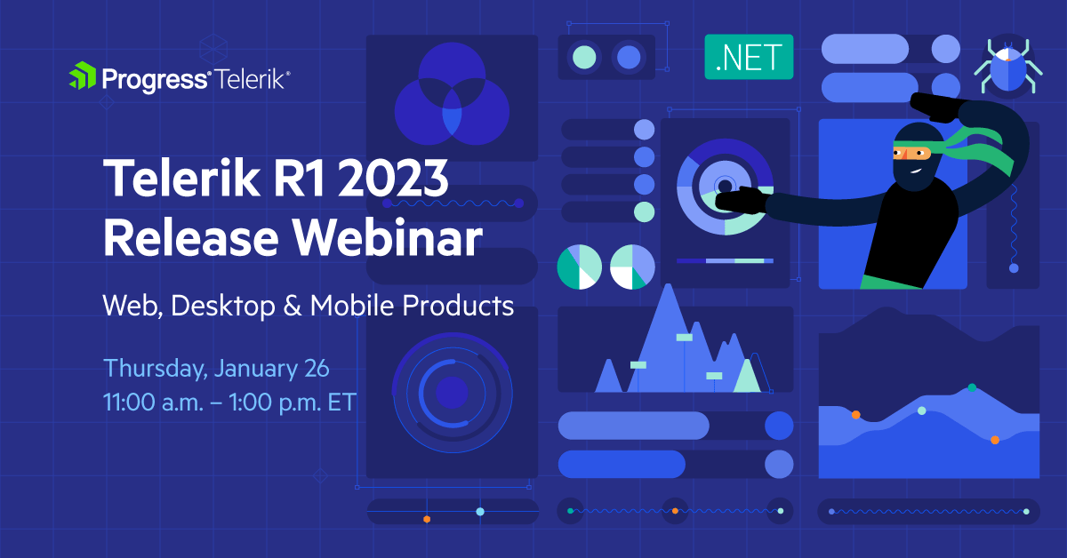
Discover all updates across Telerik UI for Blazor, UI for ASP.NET Core, UI for ASP.NET MVC, UI for ASP.NET AJAX, UI for WPF, UI for WinForms, UI for WinUI, UI for .NET MAUI and UI for Xamarin and ThemeBuilder.
Join Us on Twitch

If you can’t wait until the webinar to unpack the new release, join the Livestream Release Party on January 19, 10 a.m. – 11:30 a.m. ET to hear the release highlights across the entire Progress Developer Tools portfolio and hang out with friends.
Progress Kendo UI R1 2023 Release Webinar | January 31

Discover all updates across KendoReact and Kendo UI for Angular, Vue and jQuery, as well as ThemeBuilder.
Progress Telerik Reporting, Mocking and Debugging Tools R1 2023 Release Webinar | February 2
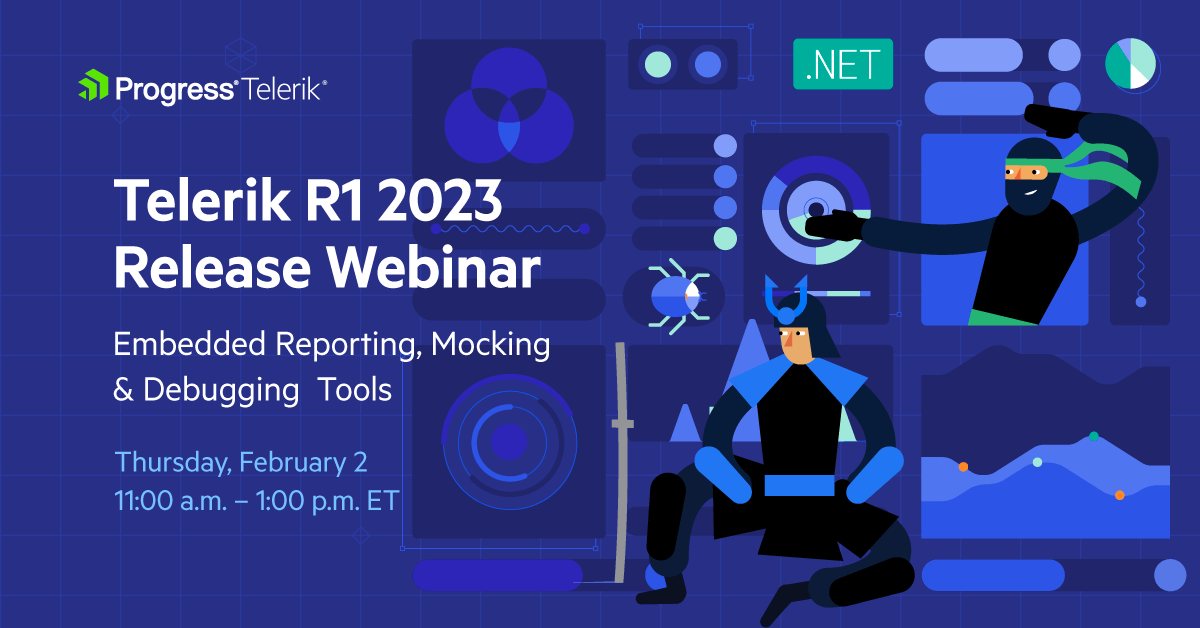
Discover all updates across Telerik Reporting, JustMock, Fiddler Everywhere and Fiddler Jam.

Maria Ivanova
Maria Ivanova is a Manager of Product Management at Progress, for Telerik and Kendo UI components and developer tooling. She joined the company in 2019 as a Product Manager for Telerik UI web components and is passionate about developing impactful and innovative software products. Maria believes that to create great products, it's important to challenge the status quo, closely collaborate with customers, and embrace a spirit of experimentation.
Related Posts
Comments
All articles
Topics
Web MobileMobile
Desktop
Design
Productivity
People
