November 2022 Telerik & Kendo UI Update

Summarize with AI:
For our November updates, we are excited to announce Day-Zero support for .NET 7 among many other features. Take a look!
Welcome to another update in your favorite developer tools libraries! Our list of improvements is long, so feel free to hop to your library of choice:
- Common November Release Items Across Telerik and Kendo UI
- Kendo UI for jQuery, Telerik UI for ASP.NET Core & ASP.NET MVC
- ThemeBuilder Pro Updates
- Telerik UI for Blazor
- Telerik UI for ASP.NET Core and UI for ASP.NET MVC
- Telerik UI for ASP.NET AJAX
- Kendo UI for jQuery
- Telerik UI for .NET MAUI
- Telerik UI for WinForms
- Telerik UI for WPF
- Telerik UI for WinUI
- Telerik Reporting & Telerik Report Server
- Telerik JustMock
- End of Support Announcements
Common November Release Items Across Telerik and Kendo UI
Day 0 Support for .NET 7 Across All Telerik Products
We are excited to announce that we have provided Day-Zero support for .NET 7 for all Telerik products (web, desktop, mobile, reporting, REPL and mocking) and their respective Visual Studio extensions. In addition, we’ve updated sample projects, projects templates and launched new components and improvements. The list of Telerik products with immediate .NET 7 support can be found below:
- Telerik UI for Blazor
- Telerik UI for ASP.NET Core
- Telerik UI for .NET MAUI
- Telerik UI for WPF
- Telerik UI for WinUI
- Telerik UI for WinForms
- Telerik Reporting
- Telerik JustMock
- Telerik Document Processing
- Telerik REPL for Blazor
You can find more information related to .NET 7 updates in Telerik products in the dedicated blog post “Day 0 Support for .NET 7 Across Telerik Libraries and Tools.”
Kendo UI for jQuery, Telerik UI for ASP.NET Core & ASP.NET MVC
Listed below are several common features and improvements that are part of this month’s update for Kendo UI for jQuery, Telerik UI for ASP.NET Core and UI for ASP.NET MVC.
Enhancements in DataViz Components
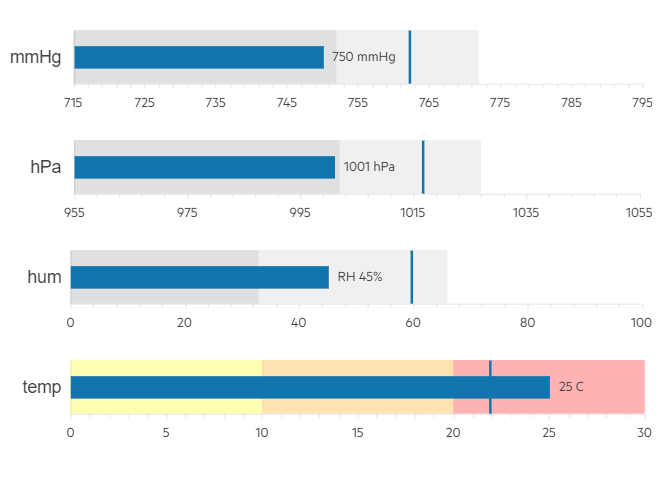
Support for Labels in Bullet Charts
You can now easily add labels to each of the data series within the Bullet Chart UI component. Furthermore, you can configure its visibility, apply background formatting and even render custom content by using templates.
Subtitle Property in Charts
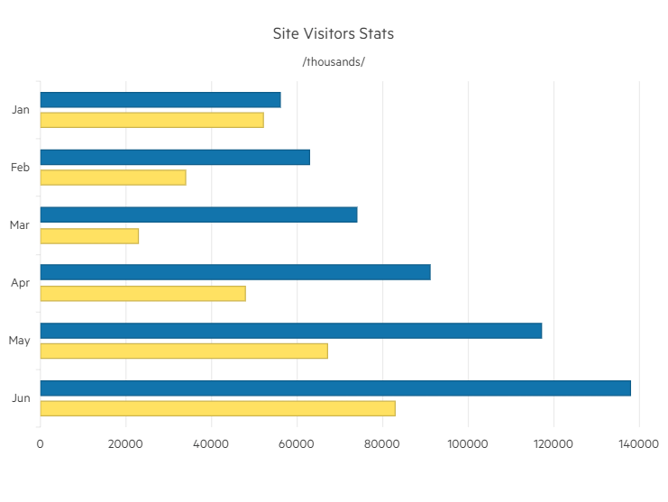
Another enhancement to the DataViz library is the ability to add an additional title (subtitle) below the chart title and apply individual style to it.
See how to configure the Chart Title and Subtitle properties.
Accessibility Improvements
We continue our efforts to ensure high compliance with accessibility standards with the Telerik UI for ASP.NET Core & MVC, and Kendo UI for jQuery components. In this release we worked toward WAI-ARIA improvements in the Data Grid, Menu, ContextMenu, TabStrip, TreeView, PanelBar, Splitter and Pager UI components.
ECMAScript Modules
With the November release of Kendo UI for jQuery, we transformed the source code from AMD to ECMAScript modules (ESM), bringing actual benefits from the ESM modules not just to UI for jQuery, but also to Telerik UI for ASP.NET Core and MVC server wrappers as well.
If you are relying on the AMD modules, you can continue using them as we managed to come up with a solution that allows moving to the new ESM module system without breaking changes for anyone who might want to continue AMD/UMD modules with the Kendo UI bundles distributed.
ThemeBuilder Pro Updates
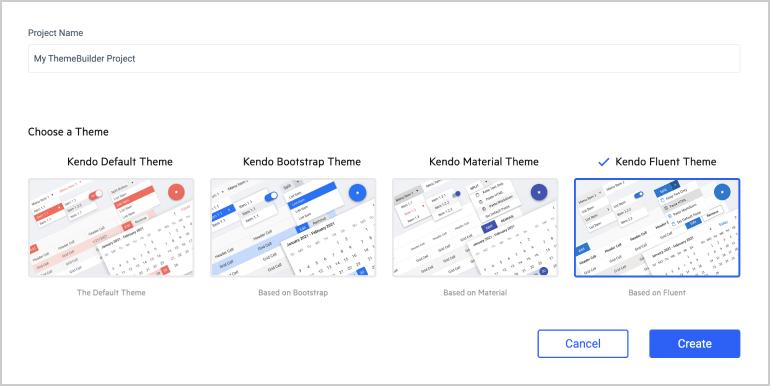
Fluent Theme Support
ThemeBuilder now supports our new Fluent theme, which follows the guidelines of the official Fluent Design System. The Fluent theme support within ThemeBuilder allows you to style and customize all Telerik and Kendo UI components for ASP.NET MVC, ASP.NET Core, Blazor, jQuery, Angular, React and Vue. If you are already using Fluent-themed components in your web applications today, with the Fluent theme added, any of the Telerik and Kendo UI components will seamlessly fit in.
Metric Custom Variables
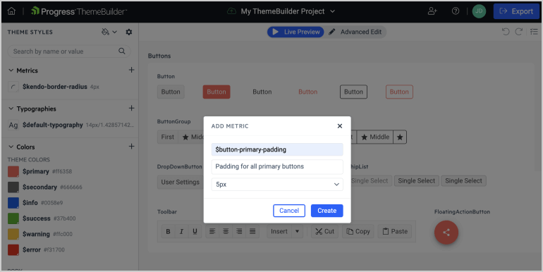
You can now create custom metric variables for paddings, margins and many more. This enables you to use standardized metrics to follow your company style guide or design system metrics. The great thing about variables is that you can later update only the variable, which will update all components that use it, saving you time when customizing.
Telerik UI for Blazor
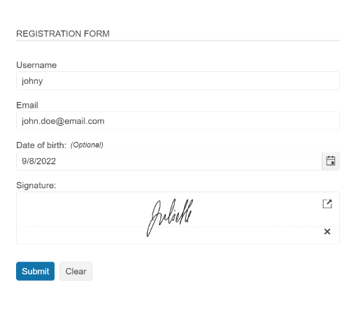
New Blazor Signature UI Component
You can now easily enable end users to place signatures in Blazor applications—either directly in a form or within PDF documents. The new Telerik UI for Blazor Signature component enables app users to draw a signature using a mouse or touch device. When placing a signature in Blazor applications, users can take advantage of the built-in configuration features and customize the way they sign using the different canvas options, stroke width, size, color, background configuration, read-only state and more.
See how to place a signature in a Blazor form or try out the new Signature component in our browser-based code runner Telerik REPL.
Blazor Scheduler Component Enhancements
In the current release, we focused on enabling further customization options for the Blazor Scheduler UI component.
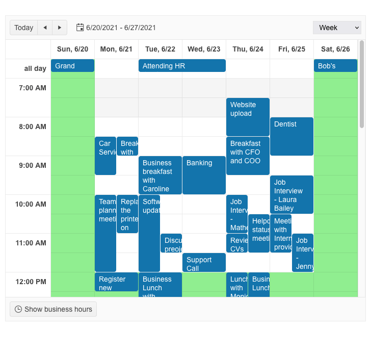
Schduler OnCellRender Event
The Scheduler slots can be dynamically customized via the new OnCellRender event in the component. It is triggered when each slot cell is rendered and allows you to add a custom CSS Class to the specific slot based on event arguments. You can take advantage of the OnCellRender event in both horizontal and vertical orientation, as well as all available Scheduler views.
See an example of how to customize Scheduler component slots.
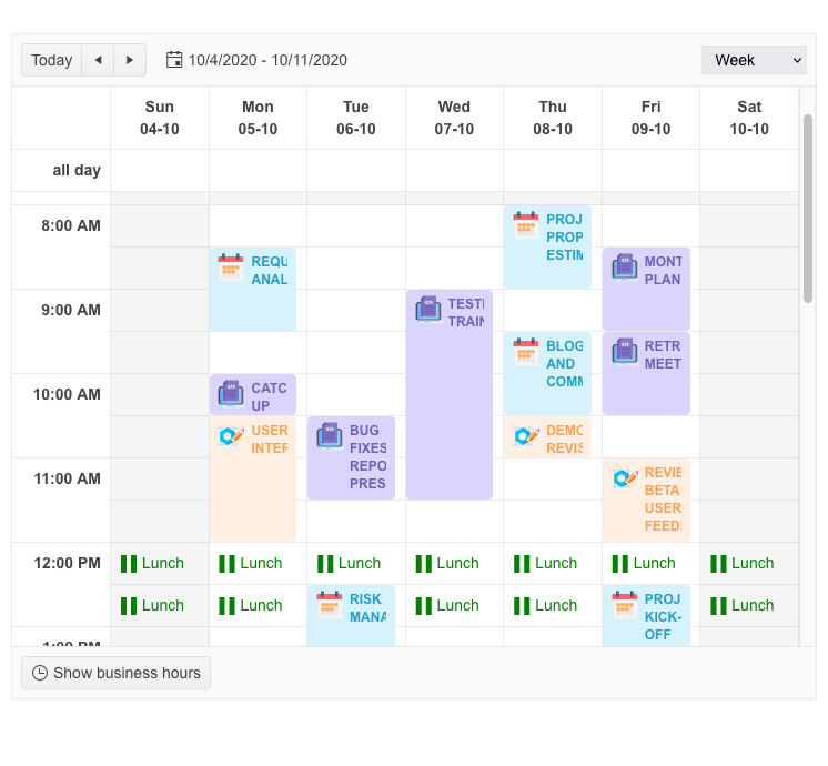
Custom Scheduler Slots
In addition to the customization capabilities of the OnCellRender event, we have also shipped a Scheduler SlotTemplate feature which allows you to add custom content including text and icons.
See how to render arbitrary content in Scheduler appointments using the slot template feature.
Adaptive Rendering in DateTimePicker & Select Type Components
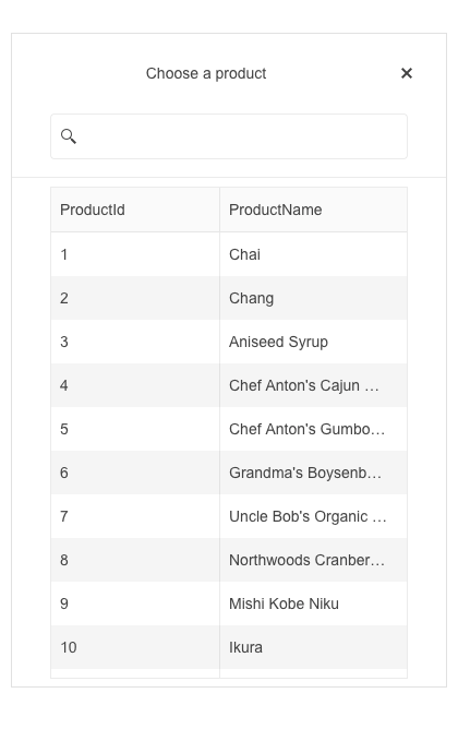
In the 3.7.0 release of UI for Blazor, we ensured mobile-friendly rendering of all Date and Time picker and select-type components. The update includes a new AdaptiveMode parameter which is added to the DatePicker, DateTimePicker, TimePicker, DateRangePicker, AutoComplete, ComboBox, DropDownList, MultiColumnComboBox and MultiSelect components for Blazor.
When set to Auto, the components are configured to automatically adapt to the current screen size and will change their rendering accordingly. In auto-adaptive mode, the DateTime pickers and select-type components also allow you to define the title text rendered in the header of their popup.
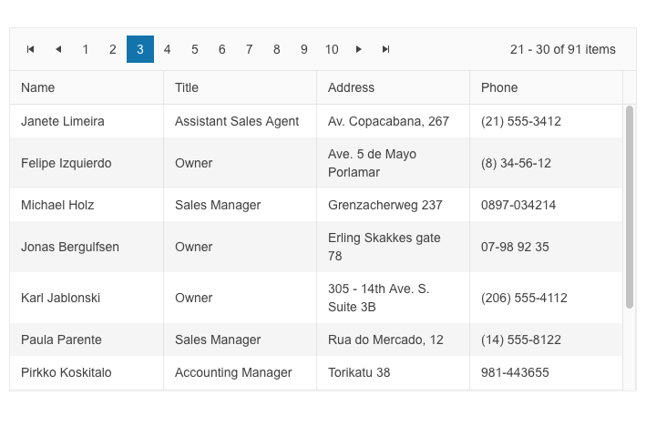
Change Pager Position in DataGrid, TreeList and ListView
The UI for Blazor Data Grid, TreeList and
ListView components have been enhanced with a new PagerPosition parameter (e.g., <GridPagerSettings Position="@PagerPosition.Top"),
which allows you to easily configure the location of the Pager component within them to top or bottom. The Pager customization feature within the data-bound components is added to the already existing options to define page numbers, page size
and page input type.
Telerik UI for ASP.NET Core and UI for ASP.NET MVC
Signing PDF File with Signature UI Component
We enhanced the Signature component demos in UI for ASP.NET Core and MVC with the common scenario of signing a PDF document within your web application.
Thanks to the capabilities provided by the Telerik Document Processing Libraries, you can extract the PDF file within a memory file and then reapply the Signature bytes to create a new PDF document. You can display to the user the PDF file easily using the Telerik UI for ASP.NET Core PDFViewer component, which provides built-in options to download and save the final document with the signature applied.
See examples of how to place a signature in a PDF File using the UI for ASP.NET Core Signature component and the UI for ASP.NET MVC Signature component.

Localization Resource Files
Another helpful update of this release is the addition of translated messages for 96 cultures that are part of the public localization repo of Kendo UI for jQuery to Telerik UI for ASP.NET Core and MVC libraries. All the existing translations from the jQuery client files were made available as resource files ASP.NET Core and MVC. You can take advantage of them as they are or customize any of the existing messages with your own wording.
To learn more about the localization updates, check out the dedicated documentation article.
Telerik UI for ASP.NET Core Code Snippets in Visual Studio and Visual Studio Code
In this release, we added a bunch of new code snippets for Telerik UI for ASP.NET Core components to ensure you are more productive when creating web applications in your preferred IDE—Visual Studio or Visual Studio Code.
All of the 110+ components now have code snippets for both HTML and TAG helper flavors and can be easily invoked. To take advantage of the code snippets pack provided for VS and VS Code, make sure to download and install our extensions published on Visual Studio Marketplace:
Telerik UI for ASP.NET AJAX
In the November update of Telerik UI for ASP.NET AJAX, we continue our efforts for providing WCAG 2.1 AAA accessibility compliance. In this month’s service pack release we have included multiple improvements in the following AJAX controls: Data Grid, Scheduler, ComboBox, TextBox, NumericTextBox, DateInput, DatePicker, DateTimePicker, TimePicker, Calendar, MediaPlayer and CloudUpload.
We have also shipped an important fix in the RadComboBox related to Bootstrap Lightweight skin not loading in version 2022.3.913. Additional components that have been improved include the RadMultiColumnComboBox and RadFloatingActionButton.
Kendo UI for jQuery
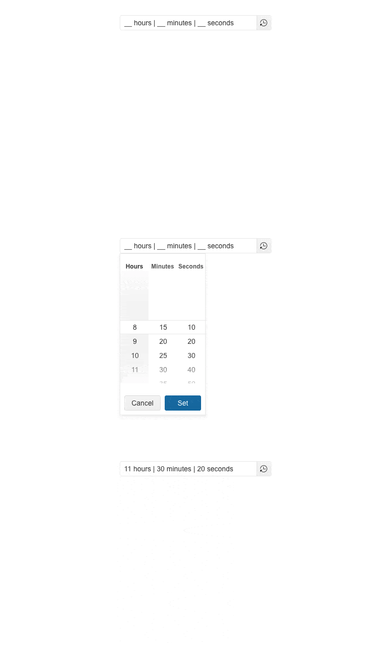
New jQuery TimeDurationPicker UI Component
The new Kendo UI for jQuery TimeDurationPicker component enables users to select a duration period, as configured by you. As a developer, you can determine the number of columns, specify format for each of them, constrain the allowed selectable values and add shortcut buttons for repetitive durations.
The Time Duration Picker comes also with built-in keyboard navigation support, multiple events that let you handle the business and UX logic, plus various appearance customization options such as size, fill mode and border radius.
See the jQuery TimeDurationPicker UI component demo.
Floating Label in DatePickers and Select-type Components
Based on your feedback, we enhanced multiple UI components with a shiny new floating label property. By setting it to true, the label will “float” above the component when it is focused. The new floating label feature is available in the following list of components:
jQuery Select-type UI Components:
- DropDownlist floating label demo
- ComboBox floating label demo
- MultiSelect floating label demo
- AutoComplete floating label demo
- DropDownTree floating label demo
- MultiColumnComboBox floating label demo
jQuery Date Inputs & Pickers

Heads-up for our Telerik customers that the TimeDurationPicker component and floating labels update will be available for UI for ASP.NET Core and MVC next month in the December release.
Telerik UI for .NET MAUI
The November release for Telerik UI for .NET MAUI comes with support for .NET 7 as a runtime and two major improvements in our DataGrid component—column reordering functionality and support for column resizing.
Support for .NET 7
Microsoft has just announced .NET 7—the next generation of .NET unified software development platform—and we are glad to share that Telerik UI for .NET MAUI ships support for .NET 7.0 with this release! We have built the controls in our suite for .NET 7.0 so you can try the latest and greatest .NET framework. Read more!
DataGrid Updates
I am excited to announce that we have added a few long-awaited client-side features to Telerik UI for .NET MAUI DataGrid component. The control now provides built-in support for reordering and resizing columns that can be done by the user in run-time.
Column Reordering
To get an idea of what column reordering is, you can check the following GIF:
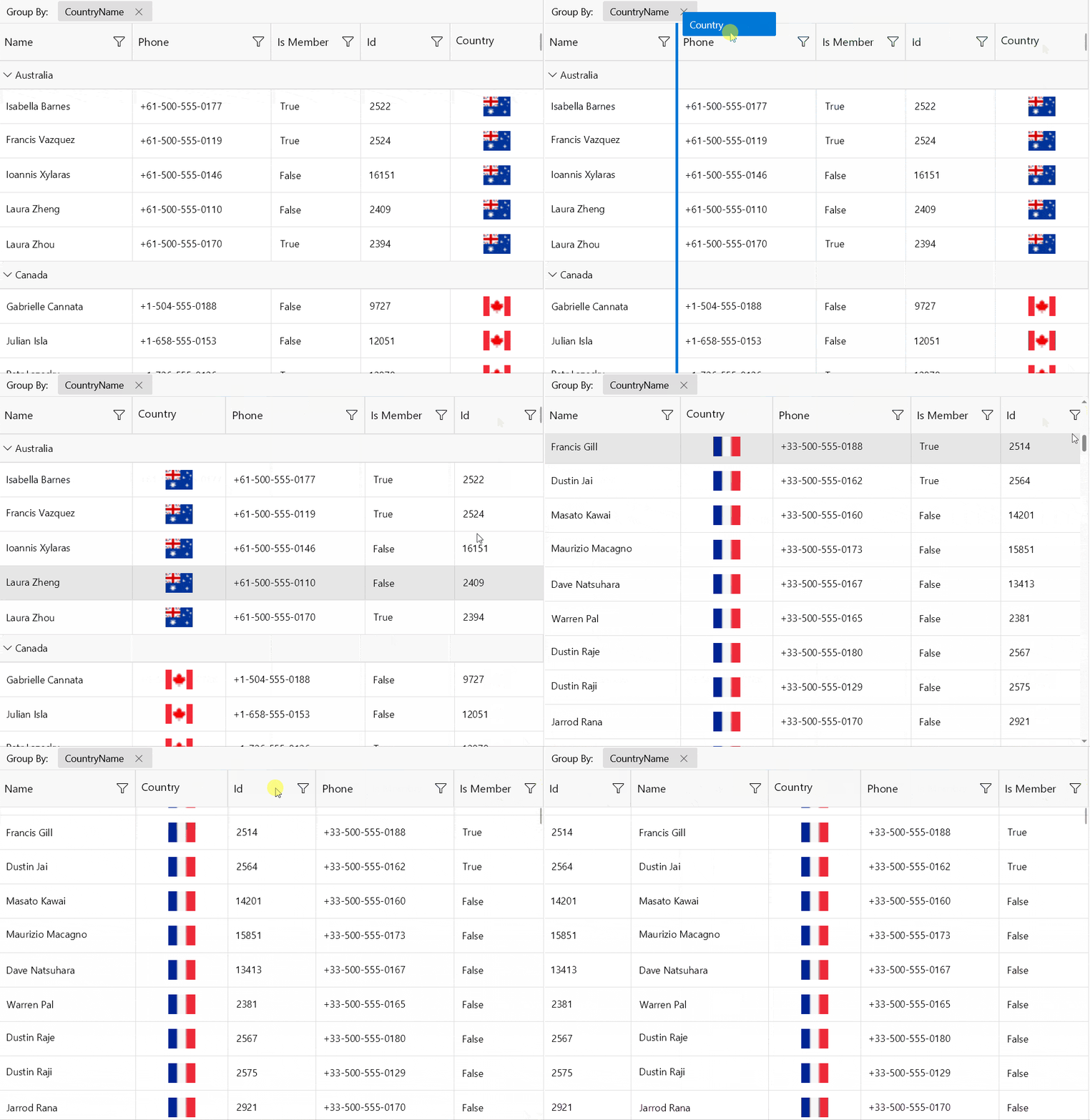
The user can drag the desired column’s header at the desired position among the other headers and drop it there. The feature is enabled by default but can be stopped at any time by using the CanUserReorderColumns property of the DataGrid.
Column Resizing
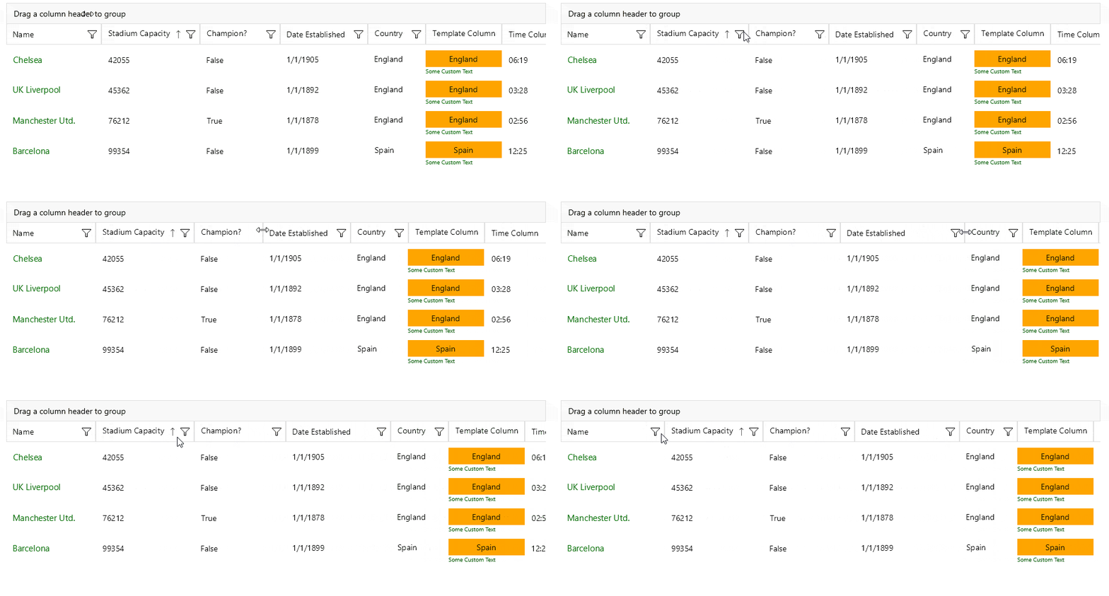
The columns inside RadDataGrid are now resizable by default via the UI. On WinUI and MacOS you can change the column width by positioning the mouse over the columns vertical grid line (in the column header) and dragging it until the desired size is achieved.
Telerik UI for WinForms
Highlights in the November update in Telerik UI for WinForms are full .NET 7.0 support, including NuGet packages and designer support in Visual Studio 2022. In this release we also bring new demos, legend wrapping in the chart component, text wrapping inside the SyntaxEditor and numerous other fixes and improvements.
Support for .NET 7 & Updated NuGet Packages
Starting with the Previews of .NET 7 we’ve been providing assemblies to our clients built against the latest version at that moment. Now that .NET 7 is official, we’ve added full NuGet support. The easiest way to test our controls in .NET 7.0 is to use our NuGet feed and install the new UI.for.WinForms.AllControls.Net 70 package. It has all the controls and their dependencies in one place.
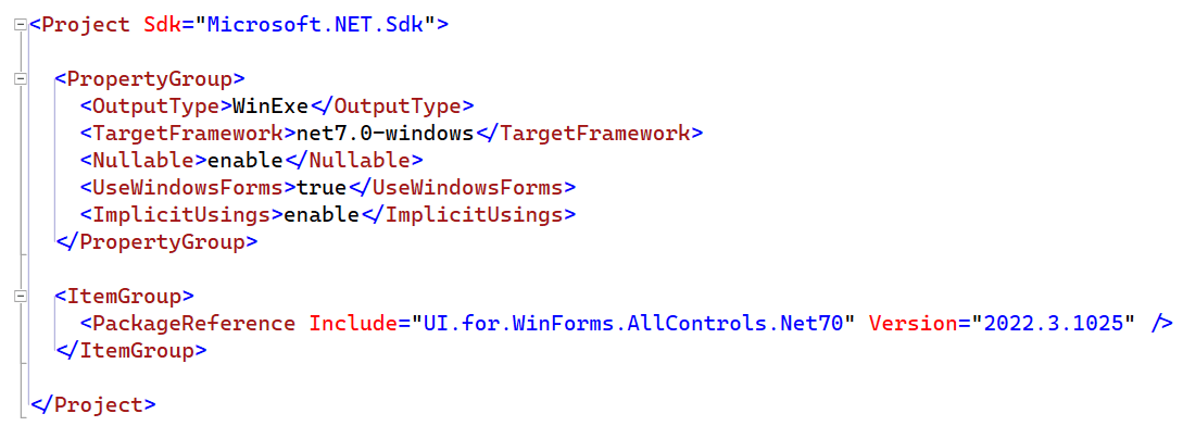
Our other multi-platform control specific NuGet packages are also updated with .NET 7.0, and they target it as a separate platform. As with all other .NET NuGets, all packages for .NET 7.0 have full designer support and you can freely use them in Visual Studio 2022.
Legends Wrapping in ChartView
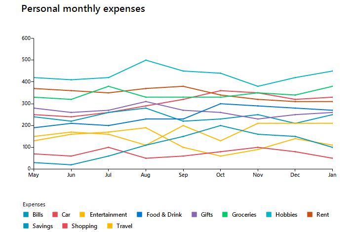
This release also brings the highly requested feature of legends wrapping in the RadChartView control. With this setting, the legends are wrapped when there is not enough space to fit them all.
Bug Fixes and Other Improvements
For this service pack, we also managed to include numerous fixes and improvements in various controls. We also updated our demo application with new SpreadProcessing and WordsProcessing examples.
Here are some of the more notable improvements:
- Expose error handling API while executing commands in Spreadsheet
- Copy/Paste issues in RadGridView
- Exception in Spreadsheet when writing in a cell and immediately focusing on another cell
- New WordsProcessing demo
- New SpreadStreamImport demo
Telerik UI for WPF
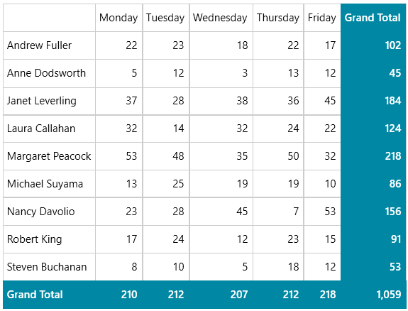
PivotGrid: Apply Number Format to Count Aggregation Values
Now it is possible to format the Count aggregation values through the UI—the feature will work out of the box. Just open the Number Format dialog of a particular Count aggregate and insert the desired format. For example, this can be useful in cases when you want to better format values with thousands. Check out Grand Total value below:
Common: Improved Custom Cursors and DPI Awareness
Some of our components come with built-in custom mouse cursors for specific functionalities. With this release, we completely redesigned the custom cursors to have a more modern look and feel as well as added DPI awareness support for .NET Core and above versions of those controls. Check out the list below for the affected controls and cursors:
- Diagrams – ConnectionTool, Path, Pencil, Rotation cursors. All other cursors are standard WPF cursors.
- ImageEditor – Grab and Grabbing cursors, displayed while panning an image.
- RichTextBox – FormatPainter cursor.
- Spreadsheet – ResizeCursorWE, ResizeCursorNS, UnhideCursorWE, UnhideCursorNS cursors.
The visual difference can be observed below. You can see the old Grab cursor of the ImageEditor on the left and the new on the right hand side:

FileDialogs: New API for Custom Renaming Files/Folders
We are adding a new property that will specify whether the user should be able to rename the files/folders. If you want to disable the renaming, just set the CanUserRename to false—this will affect all files/folders.
If you need to disable it only for specific paths (folders), you can use the new Renaming event and simply cancel it when needed. For example, checkout the following snippet:
private void OnOpenFileDialogRenaming(object sender, Telerik.Windows.Controls.FileDialogs.RenamingEventArgs e)
{
    if (e.FileInfo.Path.StartsWith("C:\Windows")
    {
        e.Cancel = true;
    }
}
For more details, check the Events article and Rename Files and Folders section of the FileDialogs documentation.
RichTextBox: MS Word Like Selection
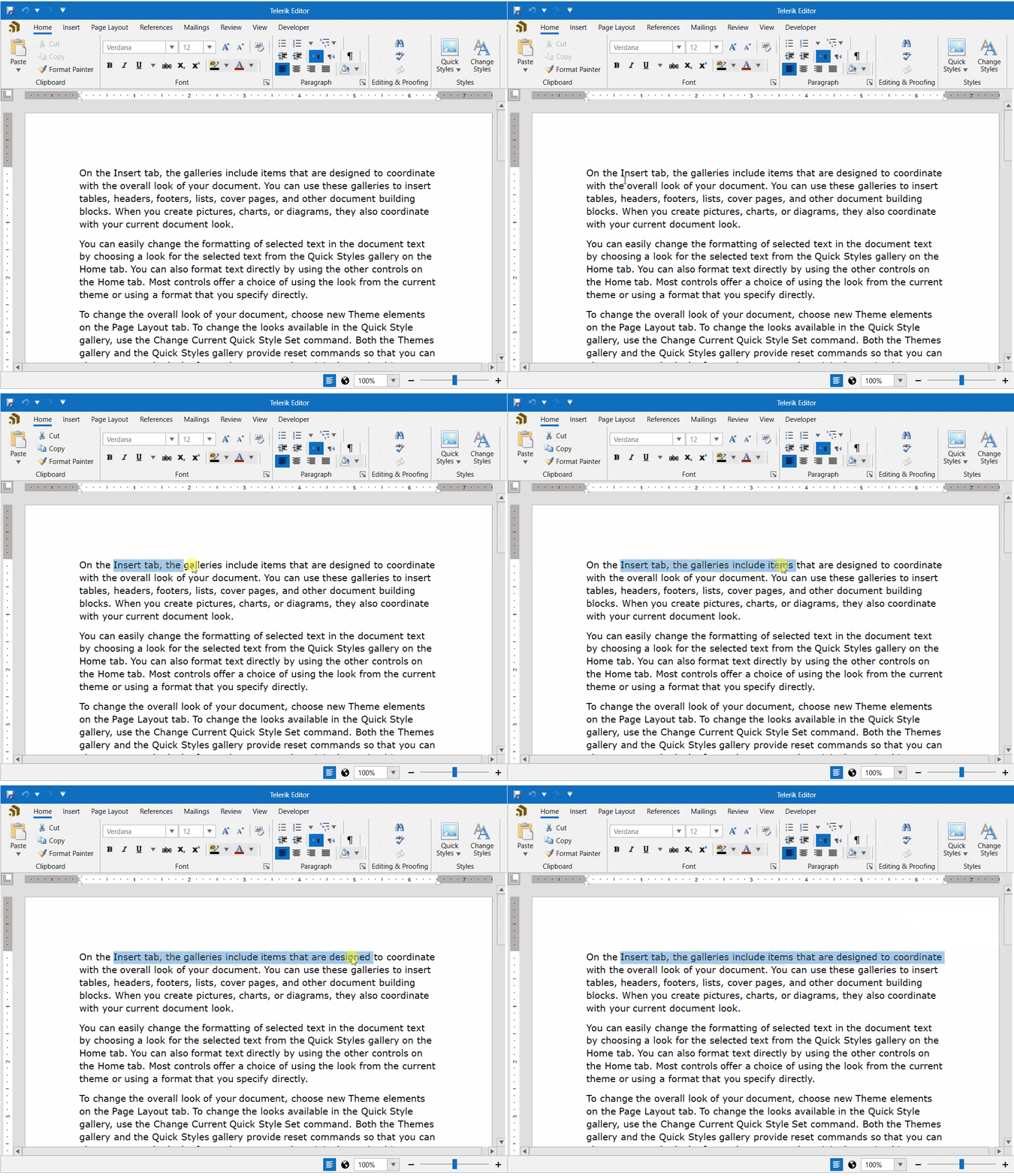
With this new feature of the control, you can allow your users to select bigger chunks of text with less effort. The selection will work similarly to MS Word, and the SelectionChanged event will be fired less frequently. The feature can be easily enabled by setting the IsAdvancedSelectionEnabled property to true. See it in action below:
EntityFrameworkCoreDataSource: Support for .NET 5/6/7
EntityFrameworkCoreDataSource has been around for couple of years now (check out this blog post for more details), and until now it has been based on 3.1 version of the framework.
With this release, for each target framework of our binaries the component will be associated with the corresponding version EF Core. In other words, for .NET 6 and .NET 7 you would need to use the 6.0 and 7.0 versions of EF Core. It will include all the benefits of the latest versions.
For more details, check out the EntityFrameworkCoreDataSource documentation.
WordsProcessing: Sequence Field Support
The Seq (Sequence) field allows you to number various items (tables, figures, chapters) sequentially. It is required for the implantation of the TOC field as well. The syntax of the field looks like this:
{ SEQ Identifier [Bookmark ] [Switches ] }
Currently, we support all possible switches that are available in Word as well. More information is available here: Seq Field.
Other Features
- DataPager: Exposed TextBoxStyle through which to control the appearance of the DataPagerTextBox.
- FileDialogs: Tooltip with additional information is now displayed when hovering files and folders in the main pane of RadFileDialogs.
- FileDialogs: Improved the appearance of the currently renamed files/folders in Windows 11 theme.
Telerik UI for WinUI
Chart—New Series
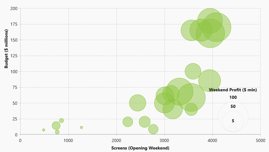
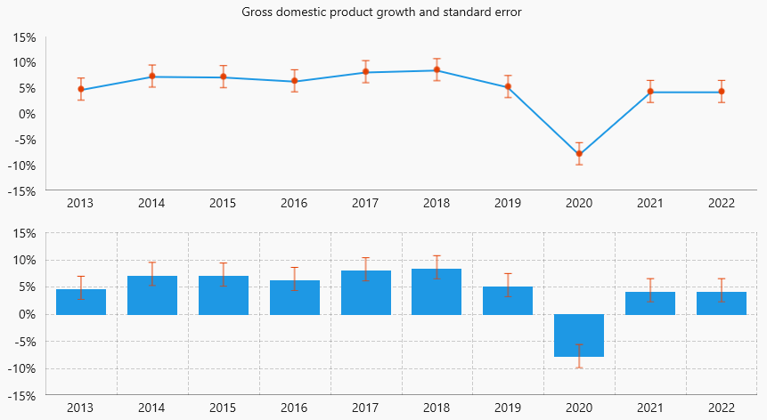
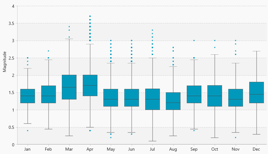
In this version of Telerik UI for WinUI, we are adding a few brand-new Chart series:
- Bubble/ScatterBubble Series
- ErrorBar Series
- BoxPlot Series
I hope they will allow you to achieve even more with Telerik UI for WinUI. For details about all Chart series, check out the Series section from our online help documentation.
PdfViewer: Printing Support on Windows 11
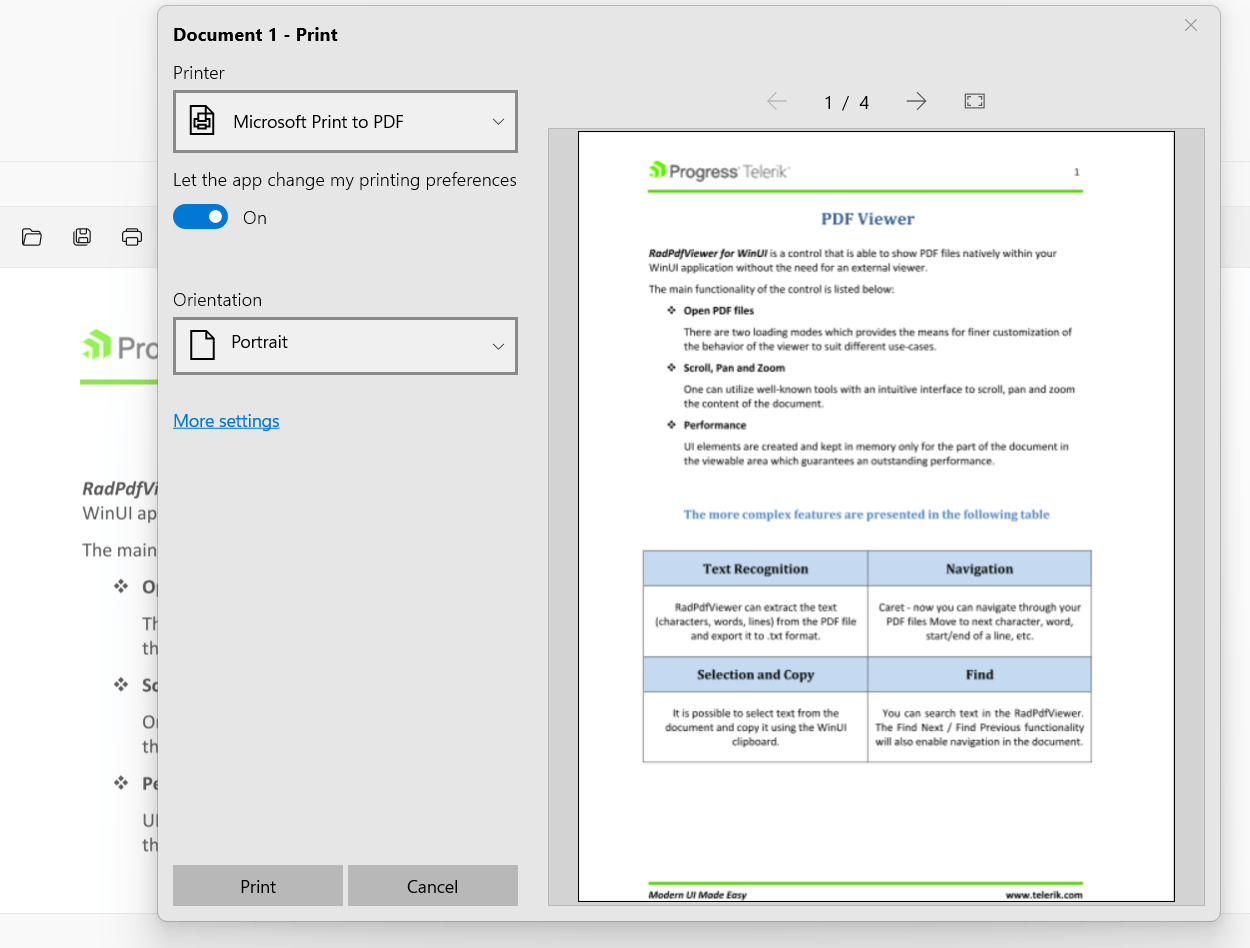
With the initial release of the PdfViewer, there was no printing support due to framework limitations. Now this is possible, but currently only available on Windows 11. For more information, check out this GitHub issue.
You can now either print using the Print method of the control or through the UI by displaying the print button in the toolbar. Simply set the HasPrintButton property of RadPdfViewerToolBar to true and the users will be to directly print the displayed document through the WinUI application.
For additional details, check out the Printing article from the PdfViewer help documentation.
Telerik Reporting & Telerik Report Server
This service release is special. It brings .NET 7 compatibility, but it also brings useful improvements that are based on your valuable feedback. It also addresses a number of reported bugs. Here are the main things:
.NET 7 Compatibility & Related Updates
Of course, we introduced .NET 7 compatibility. The REST report service that enables all HTML5-based web report viewers, the Blazor report viewer and the desktop report viewers for WPF & WinForms all are compatible with the just released .NET 7 when targeting Windows deployment. Note that Linux deployment is still not supported, but we target mid-2023 to have it supported as well.
Added Features in Blazor Native Report
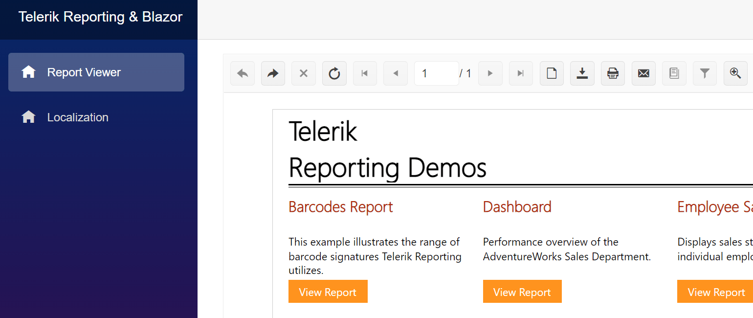
We have added multiple features to the Blazor Native Report Viewer to make it on par with the Blazor wrapper report viewer. Now it supports history to navigate back and forth when drill-through action is performed, infinite scrolling as an alternative to the page-by-page scrolling into the report, and the ability to search within the report content. You can also now localize the viewer for your end users and connect it to a Telerik Report Server instance to display server reports.
Web Report Designer Improvements
The Table/Crosstab/List design experience in the Web Report Designer received another incremental improvement. Now when there is a multi-cell selection, the selection border traces the selected cells.
Additionally, the resize handles are applied to the bounding rectangle of the selected cells instead of each cell individually. Resize operations affect the included rows or columns proportionally.

Tracing in .NET Standalone Report Designer
You can now add tracing to the Standalone Report Designer for .NET. You may configure it the same way as the one in .NET Framework. In .NET 5+ there’s no out-of-the-box support for trace listeners in the application’s configuration file, so we added our own implementation. You can even attach a custom trace listener that inherits and extends one of the .NET built-ins if necessary.
Kendo UI Theming Compatibility
As one of the most important and complex fixes, I would point out the restored compatibility with the latest Kendo UI theming mechanism. The Kendo UI products introduced and continue to introduce changes in their styling to achieve cross-product compatibility.
Report Generation Engine Updates
We introduced two new features in the report generation engine.
The first one is to enable switching off an engine optimization for a concrete legacy report so that it does not require a complete remake when upgrading. It is needed in case the report event handlers change report definition properties which is not supported.
The second new feature is the introduction of DataSource property on the SubReport item so that it enables propagating data from the main to the inner report. Until now, we only supported propagating parameter values through the ReportSource property.
Needless to say, the Web Report Designer and report engine improvements and features also apply to the functionality you get with our turn-key reporting solution, the Telerik Report Server.
Security Update
Finally, I want to mention a dependency change we made for security reasons. Both products now depend on Newtonsoft.Json library version 13.0.1 instead of 9.0.1.
Full Notes
You can scan the full release notes at https://www.telerik.com/support/whats-new/reporting/release-history and https://www.telerik.com/support/whats-new/report-server/release-history.
Telerik JustMock
With R3 SP1 2022 we are delivering few features and handful of bug fixes. Here are the new features!
Support for .NET 7
During the last year we’ve implemented and shipped support for the various preview versions of .NET 7. With this release, we are shipping support for the official version of .NET 7.
Control for the Mock Generation Rules
For some of you, the availability to generate mocks in the VS Quick Actions menu was not desired. For that reason, we’ve implemented the option to disable the mock generation rules with which you can now control whether that functionality will be loaded by VS or not.
Bug Fixes
We addressed all of these bugs reported by you, our users!
- Can’t mock Interface contained Method with ‘in’ parameter.
- Telerik.JustMock.Console version is now incremented correctly.
- Vstest.console is removed from the list of ignored processes by the profiler.
- The AzureDevOps task has incorrect default values for the JustMock profiler path selector field.
- Code coverage result file is not produced when an exception is thrown in the JustMock data collector.
End of Support Announcements
End of Support for LESS Themes in Telerik and Kendo UI
In January 2022, we announced our decision and plans to deprecate the support of LESS themes and notified our customers that the last release with support for LESS themes will be R1 2023 (planned for mid-January 2023).
The LESS themes are available for styling a subset of the available Telerik and Kendo UI products—specifically, when using the following products:
- Kendo UI for jQuery
- Telerik UI for ASP.NET MVC
- Telerik UI for ASP.NET Core
- Telerik Reporting
We are recommending that any customer using the LESS themes migrate to an equivalent Sass-based theme instead. A recap of the announcement and what it means to you is available in the Future Plans for Telerik and Kendo UI LESS Themes blog post.
End of IE Support
With the current update, we would like to announce the plans to end the support for IE in the Telerik and Kendo UI components, Telerik Reporting and Report Server with the upcoming release R1 2023 (due in mid-January 2023).
Learn more about this decision and what it means for you in the dedicated blog post.
Try Them Out & Share Your Feedback
Head over to the Telerik and Kendo UI page and download a free trial. If you are an active license holder you can grab the latest and greatest from the “Your Account” page or update your NuGet package reference to the latest version directly in your .NET solutions.
Share your thoughts with us on our Feedback Portal and help us shape the future of Telerik and Kendo UI!
Happy coding!

Maria Ivanova
Maria Ivanova is a Manager of Product Management at Progress, for Telerik and Kendo UI components and developer tooling. She joined the company in 2019 as a Product Manager for Telerik UI web components and is passionate about developing impactful and innovative software products. Maria believes that to create great products, it's important to challenge the status quo, closely collaborate with customers, and embrace a spirit of experimentation.

